Dark Mode is the new cool. Apps which automatically switch to an eye-friendly palette when lighting conditions are poor. Nifty! Most of the time, it's as simple as making the text a lightish colour, and the background a darkish colour. But all that fails when you use transparencies in images. Here's a quick example. Using the GitHub app in dark mode, I visited a repo which used a transparent…
Continue reading →

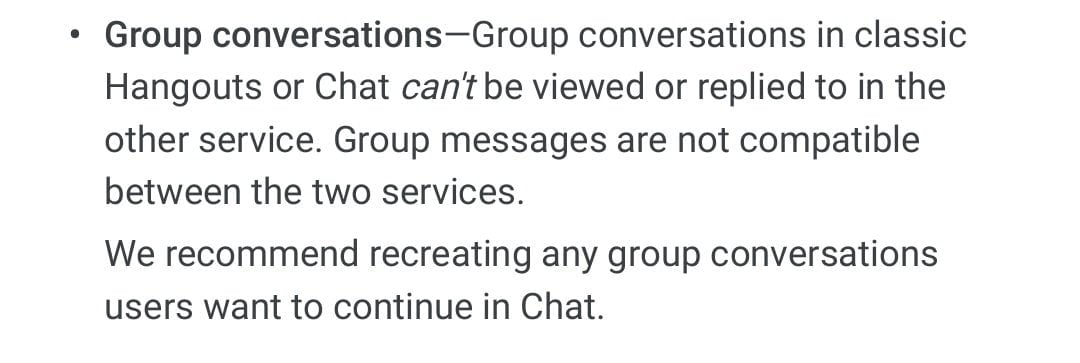
My colleague was understandably ticked off with me. A week previously, they'd asked me to get something fairly urgent done. I hadn't done it - and all hell was breaking loose. I wasn't being truculent or disobedient. I simply hadn't seen their message. And it was all Google's fault. At work, we use Google's G-Suite. It's a brilliant set of email and document tools. It also contains two…
Continue reading →

HTML is magic. It comes with all sorts of great usability and accessibility features. But people often ignore them or misuse them. Take a look at these checkboxen: If you click on this label, nothing happens. If you click on this label, the checkbox will toggle This is important. Tapping on tiny squares is hard for lots of people. Whether they have visual impairments, motor issues, or just…
Continue reading →

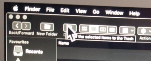
Apple's attitude to usability is... complex. The general attitude of "you're holding it wrong" seems to be prevalent across all their products. I like having a large mouse cursor. I find it easier to see on my large monitor, especially when sat at a safe distance. But, if I use a large cursor - I can't see the tool-tips underneath it. Annoyingly, Apple don't include the larger cursor sizes…
Continue reading →

I walked into an unfamiliar toilet recently. You've probably done the same, looking around to find the stalls, work out whether the driers are near the sinks, if there's soap available. I was completely taken aback when I saw this monstrosity of a sink. It's well known that we Brits love our separate hot and cold taps - but I'd never seen anything like this before! Why are the taps so far away …
Continue reading →

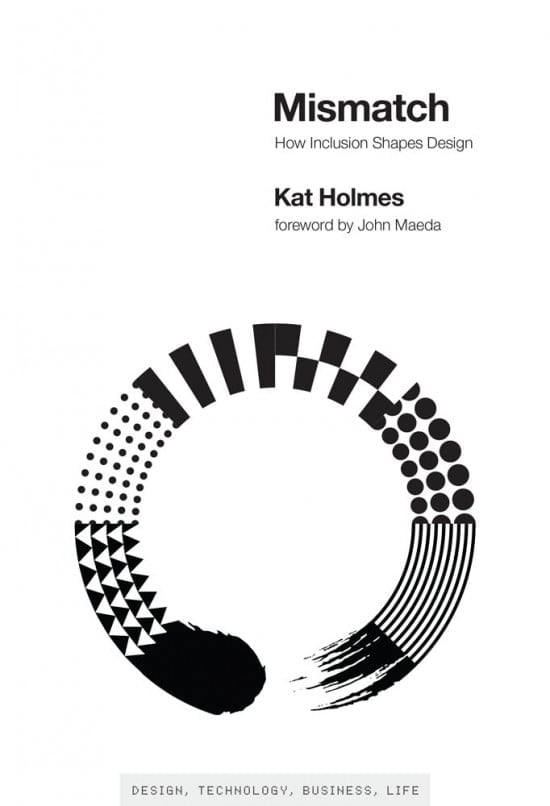
In Mismatch, Kat Holmes describes how design can lead to exclusion, and how design can also remedy exclusion. Inclusive design methods—designing objects with rather than for excluded users—can create elegant solutions that work well and benefit all. Holmes tells stories of pioneers of inclusive design, many of whom were drawn to work on inclusion because of their own experiences of exclusion. P…
Continue reading →

I review a lot of tech kit. It is amazing just how bad the consumer experience is when you have a brand-new box in your hands. It can be as simple as difficult to open packaging, to the existential horror of a poorly translated manual. The first time a customer holds your product in their hands should be a moment of joy. Something to reinforce the notion that they have been wise with their…
Continue reading →

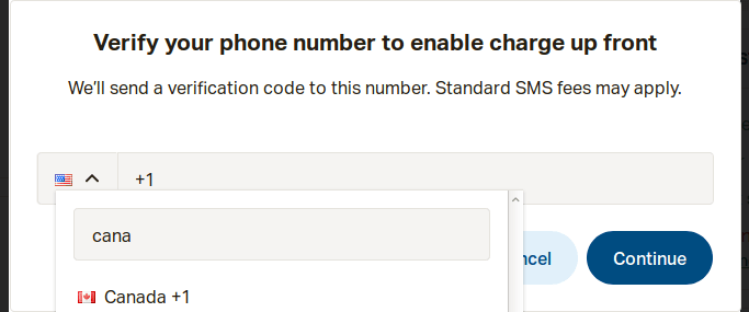
(For more about the "Falsehoods" meme - read the big list of falsehoods programmers believe.) Do You Want To Phone A Friend? A popular website asked me to confirm my phone number. It "helpfully" pre-filled the country-code with +1. And proudly displayed the Stars and Stripes. Except, of course, the USA isn't the only country to use +1 - our friends in the Great White North also use +1. …
Continue reading →

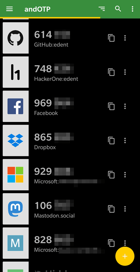
Last week I wrote about how I had 800 passwords in my password manager. It was intended to highlight the ridiculous proliferation of online services, and how redecentralising identity comes with a manageability problem. I now want to talk about 2FA - Two-Factor Authentication - the random codes you have to type in every time you log in somewhere secure. This week, I've moved all my 2FA tokens…
Continue reading →

I've started using BitWarden - the open source password manager. As I've been binge-watching Marie Kondo, I thought it was about time that I deleted all the accounts that I no longer user. I got rid of dozens related to previous employers. I hope the passwords wouldn't work after I left but 🤷♂️. I scanned through the list and deleted old bank details, failed social networks, and obvious duplic…
Continue reading →

If you've spent any time with graphic designers, you'll know that they love spending your money on imperceptible tweaks to your image files. "It must be pixel-perfect!" they cry. When you query why they've generated the same icon in multiple sizes, each with subtle variations, they cryptically mention how everything must align with "the grid." This is hokum. First Principles When we first…
Continue reading →

I've blogged before about how backward the Co-op bank is - sadly, they've not improved in the last few years. I needed to close down my business bank account. I hopped on to online banking, provided all my details, went through 2FA with a physical token, remembered my mother's maiden name and began searching the site. There was no way to close the account. Oh well, I guess I'll give them a…
Continue reading →

