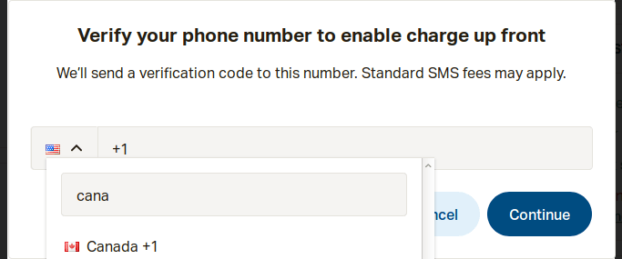
(For more about the "Falsehoods" meme - read the big list of falsehoods programmers believe.) Do You Want To Phone A Friend? A popular website asked me to confirm my phone number. It "helpfully" pre-filled the country-code with +1. And proudly displayed the Stars and Stripes. Except, of course, the USA isn't the only country to use +1 - our friends in the Great White North also use +1. …
Continue reading →

If you've spent any time with graphic designers, you'll know that they love spending your money on imperceptible tweaks to your image files. "It must be pixel-perfect!" they cry. When you query why they've generated the same icon in multiple sizes, each with subtle variations, they cryptically mention how everything must align with "the grid." This is hokum. First Principles When we first…
Continue reading →

A little mathematical / spatial / design problem I've been having. I have an icon which, depending on the user's preference, can be inside a square or a circle. Is it possible for it to be centred in both? Here's a visual example. On the left is the AirBnB logo centred in a square. When the background is turned into a circle, the logo appears to "drop" - the bottom of the logo is closer to the …
Continue reading →

I've written before about Solipsist design - those services which have been designed to work only for a very specific type of family. I was taking a look at Google's "Family" proposition - which allows users to share their purchases with other family members. What I found didn't impress me. Terence Eden is on Mastodon@edentFile under "Falsehoods Programmers Believe About Families."…
Continue reading →

Many years ago, when I worked for a mobile phone company, a group of us were encouraged to come up with crazy ideas which the organisation could patent. I had one idea come this close to getting through until someone found an unnervingly similar patent and the whole thing was dropped. Well, it has been a dozen years and no one has released my killer idea, so I'm setting it free. It's simple. A …
Continue reading →

After much kerfuffle, the world has finally got used to the new Google logo. Well, almost. My eye is continually caught by the poor contrast of the yellow "O" against its background. Take a look... This is Google's default logo on its regular grey background. The contrast ratio between the yellow and grey is 1.50. That fails to meet current accessibility guidelines. This is just awful - I …
Continue reading →
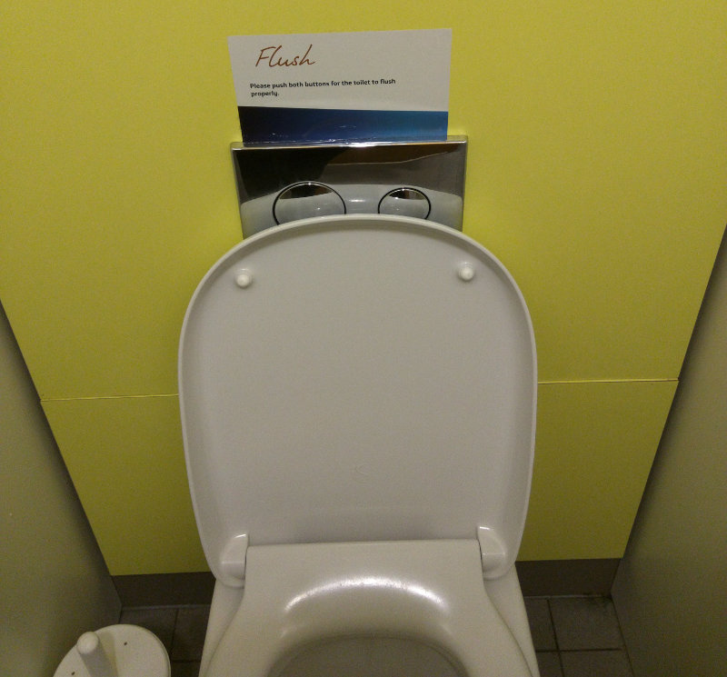
Another in my occasional series on the usability of toilets! It's hard wandering around seeing the mistakes which are made by designers. Perhaps it's poor keming on fonts, or a hotel room light switch which makes no sense, or - in my case - bogs. Lots of toilets incorporate a "dual flush." Press one button to unleash a deluge sufficient to sink all but the hardiest of bowel-movements, press a…
Continue reading →

I'm really late to the party on this one - so this blog post is mostly an aide-mémoire. The web is built on three fundamental components: HTML - the structure of the page. CSS - how the page is styled. JavaScript - the interactivity. Typically, the website owner sets up the CSS to say links are blue, headlines are big, images have borders etc. etc. Users, however, can over-ride …
Continue reading →

I hate the iPhone. Always have, probably always will. However, as a geek in the mobile industry, I have to try the full gamut of devices. So, this weekend, for testing purposes, I've been lumbered with an iPhone 4S. My aesthete friends are always complaining about how cobbled together Android is. Because there is no overall owner, the UI is full of unintuitive quirks. That's a fair…
Continue reading →

I've really enjoyed learning from Kathy Sierra's talk "Creating the minimum badass user". It's an hour long, but well worth your time. She covers many aspects of product design, but the quote which really resonated with me was this - Zoomed in - This seems so applicable to many "services" these days. Millions spent on TV adverts, positive reviews, and glossy websites - yet nothing spent…
Continue reading →

...or do I just need new glasses? I'm not a graphic designer. I find it hard to get into the mindset of excellence through beauty. I understand user flow, interactions, happy paths, delighting the user, humane design, and so on - but when it comes to the art of making something look nice I'm all at sea. I understand that, as Aral Balkan so perfectly puts it, design is not veneer - but that…
Continue reading →

Bitcoin me! 1LJmePYmet9VzzzzzzLbd0RVGoYcLqAZhk If that "sentence" makes any sense to you - you're not a muggle. Muggles (for want of a better epithet) don't want to invest a lot of time into things which don't fit with their mental model of how the world works. Without getting into a philosophical discussion on what money is and how value is generated - let's look at how Bitcoin works in…
Continue reading →