Another in my occasional series on the usability of toilets!
It's hard wandering around seeing the mistakes which are made by designers. Perhaps it's poor keming on fonts, or a hotel room light switch which makes no sense, or - in my case - bogs.
Lots of toilets incorporate a "dual flush." Press one button to unleash a deluge sufficient to sink all but the hardiest of bowel-movements, press a different button to release a trickle designed to gently dilute the user's micturations.
I've often visited lavatories where I was unsure of which button to press - but I think this is the first time I found a toilet which blocked its own buttons!
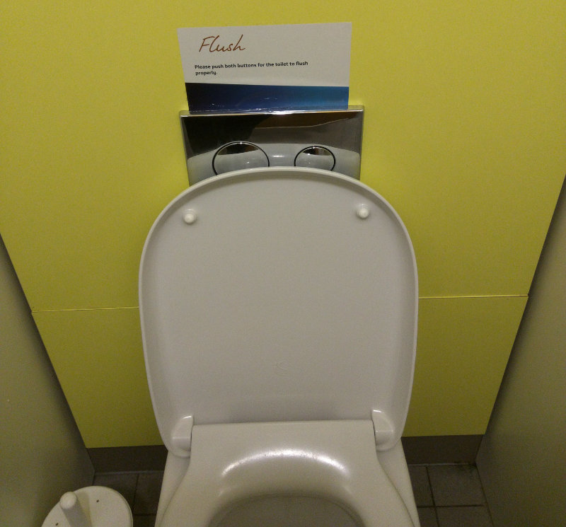
The only way to access the buttons is to manhandle the toilet seat, or attempt to curve your fingers as to avoid touching the filthy thing.
But wait! There's more! As all Usability Experts™ know - a sign is an admission that you've failed to create something intuitive. Let's take a closer look.
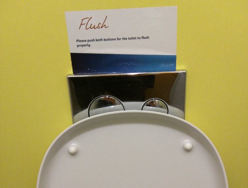
It would appear that there really is no need for two buttons. Neither works by itself - the only way to flush is to simultaneously depress both. Not quite practical with one hand.
Here's how a sensible loo would work.
- Finish the shameful business in hand.
- Rotate body.
- Use finger of one hand to depress button.
Here's how this crapper works.
- Contemplate what it's like cleaning peanut butter out of a thick pile carpet.
- Rotate body.
- Read sign.
- Close lid.
- Use both hands to activate dual button flushing system.
What a palaver, eh? Nul points!
One thought on “The Design Of Everyday Toilets”
See also http://www.propelics.com/ux-of-up-urinals-and-usability/