
Because I don't trust Alan, the Hyperprat who now runs Twitter, I decided to download my Twitter archive before setting my account to dormant. About a decade ago, I wrote about how the Twitter archive works and where it is deficient. Things have got better, but there are still annoying limitations. For example, Hannah Kolbeck - founder of the Alt Text Reminder Bot recently pointed out that…
Continue reading →

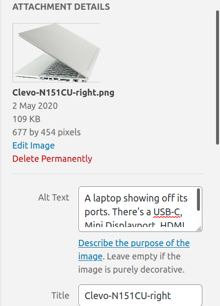
About 2.5 years ago I proposed a small accessibility improvement to WordPress. It has taken a bit longer than I'd hoped but, as of WordPress 6.1 it has been merged! Now, if you're using the Classic editor, you'll get a larger and resizeable box for entering alt text. Because the text entry uses <textarea> most browsers will also show any spelling errors. Good spelling is essential for people …
Continue reading →

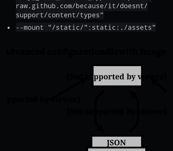
Quite often on the web, you'll see a set of "things" with a separator between them. For example, at the top of this post, you'll see Thing 1 | Something Else | Another Thing. This provides clear visual separation between logical groups. But there are a couple of problems. Firstly, the separator character may not be interpreted correctly by screen readers. They may read out "Vertical Pipe",…
Continue reading →

(You may already know this, but I didn't. Every day is a school day.) HTML has the concept of the lang attribute. It allows you to say that a specific element contains text in a specific human language. For example, this page starts with: <html lang="en-GB"> That says the entire page is written in English, with the sub-type of Great Britain. This means your browser might offer to translate…
Continue reading →

Back in 2017, I noticed that the UK Post Office was doing very dodgy things with their alt text. Lots of their pages had this snippet of code: Rather than add properly accessible alt text, a developer added placeholder Latin text. Being a good webizen, I tried to report this. Terence Eden is on Mastodon@edentHi @PostOffice,Why is your website's alt text written in Latin? I don't think that…
Continue reading →

There's an HTML element called <time>. It is a semantic element. That means robots can read and understand it. For example, if my code says: <p> The concert is <time datetime="2020-12-24">tomorrow</time> </p> Then the computer knows the specific date I'm talking about. A browser could offer to add the event to your calendar, or a search engine could find events which are happening on a…
Continue reading →

It's rather dispiriting when you launch something, only to have people berate you for not launching sooner. A few months ago, I was involved in a medical questionnaire launch. Before it was released, I had several people send me polite (and not-so-polite) queries as to why it was taking so long. "I could build that in five minutes!" was the common refrain. Some people, dissatisfied with our…
Continue reading →
Dark Mode is the new cool. Apps which automatically switch to an eye-friendly palette when lighting conditions are poor. Nifty! Most of the time, it's as simple as making the text a lightish colour, and the background a darkish colour. But all that fails when you use transparencies in images. Here's a quick example. Using the GitHub app in dark mode, I visited a repo which used a transparent…
Continue reading →

In order to provide a video playback UI, WordPress uses the excellent MediaElement library. Recently, I discovered a slightly annoying flaw - I couldn't see the play button! Here's a screenshot of the video UI. In the middle of this screenshot is a white play button. I have trouble seeing it, because the video's background colour is predominantly white. The issue is with the…
Continue reading →
My mate, the accessibility specialist Léonie Watson, has this to say about how we improve the world, piece-by-piece: Accessibility doesn't have to be perfect, it just has to be a little bit better than yesterday. Source: Twitter Damn straight! One of the best ways we can make tomorrow slightly better than today is by making small changes which make it easier for people to do the right thing. …
Continue reading →

HTML is magic. It comes with all sorts of great usability and accessibility features. But people often ignore them or misuse them. Take a look at these checkboxen: If you click on this label, nothing happens. If you click on this label, the checkbox will toggle This is important. Tapping on tiny squares is hard for lots of people. Whether they have visual impairments, motor issues, or just…
Continue reading →
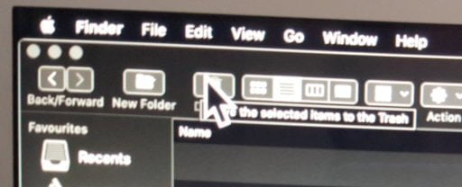
Apple's attitude to usability is... complex. The general attitude of "you're holding it wrong" seems to be prevalent across all their products. I like having a large mouse cursor. I find it easier to see on my large monitor, especially when sat at a safe distance. But, if I use a large cursor - I can't see the tool-tips underneath it. Annoyingly, Apple don't include the larger cursor sizes…
Continue reading →