I am a bear of very little brains sometimes. I had a site which, for various boring reasons, was printing a <style> element in the middle of the HTML's body. Because <style> is a metadata element, it should only appear within the <head> element. This is OK: <!doctype html> <html> <head> <style> a { color: #f00; } </style> </head> <body> … This is an error: <!doctype h…
Continue reading →

I want to make emoji bigger than the text that surrounds them. At my age and eyesight, it can be difficult to tell the difference between 😃, 😄, and 😊 when they are as small as the text. Is there a way to use CSS to increase the font size of specific characters without having to wrap them in an extra <span> or similar? Yes! Although it is a bit of a hack. This relies on 3 CSS features: src: lo…
Continue reading →

Do you know about the EURion constellation? It is a pattern which is embedded into some modern banknotes and has a curious property. Most modern photocopiers will, if they detect the pattern, refuse to make a copy. Try it for yourself - stick a €20 note into your nearest Xerox machine and try to print out some illicit currency - see what happens! It goes a little further Some printers will r…
Continue reading →

How do you know you're looking at an old website? You may have found a page which has lots of interesting information, but how can you tell it's a modern and relevant result? Some websites don't contain dates in their URls. There may not be a © date or publication date shown on the page. And the <meta> tags might not contain anything useful. If you're lucky, the site will look old fashioned: …
Continue reading →

Yesterday I wrote about a lazy way to implement a manual dark mode chooser. Today I'll show you a slightly more sensible way to do it. It just uses CSS, no need for JavaScript. Here's a scrap of HTML which present a dropdown for a user to choose their colour scheme: <select id="colour-mode"> <option value="">Theme Selector</option> <option value="dark">Dark Mode</option> <option…
Continue reading →

I'm not saying this is a good way to make a dark mode website. I'm not even saying it's a sensible way to do dark mode. But I'm pretty sure this is the laziest way of getting dark mode on your site. And it is all done with less than a handful of CSS rules. It relies on the new-ish :has() CSS pseudo class and the positively ancient filter() CSS function. Here's the code in all its glory: …
Continue reading →

Sometimes you learn the most from failures! I wanted a <select multiple> element where the <options> were laid out in a grid. I nearly got there. It's possible to have the <option>s in a horizontal row - but only on Chrome and Firefox. Here's a quick fiddle showing the results: As you can see, it's possible to do some pretty extravagant styling of the individual <options> you can even…
Continue reading →

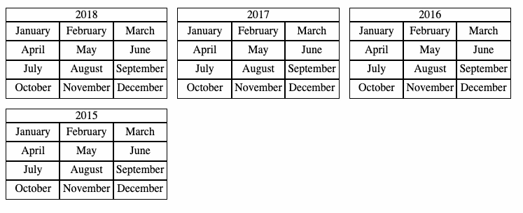
This blog has a calendar showing my yearly archives. It was in a table layout - which made sense when I first designed it - but had a few spacing niggles and was hard to make responsive. Now, it behaves like this: The code is relatively straightforward. The HTML for the calendar looks like this: <div class="calendars"> <div class="calendar"> <div class="calendar-year">2018</div> …
Continue reading →

Every day is a school day. I'd recently seen a post about highlighting images without alt text. That got me thinking. Is it possible to style alt text? Yes. Yes it is. And it's pretty simple. Well, OK, it's CSS, so simple is a relative term! Let's take a broken image like <img src="http://example.com/bigfoot.jpg" alt="The best quality photo of bigfoot!" /> There are two slightly different…
Continue reading →

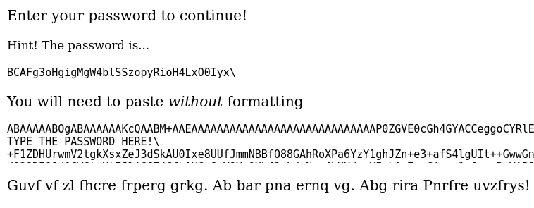
I recently saw Robin Moisson's method of password protecting a statically served HTML page. It's quite neat! But it does rely on JavaScript. That got me wondering if there was a way to encrypt a static page only using CSS? And... I think I've done it! I'll warn you now, this is a deeply stupid way to solve the problem. Here's a screencast of the demo in action: …
Continue reading →

A bit of a thought experiment - similar to my Minimum Viable XSS and SVG injection investigations. I recently found a popular website which echoed back user input. It correctly sanitised < to < to prevent any HTML injection. Except… It let through <h2> elements unaltered! Why? I suspect because the output was: <h2>Your search for ... returned no results</h2> And, somehow, the parser was g…
Continue reading →

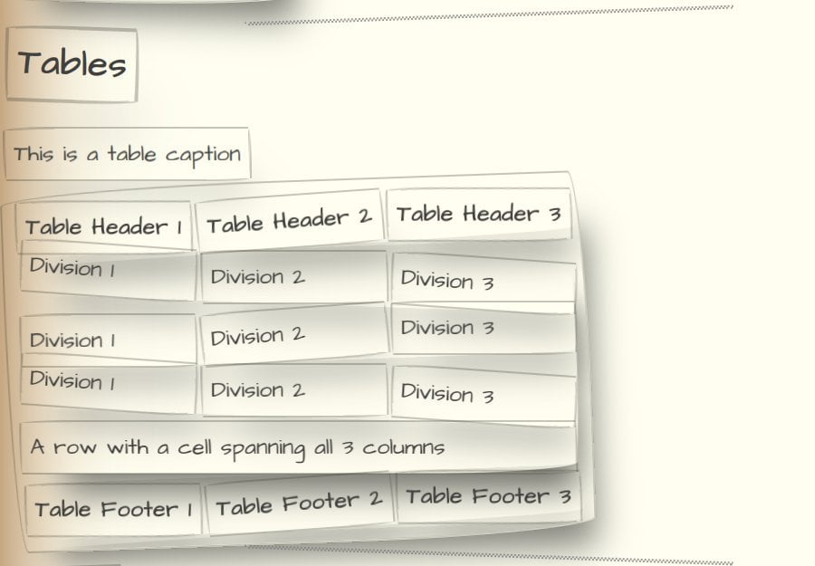
Introducing Paper Prototype CSS. When I first started designing the OpenBenches website, I wanted to make it look deliberately crappy. I didn't want the people testing it getting too hung up on what it looked like. I've found that some beta testers can only focus on whether the colours are right, or if things should be placed on the left or right. So I wanted something which mimicked "Paper…
Continue reading →


