I'm a big fan of Groupon - the money saving site - that's why I'm so disappointed with their latest campaign.
A nice simple set of banners.![]()

Let's gloss over the missing apostrophe in this one though...
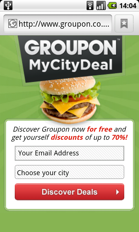
 Which leads to the Groupon mobile friendly site.
 Well formatted mobile site. Free text field for an email address and a drop down list of cities they support.
There's no notion of what they'll do with the email address - which is very naughty - but the worst is yet to come.
After filling in the form and clicking "Discover Deals" this is what the customer gets.

sigh So depressing. Why do this?
If you don't have a mobile friendly site, don't run a mobile advertising campaign.