Surrey Police and the Case of The Misleading Pie Charts
By @edent![]() · data graphs police statistics stats surrey · 450 words · read ~978 times.
· data graphs police statistics stats surrey · 450 words · read ~978 times.
Surrey County Council have sent every household in the county a booklet explaining how our council tax is being spent. Within it is a highly political comment from Kevin Hurley, the newly elected Police and Crime Commissioner.
He presents a pie chart showing how the police force spend its money. Take a look at it and ask yourself this question: what percentage is spent on "Employees".

Please use this poll to record your guess - answers at the end of this blog.
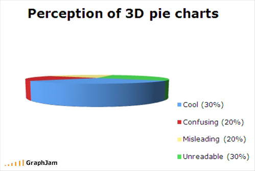
Pie charts have a long and noble history. They were popularised by Florence Nightingale and were hugely effective in helping politicians understand the causes of death among soldiers during the Crimean War.

As we understand more about the human brain and how we perceive shapes, it is becoming clear that pie charts are ineffective for representing complex information.
2D pie charts can still serve a useful purpose in limited circumstances. The real problem is with 3D pie charts. As far as I can tell, these abominations were popularised by Microsoft's Excel charting software.
3D charts distort the view of the data in such a way that it becomes increasingly hard to understand the information being presented. A picture being worth 1000 words, allow me to demonstrate:
So, just how bad is Surrey Police's Pie Chart? In an extremely scientific study of asking half a dozen people, they all guessed between 75% and 85%. That's quite a wide range considering it's a multi-million pound difference.
On the opposite page to the pie chart is this summary of spending.

In slightly more readable format, it is:
| Category | £ | % |
| Employees | £181.70 | 81.9% |
| Premises | £8.00 | 3.6% |
| Supplies | £27.20 | 12.3% |
| Transport | £5.00 | 2.3% |
| Total | £216.90 | 97.7% |
A few interesting things to note here.
Firstly, how do we calculate the percentages? The total spend isn't mentioned in the report (£216.90). If we use that, "Employees" accounts for 81.9% of spending.
If we take into account the gross expenditure (£207.70) the figure jumps to 87.5%.
Secondly, if we do assume that we're using the unreported total spend - there is at least 2% missing. Some of which can be explained by rounding - but I wonder what the rest of the money is spent on.
Given the above, I don't think the provided pie chart allows Surrey residents to see an accurate view of how their hard earned money is being spent.
Hopefully, this side-by-side - of the above data - will show you how 3D pie charts distort data and end up misleading their audience.
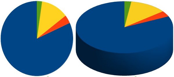
With this overlay, we can see the distortion much more clearly. The smaller sections of the chart look disproportionately larger.

It's time to announce a zero tolerance crackdown on dodgy data representation.


