Bad Oxfam! No QR Cookie for you!
Last year I gave a presentation at PayPal to show how charities could harness QR codes.
I'm not sure if Oxfam were in the audience that day. But if they were, they missed the point. QR codes are a solution for quick interactions with mobile phones. Let's investigate the Oxfam QR code seen in Metro.
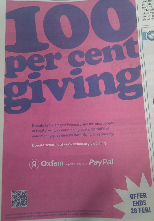
The Advert
 So, can donate by scanning the code? Well, it's not really made clear what the QR code is for. There's no text associated with it.
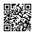
The Code
Let's take a closer look at the code.  That's a huge URL stuffed into a tiny code - making it hard to scan. Ideally, codes should use black ink - the blue used here shouldn't cause too many problems, but coupled with the small size reduces the scanability.
The URL
Let's take a quick look at the URL before moving on.
https://www.oxfam.org.uk/donate/paypal/index.php?ito=4373
Good: Use of https for a secure connection. Bad: Just about everything else. Why is this so long? Why didn't Oxfam set up a redirect so that oxfam.org.uk/4373 went to the right place? If that's not feasible, drop the redundant index.php.
https://www.oxfam.org.uk/donate/paypal/?ito=4373
Even better, just direct to the target page. In this case
https://giving.oxfam.org.uk/
Doing that would have resulted in this smaller and more easily scanned code. 
The Website
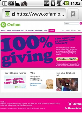
This is where things go from bad to worse. The first thing I saw - on several phones - was this certificate error. Given that Oxfam are expecting me to give them money, this doesn't give me confidence.  But, it gets worse.
  Yes, that's right. Oxfam have decided to send my mobile phone to the full version of their website. Rather than provide me with an optimal experience, they're making it slow, costly, and awkward for me to give them money.
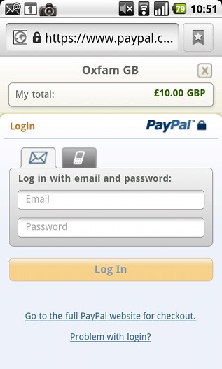
PayPal Mobile
After clicking through a few screens to try and give them some cash, we get to PayPal.  Perfect. At this stage of the transaction - if the user has even got this far - PayPal provide their optimal mobile user experience.
Conclusion
- Poorly formatted code.
- Mobile unfriendly landing page with security issues.
- Multiple clicks to donate.
- Overall, why bother?
If anyone from Oxfam is reading, the interaction should go: Scan - mobile friendly landing page - straight to donation. No more than 3 clicks including the original scan of the code.
[slideshare id=5233233&doc=charityhack-qrcodes-100919090355-phpapp02]
Hello
Thanks for your feedback - we really appreciate it, especially as we are new to using QR codes in our marketing.
We have taken your advice on board and are going to try and use a shorter URL in our ads later this month. Thanks again for your advice and helkping to imrpove our campaign.
Stuart from the 100% giving team.
Hi Stuart,
Sounds good - I look forward to seeing the new campaign. Hope it brings in lots of donations for your worthwhile organisation.
Don't forget - make the landing page mobile if you want to attract a better response.
Give me a shout if you want any help.
Terence
Ian says:
Interesting stuff and good on you for helping Oxfam.
Does any one know if PayPal's contributions are capped? Would be great if the executor of a will who was charged with making a distribution to Oxfam could do so via PayPal.