I'm incredibly disappointed with "Doctor" Emmett Brown. His forays into time-travel could have extremely profound consequences for the space/time continuum. Worse than that, his time machine has a crap user interface.
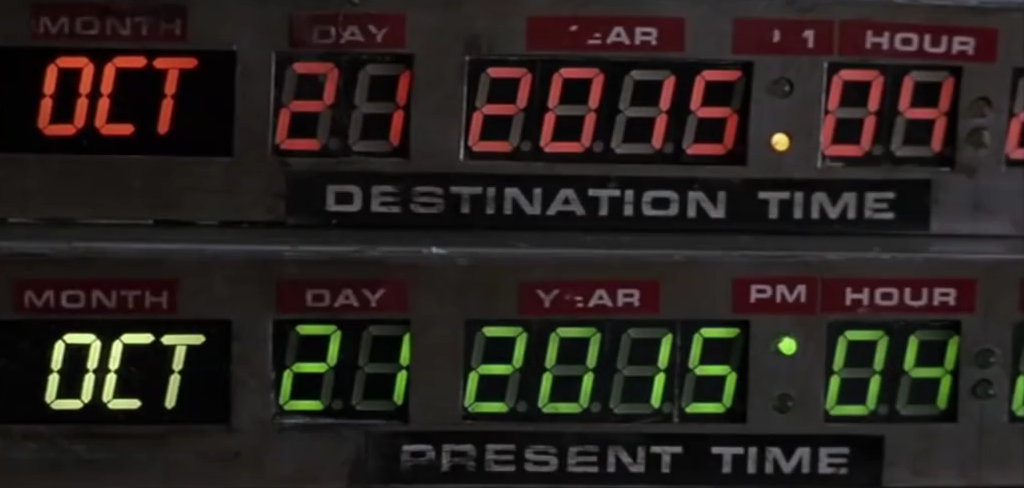
In this clip from "Back To The Future" we get a brief glimpse at the controls for setting the destination date:

Ok, we can forgive Brown for not sticking to ISO-8601 - that is the eminently sensible Year-Month-Day-Hours-Minutes-Seconds format - the standard was finalised in 1988, a few years after he allegedly built his time machine.
But why are the "Destination Time" LEDs red - the universal colour for stop/warning? The "Present Time" LEDs are green - not great for men with colour-blindness.
AM/PM are positioned before the hour marker. WTF?
Generally speaking, humans read top-to-bottom. So having the "Destination Time" label in the middle of two displays could prove confusing.
There appears to be no "Seconds" setting - is this level of precision acceptable?
Let's move on and take a look at the sequel - the imaginatively named "Back To The Future Part 2":
OMG! In this latest revision, the AM/PM labels have swapped position!
It's unclear if this is a conscious design choice, or whether the labels have fallen off and been carelessly repositioned. This could lead to the unwary user arriving 12 hours before or after they expect. That is not a great user experience!
Finally, let's take a look at Part 3

Well isn't this just fanfuckingtastic!? The AM/PM has switched again! What utter contempt the designers are showing for their user.
It's obvious that the LED lighting isn't sufficient for either use in bright sunshine - or for viewing from the driver's position.
The label is "Departed Time" - rather than "Time Departed" which would keep it consistent with the other two labels.
And, if that weren't bad enough - take a look at the "Month" section. Yup, it has gone from being JAN/FEB/MAR etc - to a two digit representation!
Oh, and apparently, there's no support for TimeZones. FFS...
Seriously, if you are planning on designing a time machine, please don't take any advice from this nutcase!
4 thoughts on “Doc Brown is a Crap UI Designer”
@Edent maybe the omission of seconds was to avoid having to deal with leap seconds?
| Reply to original comment on strangeobject.space
Peter G
It's a good thing the journeys kept to a fairly narrow range - maybe the machine had limits on how far back or forwards it could travel. We only have four digits for the year, so no visiting the year 10,000 nor can we select a date BC (or BCE). Unless maybe it uses a digit for a - sign, that would stretch it all the way to 999 BC. So no going to take a look at the pyramids being built. Anyhow, that raises questions of who's years do you use, do you roll the current calendar back, which would leave you some days out from the calendar of the era? Never mind the Romans adding and removing months, so sticking to modern calendar seems best, but you'd need to have a conversion chart if you wanted to hit a specific day.
I fail to see how Doc Brown is worse than most FOSS UIs. For much the same reason, actually.
| Reply to original comment on bsky.app
vfig
also he put the “time circuit enable” lever too close beside the gear lever. there was at least one recorded incident of the time circuit lever being bumped while changing gears, inadvertently leading to an unintended instance of time travel.