I hate the iPhone. Always have, probably always will. However, as a geek in the mobile industry, I have to try the full gamut of devices. So, this weekend, for testing purposes, I've been lumbered with an iPhone 4S.
My aesthete friends are always complaining about how cobbled together Android is. Because there is no overall owner, the UI is full of unintuitive quirks. That's a fair criticism - some parts of Android are incredibly shonky. But, to hear those in the gilded cage speak, iOS was delivered as the platonic ideal of what smartphone should be. It is perfect, and gets more... er... perfecter with every release.
That's horseshit.
I know that coming from one phone to another, you're bound to find things which don't work quite the way you expect. This is different though, there are such bone-headed flaws present throughout iOS that I can only conclude that Stockholm Syndrome has set in amongst its users!
Firstly, it's a relief not to have to use the accurs'd iTunes to set up your phone. But, there is a fly in the ointmet. To set up the phone, you must have a SIM in the phone.
Why? Seriously - why? Literally every other phone I've ever owned "just works" when you take it out of the box. Want to use Android or BlackBerry using WiFi? Fine. So, I stuck in a SIM and it got through set up. Guess what? The SIM was invalid - it didn't attach to any network. Well done, Apple - another pointless loop for customers to jump through to pacify your insane control-freakery.
The rest of the set-up process was predictably poor - despite setting my language as English, and knowing which country I'm in, the iPhone presented me with a country list starting with Afghanistan. That's a heck of a long scroll to get to the UK.
Still, initial impressions rarely count, do they? Let's look at what the rest of the experience delivers.
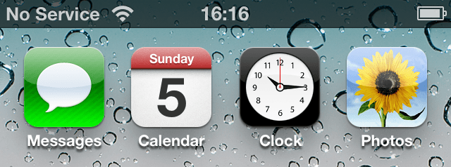
 Well, the date on the icon is right - but the time is wrong. What's the point in that?
As it happens, there's a software update for the iPhone. I took a look at the details. Bizarrely, this link isn't clickable.
 Great work - make it look like a link, but don't let anyone click on it. Good work there!
I went into music, there's nothing in there - other than this rather confusing pop-up.
 I assume "OK" should read "Music"?
But look - there's a handy little link to iTunes. Naturally, it doesn't work.
 You can click and click and click - there's no way to get to iTunes from this page.
Was this thing designed by a chimp?
Clicking around the App Store - which apparently has revolutionised the retail industry - I kept encountering this error.
 Top tip, Apple: don't offer me link to things I can't get.
The capitalisation on this seems really off to me.
 Still, attention to detail is for losers, right?
Now, on to my chief annoyance. The keyboard. I know Apple loves skeuomorphic interfaces, but this is ridiculous. Hit that shift key as often as you like - but nothing changes.
 Why? It's really annoying to have to look in the lower left hand corner every time you want to see if you've hit the shift key.
Oh, bonus fuckwittery, I spent a couple of minutes looking for the "opening quote" symbol.
 My problem or theirs?
Honestly, this post is boring even me. It's obvious that the famed Apple design is a bit shabby. I just don't get why everyone raves about it.
Every device has quirks - and the iPhone is no exception. Yes, we should strive for perfection in design - but people are so desperate that they are being seduced into the worship of false idols.