How Not To Get People To Download Your App
If you really don't want people to download your app - put as many barriers in the way as possible.
BlackBerry's Facebook app is a classic example of this. A brilliant application ruined by the rigmarole of actually trying to download it. Let's take a look at what a customer has to do in order to get the app on their phone.
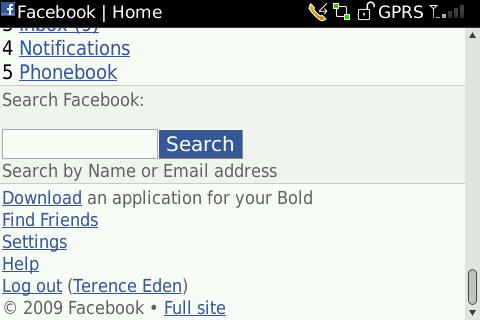
I'm on Facebook on my BlackBerry. It's a nice experience, but I want something more. What's this I see at the bottom of the screen?
Step 1
"Download an application for your Bold". An application for what? For Facebook? Is this an advert for something else? What are the benefits of this app? Why is this link hidden at the bottom of the page? Not a good start.
On the plus side - they've correctly identified my phone. This gives me reasonable confidence that the app is going to be compatible.
Let's click on it anyway....
Step 2
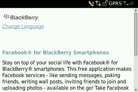
Ok. What's ® with © all ™ the funny characters? This just makes it hard to read.
Why do I need to change my language? Surely Facebook already knows my language. Hang on! If I don't speak English - how will I know to click on "Change Language" in the first place?
How about a screen shot? Show me what I'm getting? Let's scroll down.
Step 3
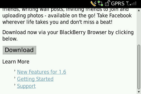
"Download now via your BlackBerry Browser". What on Earth does that sentence mean to a non-technical user?
On the plus side - there's a big "Download" button that's pretty hard to miss and some links for more information. Let's play "devil-may-care" and download this app. I'm eager to start poking my friends.

Step 4
What? My language is already determined from Facebook and you gave me a chance to change my language at the start. Again, if I don't already speak English - assuming I've persevered this far - will I know what to do here?
The missing image on the right hand sign is sloppy. It doesn't bode well for this software if they can't even get the website straight. This sort of thing should be picked up in testing or by simply checking the daily logs to see where the most 404 errors are being generated.
The "Next" button is comically large - but makes it obvious where to go. Knowing the device's vertical resolution, they've kept everything on one screen. A smart choice.
Let's whack that great big button!
Finally!
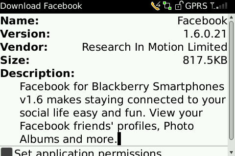
Ok. We're there! We can begin downloading and installing.
A lot of nonsense is talked about the Three Click Rule. It's not always practical to keep everything so close. But there is no reason why clicking on the first link on the Facebook couldn't have lead straight to the download page. The journey that the user had to go through was entirely spurious.
A poorly thought out user-interface reduces the confidence in your product and turns your users away.
Make it easy for your user to get to your app. The more clicks they have to do, the more decisions you force them to make, the more you drive them away.
Addendum - Languages
The issue of multi-lingual sites is tricky. It's not always possible to detect from the browser or the refering site what language the user needs. Here's how not to do it.
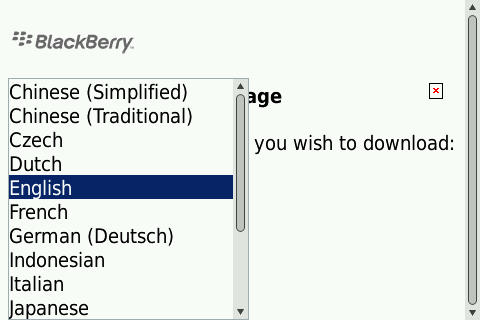
Languages
This is a classic mistake. You're assuming that the user knows what their language is when spelt in English.
Assuming you speak English, would you recognise the Chinese for "English"? How about the German?
This can be avoided by printing the language's name in the same language as it is written. Why write "German (Deutch)"? Who does that benefit?
Think like you are the user. Ask if the page is for the user's benefit or the page designer's / back end system's / legal department's benefit. The user must come first. Even if she doesn't speak English.