Whatever Happened to UI Affordances?
I am grumpy. As my very clever wife summarised, I hate when designers prioritise their æsthetic preferences over my usability needs.
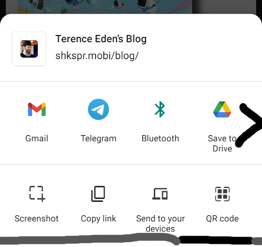
I tried sharing a website using Google Chrome for Android. I hit the share button, and a panel popped-up from the bottom of the screen.

Hmmm. It didn't have the share destination that I wanted. It was early in the morning - when I'm not at my cognitive best - and I was stumped. There is nothing on this screen - other than the icons - to tell me how I can interact with it. There's no scrollbar, no handle, no "more" icon, nothing.
Let's talk about doors for a while.
I'm sure you've all come across a door with an ambiguous handle. This is what usually happens:


Ideally, all doors would look like this:

Even if you don't speak the language written on the doors, the physical nature of the handles tells you what you can do with them. A flat panel can only be pushed. The protruding handle is designed to be pulled. This design feature is known as an "affordance".
If you're involved in design, at any level, I urge you to read the classic book "Design of Everyday Things". This is what it has to say on the subject:
How can design signal the appropriate actions? One important set of signals comes through the natural constraints of objects, physical constraints that limit what can be done. Another set of signals comes from the affordances of objects, which convey messages about their possible uses, actions, and functions. Where do we grab it, which parts move, and which parts are fixed? Affordances suggest the range of possibilities, constraints limit the number of alternatives. The thoughtful use of affordances and constraints together in design lets a user determine readily the proper course of action, even in a novel situation.
(Emphasis added.)
Let's go back to that accurs'd Android panel. I tried swiping it up - that's what I've learned most panels do in Android. But it did nothing. So I gave up. I didn't feel like battling with my computer to achieve a simple task. I just assumed that Google had chosen a set of default options and I was not allowed to stray from them.
As I went to dismiss the panel, my thumb slipped transversely. Nudging the row a few pixels to the left. The fucking thing was a horizontal slider!

I felt like a bit of an idiot. And that violates the unwritten 0th law of robotics - no computer interface shall make a human feel stupid.
I vividly remember being pissed off 12 years ago at the iPhone's inability to delete podcasts. It turned out that, once again, you had to magically know that swiping a podcast revealed hidden buttons.
The thing is, it's easy to add an affordance. Here's my crappy paint attempt showing a couple of options:
Either an arrow to let the user know there's more to the side (maybe even give it a jaunty animation) - or a scrollbar to show how far through a list they are. I'm sure you can think of a dozen better ways to represent a scrollable area than literally nothing!
Apple's solution is to bisect the final icon in a row, to indicate to the user that there's more available.

That's a cute way to do it. But there's evidence that Apple are slowly undoing their great usability work in the name of elegance.
Modern design is so beautiful to look at - but an absolute nightmare to use. You either need to use trial an error on every element, or hope that someone else can tell you what you need to do.
Flat, minimalist, clean, material - whatever you want to call it - is an annoying antipattern. Computers are here to make life easier for humans. Removing affordances is just a nasty thing to do to your users.
My gut feeling is that it looks fine on the screen of developers/designers so they're not aware of the problem, but your screen width or zoom level falls into "unlucky" case.
Either arrow/smart cut as you suggested, or fadeout on the edge, should do the trick.
| Reply to original comment on twitter.com
Well said. I hate having to explain to elderly relatives how this stuff works, because there is no logic to any of it. I'm sure back in the 90s usability was the most important UI driver - 3D effects on buttons to make them look like real-world buttons, etc. 1/2
| Reply to original comment on twitter.com
Had exactly this issue with Gboard: added virtual keyboards (for French and Russian) but they were non-QWERTY (annoying). Turns out there are QWERTY/YaWERTY versions available but you need to scroll horizontally to see them (not obvious at all)
| Reply to original comment on twitter.com
Andreas Edvardsson says:
There’s a blog/site dedicated to bad UI by a few developers, grumpy website! It’s great 😄
https://grumpy.website/
O says:
This can been viewed as "older generation complaints" - as a younger generation would have checked swipe options.
For the record...
I agree with "affordance" 100%
I belong to the "older generation"
I get grumpy when people don't accept change
..also get grumpy when Devs whine about anything not being " regex terminal " compliant - and pretty much behave like the very same people they whine about - just my 5p - cue the flamethrower
In case you need to rtfm - big ass arrow / bring back scrollbars is NOT the future - or we would still ride horses. ( or bang rocks together )
Dinonerd says:
I am a 63 year old developer who is no longer “tech savvy”, because young people go out of their way to make things “different”, and then add insult to injury by claiming e.g. that their intent is to produce “surprise and delight”. I think you are right that this won’t change. So-called human interface designers design aesthetically pleasing toys for children, and insist that these are suitable for use as tools by everyone. Then when older people avoid buying their products, they console themselves with false beliefs that older people lack disposable income, and would buy a new cell phone etc. every year if they could. I save a lot of money because there’s no cell phone available that meets my basic requirements, so I make do with an elderly piece of junk that really isn’t much worse, by my standards, than this year’s top of the line.
In the unlikely event that the young designers cared about people unlike themselves, they’d at least write up the “obvious things everyone knows to try”, but since those things are obvious to them, and others their and your age, they do nothing of the kind.
I don’t believe anyone your age has ever used – or even seen – a good computer system. You are fine with 90% accuracy using your on-screen keyboard, complete with auto-correction resulting in what you didn’t intend to say. The idea of using a keyboard large enough for your fingers is outside your range of possibility, and you look forward to e.g. speech recognition (with even lesser accuracy) as an “improvement” over auto-corrected thumb-based pseudo-typing.
My hope is that as baby Boomers age a critical mass of older developers will eventually create tools for the rest of us, and let Apple and Google serve (and profit from) only those they design for. I don’t think this is likely, but if you’d like to be part of such a project, or know of anything already happening, I’d love to hear from you.
O says:
Hey
A lot of great points – thank you
I’m 49 – product owner – background in Code / 3D / Advertising – a unholy trinity 🙂
IMHO…
“Kids” will always rebel – as we did too – this is a good thing, keeps evolution going.
Tech these days is very youth focused and moves faster than ever… ..also much more complex and the UI / UX has to cater for so much more than it used to.
I also see a lack of discipline and inability to focus on multiple levels.
Perhaps this is due to “generational social media damage” ..or “pressure for unlimited growth on a finite planet” ..or “planned obsolescence in the age of idiocracy” – who knows…
..the net result is products that only care about unboxing, not deep dive… ..that don’t age well… ..that break when the app no longer update or the cloud is retired…
( all of this somehow seem to be ok – in my book it’s criminal )
..lack of loyalty for others – along with a pervasive arrogant disregard for the planet and every living thing on it.
In light of this…how can there be inclusivity and care for any outliers 🙂
This is true not just for software – it is increasingly hard to buy a physical item that last more than 5yrs. It makes little sense to stay in a job more than 2yrs.
That said… ..it has never been a better time to create new software / services / products – never been easier to design, create and scale experiences – virtual or physical.
So… ..if there seems to be no alternative, perhaps a great time to make one 🙂
Increasingly – I find myself designing rules of engagement – to get the best – and avoid the worst – of the new…to cope with the onslaught…
..because there’s only one thing that do not change and that is change itself.
Dinonerd says:
I first noticed the tendency of product revisions to destroy power users' hard won knowledge back in the last century, when Microsoft was the prime offender. This was my first experience of "products that only care about unboxing, not deep dive".
This is also about the time when I first noticed new hires in software engineering teams refusing to learn to use the "old tech" already in use, and insisting that we all move to the latest and greatest; at the time, this mostly involved documentation, which progressively needed to be Word, html, wiki, and (currently) MarkDown so as to satisfy the new grads. (The net result was chaos, with older docs not editable - or, sometimes, locatable - by newer engineers. We usually had at least 3 repositories of still relevant docs in different formats.) But who needs to know what the original author had in mind, if they can jump to inaccurate conclusions and thereby introduce bugs?
Later, there was the phase when they all used a Microsoft IDE to edit source code that would be built - and source controlled - on *nix - introducing giant whitespace changes because they failed to notice they're preferred editing environment saved source files in MS$ format by default, and farthermore used a different default number of spaces per tab.
I'm not against improvement, but gratuitous change for the sake of change seems to me to be somewhere between extremely selfish and moderately idiotic. And when the new new thing is worse than its predecessor (e.g. markdown, with multiple incompatible "standards"), I try to avoid being swept along.
O says:
Yes - it is amazing how often change happens without much thought on what it truly means.
Some problems solved...several more created.
Well - I guess it keeps us busy 🙂
Pneen says:
Lol I’m 18 and have similar complaints. My private Twitter is literally just a vent blog similar to Grumpy Website. I saw this change coming to the share sheet as a flag and knew what to expect as I’m pretty interested in Chrome’s UI. I always found it fucking shit and the first time I used it I had no idea you could scroll it horizontally and literally did the same thing Terence did.
I wouldn’t say that this is caused by a different generation. I think this is caused by “natural” changes in companies that drive lower quality software. Microsoft and Windows 10 is an easy example of what I mean. They instead put their efforts on Azure. Which ain’t even that great but yeah >.>
I suspect that as computer interfaces became more common, having a bad interface resulted in more people needing to ask someone rather than refusing to use the computer, so the pressure to maintain a ui good for people who didn’t already know it slowly ebbed away 😦
| Reply to original comment on twitter.com
O says:
Great point.
This is likely optimisation at work…along with generational shift.
Wish I would live long enough to see the young generation complain on the same thing…20yrs from now 🙂
Whatever Happened to UI Affordances?Link: shkspr.mobi/blog/2021/06/w…Comments: news.ycombinator.com/item?id=276409…
| Reply to original comment on twitter.com
Tom says:
Very nice article that concisely encapsulates a trend that has been annoying me for 30 years.
I have to day that I find it pretty depressing when UI design from the late 80's ends up vastly more functional than current interfaces. They absolutely don't look like they're out of a Hollywood movie, but the amount of cognitive effort to use an 80's interface was vastly lower.
(And being a troglodyte that barely appreciates the aesthetics, the new pretty interfaces buy me almost nothing.)
Alex Jacobson says:
Clarity DID probably peak in the 80’s. But apps do vastly more today, and often on tiny screens. 80’s level UI’s would never work; it’s remarkable what can be done now with simple interfaces.
Don’t get me started with cars, however.
JH says:
Very much like the old Facebook "Share" option, which used to place a large translucent white layer over most of the screen on a pc for several seconds. Very annoying, now it seems to have gone to a more discrete notification bar. Its like trying to look up YouTube comments on a mobile from an email link, first there is no obvious way of opening them and second when you do if the comments section is long it won't open the ones above the comment in the email.So you have no idea what they are referring to, without further shortcut presses. I think the problem is the same as we are seeing in mass-produced programs, is the rush to get them out leaves the interface full of bugs and unfamiliar idiocracies.
This has been a terrible trend that started with Apple and Google’s fad obsession with “Flat UI.” Buttons, scrollbars, dialogs, and modal controls lost their affordances. Links, Labels and Buttons all look the same for the sake of clean UI. I do hope that things come back to incorporating elements of skeuomorphism in the design. These physical elements don’t just look good, they help us understand how to interact with digital objects.
Makes me want to go back to Norman’s book and just be methodically angry about even more things.
| Reply to original comment on twitter.com
oolon says:
suffered from the exact same problem a week ago. how these multibillion companies fail to address such simple issues still baffles me.
Nasao sam coveka jednako ispizdenog na moderne "dizajnere" kao ja, samo mnogo elokventnijeg u objasnjavanju problema, tako da sad morate obavezno da procitate ovaj tekst shkspr.mobi/blog/2021/06/w…
| Reply to original comment on twitter.com
欸 Affordance 這個字該怎麼翻其實已想了十多年,中間試過多種版本但事後看都覺得不易理解,直到最近才覺得「寬容度」是個不錯的選擇?😌
( 下個還沒定論的字是 resilience...🙉
shkspr.mobi/blog/2021/06/w…
| Reply to original comment on twitter.com
I’m just really annoyed at the number of designers I’ve worked with, even recently, who think users are so used to some designs they can skip the affordances or, worse, design systems that have really awful a11y compatibility.
| Reply to original comment on twitter.com
Bravo! I could not agree more. Companies need better designers in the ergonomic sense.
I think aircraft cockpit designers are pretty good at that. Lots of experience and very important to do right. In days of prop planes the gauges for each of the (4) engines were aligned such that when, for example, the oil pressure was at the correct level, the needle pointed straight up. Engineer could easily scan the row of dials and if all needles were NOT pointing straight up, there was a problem!
I'm not the only one who has noticed the lack of affordances in current UI/UX design,
shkspr.mobi/blog/2021/06/w…
Good design matters. Delivering a bad experience to a user eventually leads to fewer users.
| Reply to original comment on twitter.com
Dylan says:
I think Norman would argue that the right term you are looking for is a "signifier". The panel afforded sliding for you regardless of whether it signified the affordance.
Whatever Happened to UI Affordances? shkspr.mobi/blog/2021/06/w… /post reddit.com/r/programming/…
| Reply to original comment on twitter.com
Tim H says:
It doesn't appear to be just an OS issue. If you try sharing a URL from Edge and from Chrome, you will get very different experiences. I'm not saying which is best though.
The share dialog on Androids has been borked for a miraculously long time, considering that sharing is such a pivotal thing in mobile everything now...
My fav is the "oops accidentally share to your buddy who you have not talked with like forever"
shkspr.mobi/blog/2021/06/w…
| Reply to original comment on twitter.com
mike says:
I was trying to work out how to do something on iPadOS 15 the other day and could not find the menu option that the Internet told me I needed to use. Eventually it occurred to me to try touching the screen between the menu options I could see and moving my finger. The menu scrolled and the option I wanted appeared. There was no visual indication at all that there were more menu options than those I was initially presented. Things change between different OS versions so my initial thought was that I looking at instructions that had been written for an older version of iPadOS or iOS and they didn't work for iPadOS 15. I've been using an iPad for years and still I was confused by this terrible UI/UX.
The Flattening™ was a good visual break, but sadly it included the death of UI affordances, and not just in hidden, scrollable areas, but also buttons, lists, etc.
I mean it didn’t have to happen but the trend was set that it’s cool to not have any.
shkspr.mobi/blog/2021/06/w…
| Reply to original comment on twitter.com