Event Horizon's crappy UI
Remember schlocky 1990s splatter film "Event Horizon"? No, me neither. But lockdown has us exhausting our supply of Sci-Fi movies, so we rewatched it.
Anyway, I found some bugs! I'm a big fan of the Sci Fi Interfaces blog. It details the Human Computer Interaction design of the imagined future. It has primed me to pay attention to the interfaces in films. Look, you have your hobbies and I have mine!
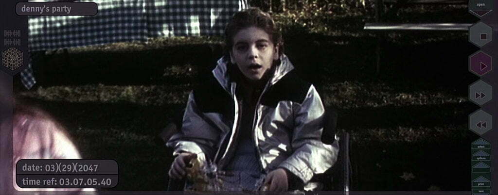
Early on in the film, a crew-member is watching a video message from home:

Let's focus on the date in the lower left corner. The future doesn't believe in ISO8601. So we get the American date format.
03)(29)(2047
Ew! What's with those brackets? I assume that's the 29th of March in the year 2047. The timestamp in the bottom is hours, minutes, seconds, and milliseconds.
A few frames later and we cut to a shot of the crewmate watching the video on a tablet computer (futuristic for 1997!) - but there's an issue. The movie we're watching is in an aspect ratio of 23:9 (CinemaScope). But the tablet is in 4:3. Just like the iPad! So the entire UI has been changed.

But what's the date in the lower left corner?
ZOOM! ENHANCE! ROTATE!

29)(03)(2047
OK, it looks a bit more like 29)(05)(2043 to me - but, either way, the date has flipped to the UK format of Day, Month, Year.
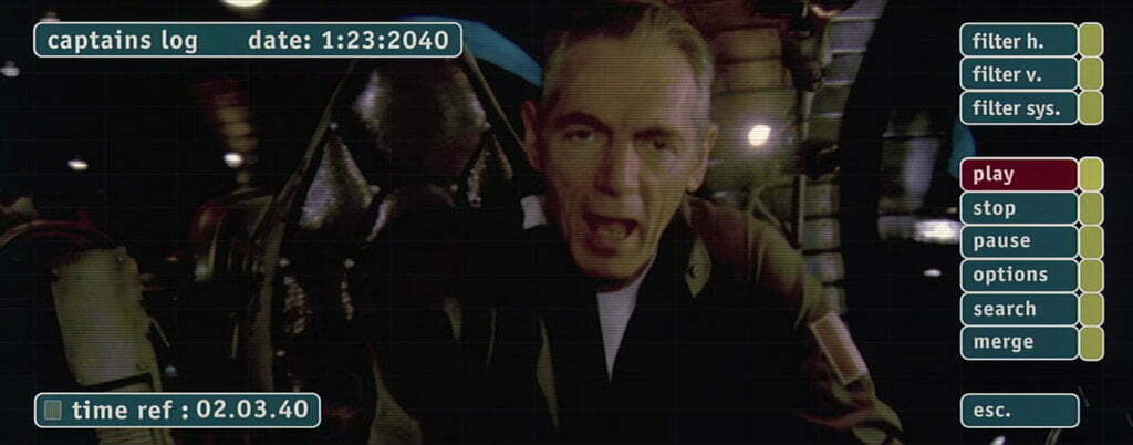
Later on in the movie, the crew watch the "captains [sic] log" with a completely changed UI.

The date format is back to American, but now has colons as separators. And the time no longer has milliseconds. Because why would you need an accurate timestamp for an official record?
Did you notice the media controls on the first playback screen? ⏹️ ▶️ ⏩️ ⏪️ But, in the second interface, they're words - "play, stop, pause". A completely different order, and different functions!
Later on, the crew try to blow up the ship. Because why not?
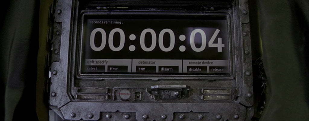
 The countdown is in minutes and seconds. Separated with a period. Helpfully saying "Minutes" below the minutes section.
The explosives - which are different to the self-destruct - have yet another time format.

HH:MM:SS although it just says "seconds" above the display.
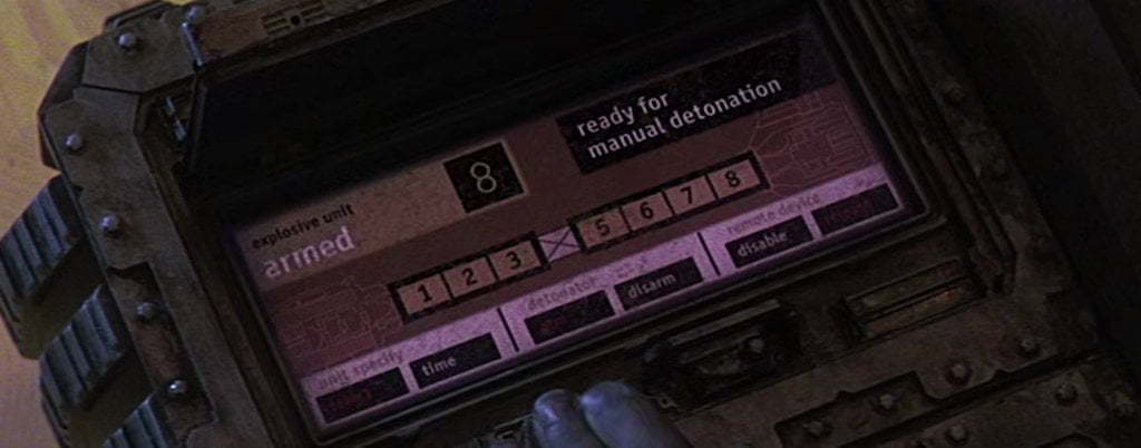
The bomb also has a "manual" mode:

Notice that the lower buttons' interface on this one is in white and red. Whereas the one above is all white. Why are some of the reds on the left, and one on the right? Surely on critical systems like this, users will value a consistent design language.
If those are touch-screen targets, they're very close together. That looks pretty easy to mistakenly touch a button. Not something you want on explosives!
Event Horizon is a gory horror film. But I think we can all agree that the real horror was in the user interface design.
| Verdict |
|---|
5 thoughts on “Event Horizon's crappy UI”