A small accessibility improvement to WordPress
a11y accessibility Open Source WordPress · 6 comments · 300 words
My mate, the accessibility specialist Léonie Watson, has this to say about how we improve the world, piece-by-piece:
Accessibility doesn't have to be perfect, it just has to be a little bit better than yesterday. Source: Twitter
Damn straight! One of the best ways we can make tomorrow slightly better than today is by making small changes which make it easier for people to do the right thing.
With that in mind, I've proposed a small change to the default behaviour in WordPress's media UI.
At the moment, when you add an image to your blog, you get a tiny little text input field - with only enough space for a few characters.
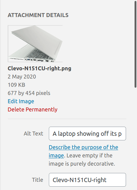
That doesn't encourage people to write meaningful text. So my suggestion is to turn that into a <textarea> element.
It looks like this:
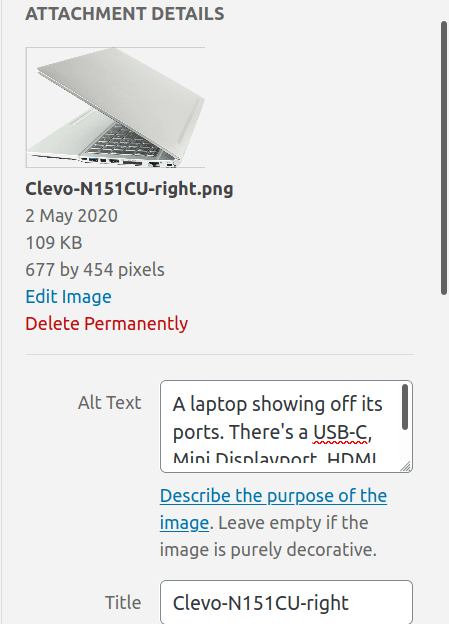
More space for writing, and people can drag the corner of the area if they need more. It also matches the other text areas in the interface.
Hopefully, that will go a small way to improving accessibility on the web.
(I raised the same issue in the new Gutenberg Editor a couple of years ago - and it was accepted and merged.)
You can read the patch and the bug report - please leave a comment on them if you think this is a useful change.
 Woohoo! WordPress accepted my accessibility PR
Isabel Holdsworth says:
Isabel Holdsworth says: