This is a blog post about user interfaces.
I was wandering along the beach one day, when I noticed some clever chap had drawn some arrows in the sand. Can you guess where they led?
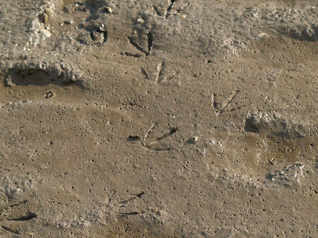
The more astute of you will have realised that these are not human drawn arrows. They are, of course, footprints left by birds.
A bird's foot is a "backwards" arrow. The apex points to the bird's rear.
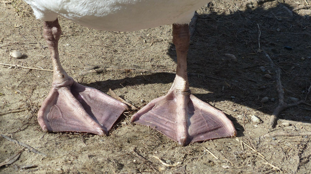
It is conceivable that had birds evolved greater intelligence and developed a writing system then their → would be the equivalent of our ←.
All this talk of birds leads, naturally, to Aliens!
In the 1970s, the USA launched a pair of space probes - Pioneer 10 and 11 - which contained "a message from mankind". An anodised metal plate designed by Carl Sagan.
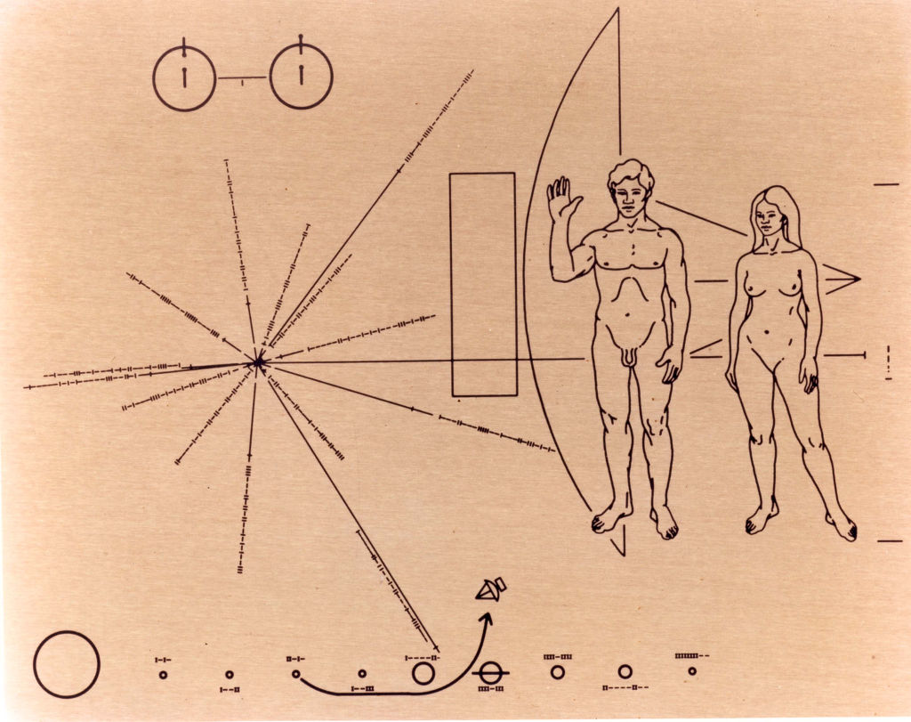
Much has been written about whether the message is appropriate. Not just because of the nudity(!) - but whether the abstract design could ever be successfully deciphered by an alien mind.
At the bottom of the plaque is a diagram which, to our human eyes, shows where the spacecraft has come from.
A contemporary complaint from an art historian ran:
The trajectory, it will be noticed, is endowed with a directional arrowhead; it seems to have escaped the designers that this is a conventional symbol unknown to a race that never had the equivalent of bows and arrows. " The image and the eye" - Ernst Hans Gombrich
Suppose that the plaque is picked up by a race of super-intelligent birds - how will they interpret that message?
To them, an arrow points towards its stem. In this case, the Pioneer craft is on a journey to Earth. Perhaps they will have noticed that our toes are not like theirs - if they even recognise the squiggles as belonging to creatures - but there is nothing fundamental about us which indicates the chirality of our arrows.
Behind the human figures is another arrow. From the Birds' perspective that is also pointing towards the map to our sun. Is the message on the probe "if lost, please return to..."?
Semantic Imagery
When you choose an icon - you're inadvertently assuming that everyone has a similar cultural background.
If you are an alien - or perhaps a teenager - many of these symbols are meaningless.
You may already be familiar with skeuomorphism Let's take a few interesting examples.
Post
📯
For people in two-dozen countries, the Postal Horn is the symbol of the national post office. It makes perfect sense to hide messages behind this icon, right?
Of course, if you are in Japan, you'd probable expect the symbol to be:
〶
Do those symbols mean anything to you?
Settings
🔧 ⚙️
When was the last time you used a spanner to adjust something? On your computer - never! In the physical world, spanners are used mostly for repairing or installing something. What does that have to do with setting your program's preferences?
And cogs? Computers don't have them! I struggle to think of anything I own which has a user replaceable cog which will adjust its function.
Save
💾 🖫 🖬 🖪
The save icon is, even on the most modern interfaces, an image of an antiquated medium. Do you have a floppy disk reader on your computer? Would your website even fit in 1.44MB?
What is the message that you're conveying with this icon?
Health
⚕️
What does a snake twisted around a rod have to do with health? What does this icon say to people without a a detailed knowledge of Greek mythology?
📧 📨 ✉️
Does email come in an envelope? How many envelopes do you get which are white squares with elongated lips? Is the metaphor still relevant?
Telephone
📞 ☎️️ Ask someone under the age of 25 to draw a picture of a telephone. Here's a hint, they're not going to draw either of those two icons!
A few years ago most people would have drawn something like:

Today, telephones are black rectangles.
Search
🔍 🔎
Unless you are a 19th Century detective, I find it hard to believe that you've ever examined the world with a magnifying glass. How has this become the default search icon?
Please Wait
⌛ ⏳
Tell me honestly - when was the last time you used an hourglass?
Perhaps you boil an egg with the precision only sand tumbling to its doom can provide, I certainly don't. It is interesting that most major Operating Systems have rejected this in favour of a more abstract animation.
Responsible Icon Choice
Under some circumstances, it may be sensible to localise an icon based on cultural differences. For example, these could all be substituted depending on the user's demographic:
🏣 🏤 📮 📩
Icons introduce ambiguity. Please remember your cultural biases when you pick a symbol - lest you confuse any of your users who are birds.
🐦🦆🦃🐤🐓🐥🦅🦉🐧🐔🐣🕊️
7 thoughts on “Where do these arrows point?”
"Do you have a floppy disk reader on your computer" Yes (an external, USB, drive).
"What does a snake twisted around a rod have to do with health" This: http://static.ilykecdn.com/uploads/2015/11/25/sub/71619-large-255386.jpg (not for the squeamish!)
Stefan
And apart from the cultural confusion icons can bring, they share with emojis the risk of a level of information density which seriously impairs legibility for readers with even relatively minor visual impairements, Text has a useful level of information redundancy - you can make sense of it when partly obscured, and a few pixels here or there rarely affect either meaning or legibility. Icons and emojis are often much less redundant, and for emojis in particular, distinguishing one meaning from another often hangs on a few pixels' difference - and if you can't resolve differences at that level, all meaning is lost.
the hatter
I can't agree with the historian, to think a culture hasn't realised how to make pointy things and attach them to something else to get them further, seems rather a stretch. An arrow is just a spear with a better throwing mechanism, and combining a tough, angled, probably crafted tip with some kind of long, thin, less worked/valuable item is something that seems fairly fundamental; adding the stick is a step up from a hand-held point and then the common axehead/handle. Even if a civilisation somehow skipped all this, by the time they're dealing with a modern world, they will have discovered the pointy end goes forward when they're driving, flying or diving.
Terence Eden
You're assuming a world which has a significant amount of air resistance. Would creatures living in low / no gravity make those design choices?
charlesarthur
I wonder what scholastic level a human would need to be to understand all the content of the plaque. Is the big exploding thing on the left something about atomic structure and cloud chambers?
Terence Eden
From what I remember, it shows the position of Earth relative to a series of Pulsars. The theory being that Pulsars (their period is engraved on the lines) are stable over millions of years. There's also some atomic structure stuff in there too!
kannaiah
If I'm a intelligent species and I don't know what arrow means then wouldn't the arrow symbol redundant? also I think the arrow would not be confusing to super intelligent as they should be able to guess the mistake of lesser intelligent species.