The Gender Politics of Conference T-Shirts
I spent my Saturday crewing the reception desk at the amazing UK GovCamp Unconference. Part of our task was to check people in, hand them their name badges, schwag, and offer them a free conference T-Shirt.
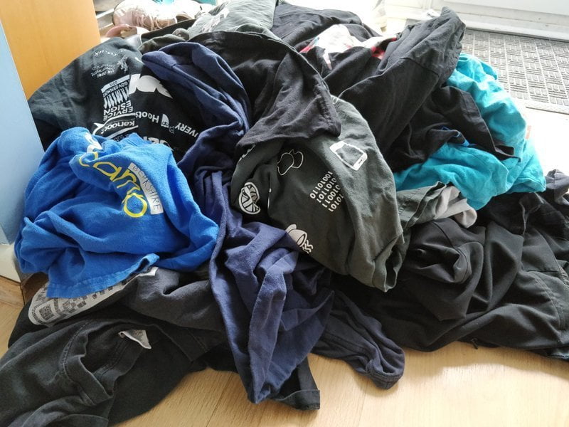
If you're anything like me, you've got hundreds of conference Ts stuffed in a drawer somewhere. They're all the same - a funky logo on the front, and usually a list of sponsors on the back. Not quite as glamorous as a rock-concert tour shirt but, hey, good enough from slobbing around the house.
As I was directing people to their shirts, a few of us got in to a (very good natured) discussion about the gender politics inherent in linguistic choices. For example, considering the following sentence.
On the left we have women's T-Shirts, and on the right we have men's T-Shirts.
What if a woman would rather wear a "male" shirt? Are we implicitly suggesting that such a course of action is wrong? If a trans-person wants to wear a specific shirt, are we reinforcing the notion that they are violating social norms?
It is simply a matter of politeness. I'm not necessarily talking about a Debrett's etiquette guide on whether a Marchioness outranks a Viscount - but what language is the most inclusive while retaining clarity.
A Little History
For the longest time, the British tech conferences I went to asked participants only for T-Shirt size on attendee application forms. It was gently pointed out that T-Shirts come in more than one style, and that a female medium size is equivalent to male small size. Thus, organisers started asking whether participants would prefer a male- or female-style shirt and, if so, in which size.
But, what are male and female styles? Generally speaking, they look like this:
 The male one is basically a rectangle of cloth, the female one tapers in at the waist and has more space at the breast.
Back To Language
Here are some of the choices we talked about, and some of the decisions we came to.
- Regular / Fitted. This implicitly says that people who want fitted are somehow irregular.
- Fitted / Non-Fitted. Again, implicitly saying one is different from the norm.
- Unisex / Women's. Suggests that, while women can wear either, men may not.
- Tits / No Tits. (Suggested by a woman I hasten to add!) Not all women have breasts. Some people have breasts but choose not to emphasise them with figure hugging clothes.
- Straight Cut / Curve Cut. The most factual description, but caused some confusion when we asked as this is not usual terminology.
In the end, we tentatively settled on "Fitted or Straight Cut" only to be hit with a problem.
Men are idiots.
The majority of men who were given the choice between "Fitted or ..." responded with either "Errr.... I'll take one that fits...?" or simply "What does fitted mean?"
Yup, guys generally have no clue that a traditional women's cut T-shirt is different from what a man usually wears. So, we had inadvertently chosen a language which was exclusionary to those who don't pay much attention to fashion.
If you have to ask what the difference between two choices is, you're marked as an outsider who lacks knowledge.
A Solution
From my many years of helping out with events, I know there are some things one just shouldn't do. Chief among these is cause guests embarrassment. Many people actively dislike being asked what size shirt they wear. They're also embarrassed if, after saying they want a Medium, they have to return it for a larger size.
What we usually do is leave the T-Shirts on a separate table, sorted by size, so that participants can pick the one which best suits them.
We abdicate responsibility, in order to provide a more pleasant experience. That, I think is what we should do in this case.
If we had one of each style and size of T-Shirt on a hanger, we could have placed them over their respective pile and simply let participants pick the size and shape they are most comfortable with.
Language choice matters. The words we choose to use have an impact. It might not be the most pressing issue in the world, but we should strive to avoid needless discomfort to those around us.
 No More Conference T-Shirts, Please!
 Notes from GovCamp 2020
Andrew says:
Ryan says:
Katie says: