Nokia Ovi - 25 Mistakes
I know a thing or two about mobile websites. The last 4 years of my life have been spent obsessing over them. I wouldn't claim that the sites I run are the best in the world - but I've picked up a thing or two about how a successful mobile retail channel should work. Nokia's Ovi gets everything wrong. I'm going to show you 25 easily avoidable mistakes in the new Ovi Store.
Here's how to make a successful downloads platform:
- Make it easy for your customers to buy things.
- ...er....
- Nope. That's pretty much it.
So, here's the front page of the Ovi Store.

Count the errors
Here's every error I can find on the above the fold page...
- Incomplete titles. "Star Trek Noki"? Surely "Nokia"? Looks sloppy and unprofessional.
- Poor descriptions. "Ringtones In Cinemas Now!"? Ringtones aren't in cinemas. Is that one ringtone or several I'll be downloading? If you don't tell me what it is I'm getting, why would I download it?
- Ratings. Why would you put unrated (or rated zero) content at the front of the store? You want your killer apps there.
- Search. Why do I need to click through to search? There should be a text field and button there, not a link.
- Colour differentiation. Using white and then light grey doesn't help customers easily scan across the page. A darker shade would help.
- Menu bar. Is there an order to it? Is there a reason it splits haphazardly over three lines? The longer the menu - the less space for content. As it is, it's a pretty poor use of space.
- No Nokia branding. I know they're trying to promote Ovi as a brand - but no one knows about it yet. The use of the Nokia logo would really help customers trust the store.
...and breathe...
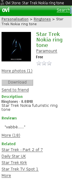
Let's assume we're reckless enough to click on "Star Trek Noki". What do we find?

Oh dear...
Let's take this from the top. Don't forget, this is the Nokia Ovi Store's FIRST link. This is what they really want you to buy.
- Where's the description? What exactly am I buying? It turns out, this is the product placement tune in the new Star Trek film. Some descriptive text would help. I thought it was going to be the film's theme tune!
- The description - such as it is - appears half way down the page. Why do I have to scroll to see what I'm getting?
- Photos? Why do I need photos of a ringtone? Why are there "more" photos when there's only the one?
- The product photo is, essentially, black. A bit of colour to liven up the page wouldn't hurt.
- The review - why isn't it in English?
- Are the related links Games, Videos, Ringtones? Some context would help.
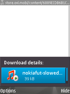
I clicked on download and got a blank page. Once I refreshed the page, the download started.

Huh?
Files should be named. It makes it easier for the user to find in their filesystem, it looks more professional when downloading.
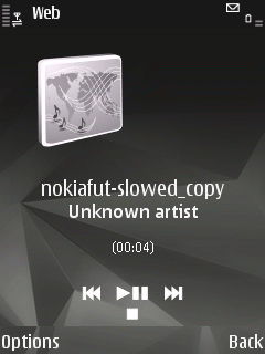
So, I play the file and what do I get

Real professional lookin'
Add some fracking ID3 tags! It makes it easier for the user, it looks more professional and it costs the supplier nothing!
Gah! Fine. Ok. I'll go back to the store and grab something else. I click back and am presented with this monstrosity.

Where do we go from here?
Nothing. Not even a page telling me how to get back. How is this meant to encourage me to buy more? This page should thank me for downloading. It should encourage me to buy more. In this case, I'd expect to see more Star Trek merchandise that Nokia want to sell to me.
Contrast this with the N-Gage download from the N-Gage site.

Much better
Once my download is completed, I get sent back to a nice page which lets me continue enjoying the store. Nokia have this technology for Ovi - but not in the Ovi Store. Bizarre.
Last, but not least - registration. I know that Nokia has to have a registration process - they don't have an MNO's advantage of seeing a customer's phone number. They also don't have an associated account which they can reuse - like Google or Apple.
Oh... No... Wait... They do. I've registered for a Nokia account, an Ovi account and a Mosh account. I don't seem to be able to use any of them with Ovi Store. NIH syndrome?
To be fair, the sign up process isn't too bad. Apple could learn a lot from it.

A pretty good sign up screen
The only criticisms I have are the "Mobile Number" field should be masked so the user can only enter numbers. I also think that a captcha is a bit of an overkill on a mobile site.
Good to see that the example number is from Ofcom's reserved range.
Overall, this is a step backwards for Nokia. Mosh and the original Ovi were quite good. This is just a mess. By my count, there are at least 25 basic mistakes just from going to the front page and downloading a ringtone.
25 mistakes in 3 clicks.
[Disclaimer. In the interests of fairness, I work for Vodafone. Specifically looking after Vodafone live! a direct competitor to Ovi. The thoughts expressed in this post are my own and not those of my employer. I have nothing against Nokia; I kick up as much of a fuss about Apple and BlackBerry too!]
McPete says:
From reading these 'mistakes', there seems to be some which can be easily put aside as 'not Nokias fault'...
Yes they have a responsibility, especially in the early days of a content download site such as this, to make sure that a certain level of babysitting is undertaken for the early content providers. However that being said, it is still content being listed by a 3rd party.
As for the user review being in another language, it is an international site - would be difficult to forbid the french from reviewing downloads without it sounding a bit anti-french 🙂
I agree it is messy, but 25 faults is a bit harsh when a good 8-9 of them are most likely down to the 3rd party.
BTW I am also quite pleased that they don't have downloadable content with 5-star ratings yet - this shows that the content is being rated by the users themselves, and is not being unfairly rigged by Nokia / Ovi / the 3rd party in question.
I would also not hesitate to make comment on a pot calling kettle situation here - Vodafone Live! is for all intents and purposes unusable. Example: high end Nokias like the N95 8GB come with 'Mobile Internet' as their default connection method. Unfortunately you cannot access Vodafone Live! through this method, which means that by default all customers with mobile internet as their default connection method cannot use their operator portal...nice.
I think I'm of the mindset that their front page content should be editorialised - for now. They should also be setting standards for the third-party content.
As for international reviews - yes, it's an international site, but they're already detecting my language to provide the UI in English, why not the reviews? I don't think the French should be banned from submitting reviews - but I doubt many people in UK, Germany, Netherlands etc. will be able to read and understand it.
You're right to bring up Vodafone live (usual disclaimers - including that I don't work for Vodafone UK). Although I was under the impression that branded phones came with the right soft key set to Contract WAP. Everyone in this space needs to make access easier for customers.
Thanks for the comments - they're appreciated.
Reasons your list fails. - You only tried it on one phone, on my phone the store looks way better. I know that it should work perfectly on all nokia phones, but there are alot of supported phones and the service has only just come out. - Their recommended page would be dynamiclly updated from what other users are downloading and as I stated in my first point they have only just launched the service so the list does not have much data to be generated from, I expect this list will get better over time. - You talk about the descriptions not being good enough? Nokia did not write that description, the person that uploaded the file for you to download did. And I don't see how much more descriptive you can get than 'Star Trek Nokia futuristic ring tone' - I think this might be a Star Trek ringtone? - id3 tags as with the description are not up to Nokia to manually add. Paramount should have done it. But when it comes down to it. It was free. - And my finall point, next time you write a list, either use numbers in a consecutive order so I know where I am up to, or write it in paragraph form with heading tags or at least bold headings so I can skim to the parts I want to read.
Sorry my comment was so negative but if you are going to write a post on a new service. Dont try to point out as many bad things as you can see, point out the real issues and filter out the parts that have nothing to do with the actuall service. Maybe even test it on another phone or search around for some screenshots to see if everyone has the same problem you do.
Very true about testing on other phones - although I was testing on the Nokia N95 8GB. Arguably one of their flagship devices.
I would have expected the front page to be editorially managed (especially while there's so little content on there). Similarly for their content - if they have a relationship with Paramount (as opposed to a small developer) they should be setting boundaries for their high profile content. If Apple can reject apps which have poor UI, Nokia can reject ringtones without ID3 tags.
I take your point about the numbering - I'm still getting the hang of the Wordpress system.
Thanks for your comment.
HD Boy says:
"...Sorry my comment was so negative but if you are going to write a post on a new service. Dont try to point out as many bad things as you can see, point out the real issues and filter out the parts that have nothing to do with the actuall service..."
Hey, the overall user experience IS part of the actual service! This very real issue is what all these wanna' be software companies with copycat iPhone App Stores don't get. It also is why duplicating Apple's success will be difficult to attain. Besides, Nokia, RIM and the others all have too many different phone models with too many different screen sizes to deliver an elegant user experience. Developers will suffer. Customers will suffer. And Nokia will have to get used to these negative reviews.
John Evans says:
I belive people in the Netherlands can actually speak many languages, same for other countries that use the store. Actually there is an option for reviews in 'ones languages' right next to the reviews but by default is multi-lingual which given it's truly global nature is exactly right.
I am also suprised the content is not editorialy controled for launch though.
I have to point out my ovi/Nokia credentials got me into the store just fine. I was also impressed by the signup page.
I have a feeling that blank page you saw was perhaps a load issue. I might be wrong though. It would be rather stupid of them to mess that up.
Overall I feel the store isn't so bad. However I have yet to really try it out.
Disclaimer: I work for Nokia.
Neil says:
I don't understand the comments "this isn't fair because...". Nokia has created this portal and wants the poor user to part with their cash using it. If third party content makes it look crummy then don't show it!
Making an app store which looks good and works well is a matter of quality control. Just be bold enough to not release it until it's ready. It sounds like nokia dropped the ball and released to their poor users too early.
Sure real artists ship, but real artists don't ship crap.