Mobile Badvertising
I've seen two very different adverts recently which, in my opinion are bad. Very bad. I'd even go so far as to say that they are terrible.
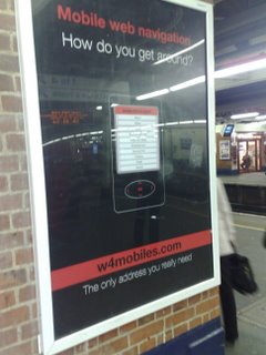
The first is a poster advert seen at my local train station.
 A tagline, a shot of the service and a URL.
Let's break it down. 1) The URL. I initially typed in w4mobile rather than w4mobiles - and got a non-mobile friendly page. It would have been better if they'd bought a few similar sounding domains or set up a mobile friendly .mobi address.
2) The URL. I have to type it in myself! What, is this 2005? Where's the QR Code? Where's the mobile shortcode? If you're going to have an easy to mistype URL - make it easy to get onto the phone.
3) It's just so dull! Why not have a bigger and more colourful shot of the service? A more descriptive idea of what the service is for?
4) Black text on a red background!
The service itself is nothing special. It's a list of links to various mobile friendly sites. I was expecting something a bit more dynamic. Some social bookmarking for mobile users. It's very 1998.
Next up, a mobile advert seen on Vodafone live! (I work for Vodafone, these are my opinions, not theirs).
Click-to-Call. Great stuff. Too many mobile websites insist you remember their number, exit the browser and manually dial. With this, click and you're dialling.
The bad....
Again, a fairly dull advert. 1 Image, and a few lines of text. This isn't a newspaper - you're not paying per word or per image - why not brighten it up?
What the click-to-call giveth the "this is a chargeable call" taketh away! Why use a premium rate number that isn't included in anyone's bundle when you could use a geographic number that would be free for all your customers to call?
Finally, take a look at that advert again. What do Avis do? What exactly can I rent for £10 a day?
Mobile Advertising is big business. You wouldn't know it to look at these two adverts.
