Solar Battery Statistics - Day One
We recently upgraded our home solar storage to 4.8kWh. The battery has sensors to detect how much solar power we're generating, and how much electricity we're buying from (or selling to) the grid.
That means... GRAPHS AND STATISTICS!
Our battery was commissioned just after midday. This graph shows:
- 1630 - it was fully charged.
- 2000 - the sun had set and the battery started discharging into our home.
- 0700 the next day - the sun rose and started generating electricity, so the battery stopped discharging.
- 0900 - solar was generating more power than the house needed, so the battery started charging.
- 1400 - the battery was fully charged.
- 1830 - we started cooking dinner in the oven and the battery started discharging.

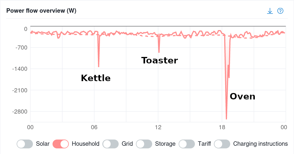
Let's see how that maps on to our energy usage. This is what a typical WFH day looks like:

To be clear, this is how much electricity I used during the 24 hour period. This graph doesn't care if the electricity came from solar, the battery, or the grid.
Our total energy mix for the day was:

The majority of our electricity use today came from yesterday's solar!
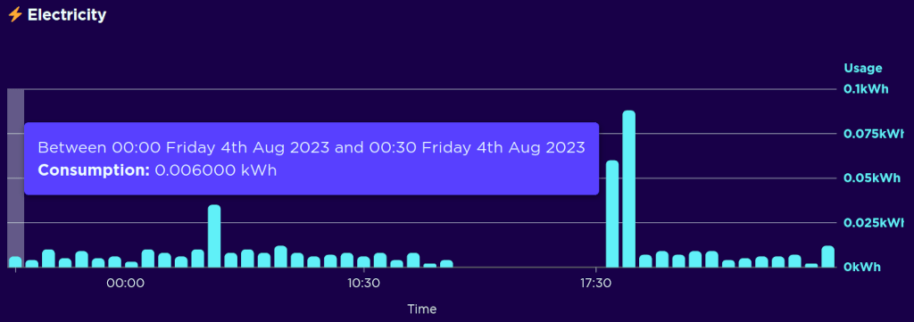
And what does that do for our electricity bills? We use Octopus Energy (join and we both get £50) who take smart-meter readings every 30 minutes. Here's the graph they provide for the electricity we bought:

It is hard to perfectly calibrate a battery to monitor the precise energy flow - but that's pretty bloody close! Ideally that would be reading 0 Watts overnight as the battery supplies the house. But I can live with that tiny trickle!
In total, we drew 433 Watts from the grid over 24 hours. That cost us £0.09! The battery saved us about £0.75 that day.
We're lucky to be on a fixed-rate tariff where the energy prices are low. If we were on a modern tariff, the UK's price cap is 30p/kWh. So we'd have paid £0.13 for the grid electricity, and saved £1.01 using the battery.
Big Graph Showing Everything
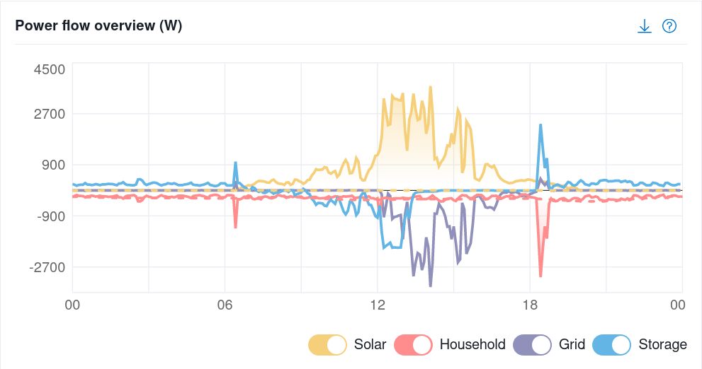
This is the view of our electricity use as seen by the battery's sensors:

The red shows what we actually used - and you can see the battery in blue discharging to match demand. The purple line shows what the grid was doing - we exported about 5.8kWh of electricity.
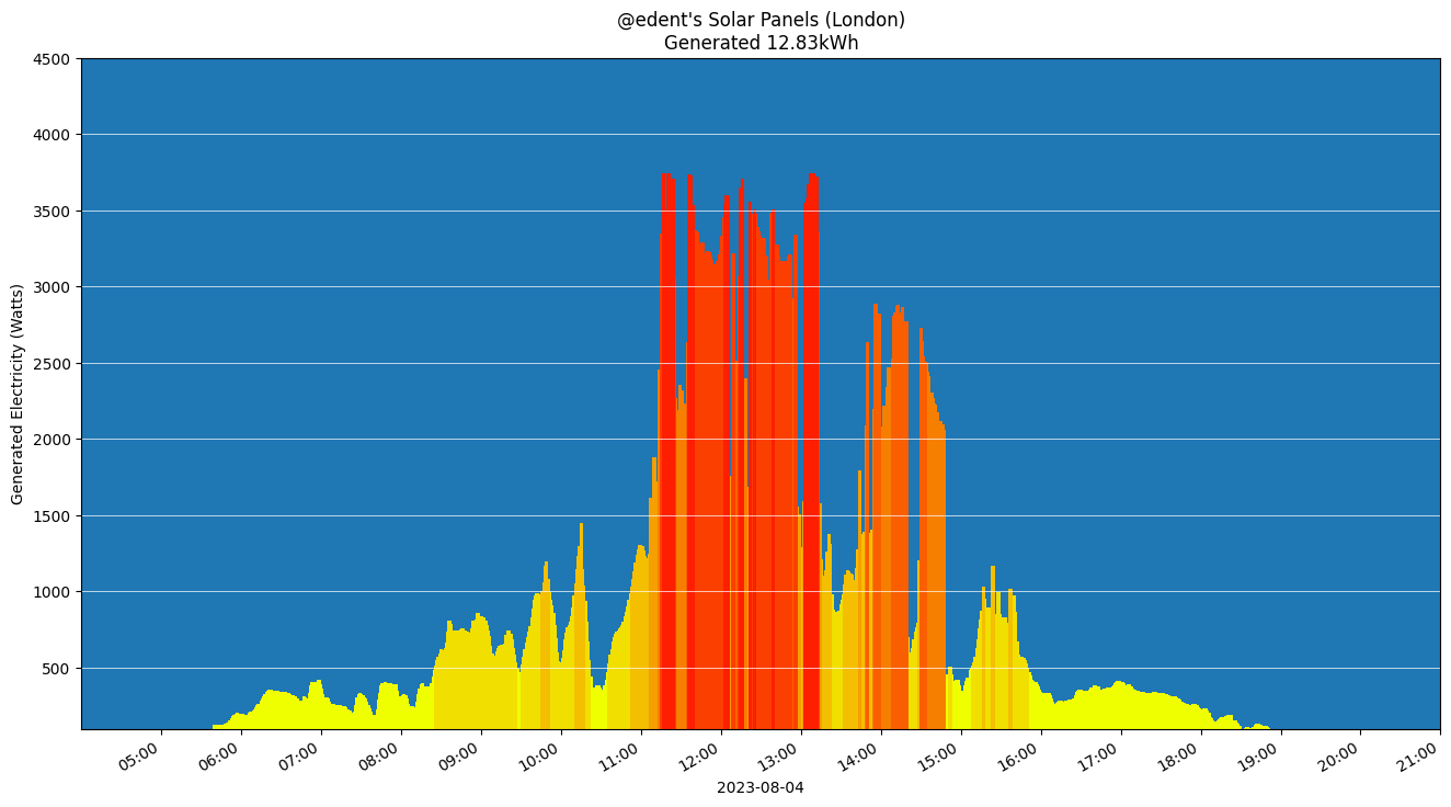
Finally, the yellow shows the solar being generated. As described above, the battery has a sensor to detect the current flowing through the wires. How does that match with what our inverter is reading?

They're almost an exact match!
Conclusion
Solar batteries have a large up-front cost. But they work. On a fairly wet and dreary summer day, they performed perfectly. As we move into winter, we'll switch to a dynamic electricity tariff. That will allow us to charge the battery when power is cheap and then use it when prices are high. So expect another blog post in 4 months' time describing if that has worked as expected!
 One month with a solar battery - real statistics
More comments on Mastodon.