Running a Shortest Splitline Algorithm on the UK - and other mapping adventures
How do you fairly split a country into electoral subdivisions? This is a difficult problem. Whatever you choose, you'll piss off someone. A politician will be annoyed that their loyal voters are no longer in their district. And voters will be annoyed that they're now lumped in with people from the wrong side of the tracks. This is a very human problem. So let's ignore all the human aspects and run an impartial0 and unbiased1 algorithm on the issue!
The Splitline Algorithm is, conceptually, very simple:
- Divide the entire map in half based on population.
- Repeat (1) for each half.
- Once you have reached the target number of voters in each segment, stop.
There's an excellent paper about how to apply this to the USA's districts.
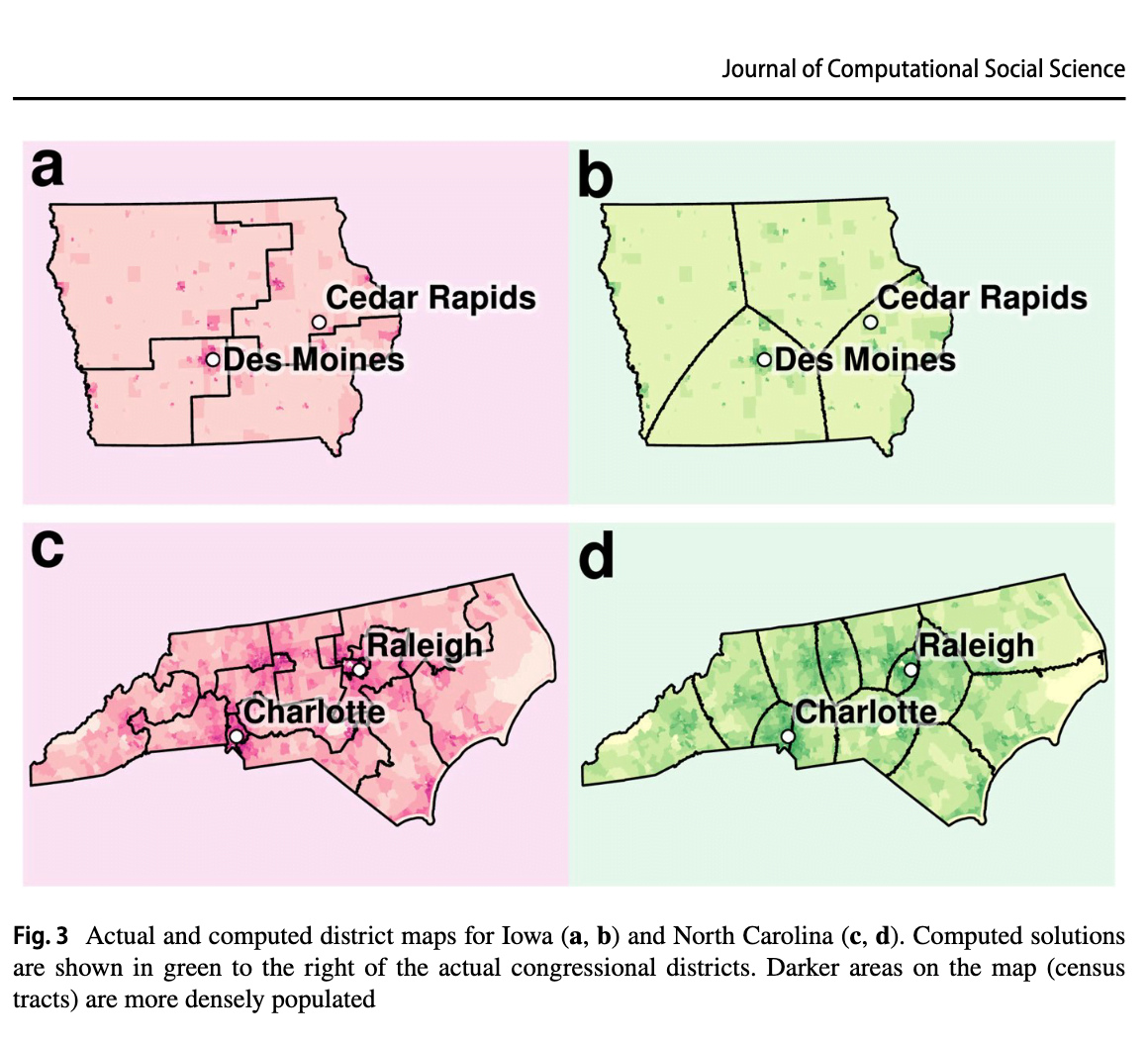
But, I couldn't find anything which applied the algorithm to the UK. So I thought I'd give it a go for fun2.
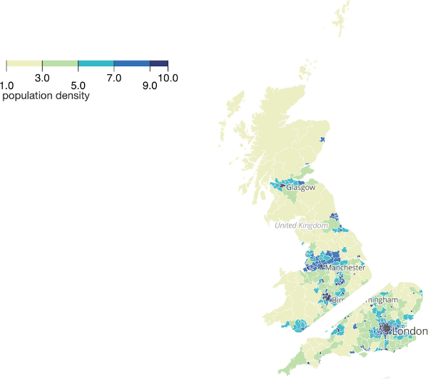
First, start with the Office for National Statistics' Population Density Map

Before we even begin, there are a few obvious issues. Firstly, the map isn't contiguous. So what happens to the Shetland Isles (population 22,000) and the Isle of Wight (population 140,000)? There are, on average, 100,000 people to every MP3. Do Shetland Islanders want to be lumped together with 78k other people from the mainland who might not necessarily share their values? Do the people from the Isle of Wight want to be split in half with one half being tied to non-islanders?
The second (related) issue is NI. I'm not going to get into the long history there4. But I think it is fair to say that an algorithmic segmentation might cause a few raised eyebrows. So I'm going to concentrate on England, Scotland, and Wales for this section.
Here's a really naïve (and inaccurate) split based on eyeballing it.
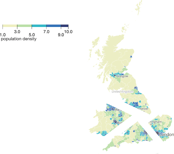
Applying the algorithm again, and we can split the area into four equal population parts:
Repeat a few hundred times and you have equal population constituencies.
You could slice the country into long horizontal strips. That would be equal - but not necessarily practical.
OK, that's enough mucking around, time to try applying it for real.
Getting the data
The first question is what resolution of population do you want? Using country-level population density isn't fine-grained enough. Using existing constituency data is just going to replicate the existing boundaries. Like this:

So... street level?
ONS have local authority level data - which isn't quite granular enough for my purposes.
Instead, I downloaded a 1.2GB CSV from Data for Good at Meta (previously Facebook). The data looks like this:
 TXT"Lat","Lon","Population"

"50.62069444448494","-2.023750000001619","0.785894169690091"

"54.91486111115504","-1.378472222223325","3.3208914089403367"

"52.725416666708846","0.11152777777786699","1.116925979478443"

"52.72736111115329","0.12402777777787699","1.116925979478443"

"52.779583333375555","0.100694444444525","1.3609065999360417"
They have a GeoTIFF which renders the whole of the UK like this:

Zooming in to Edinburgh, shows the city is well-populated but not the countryside around it.

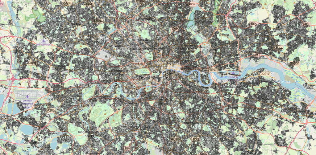
London, however, is dense. With occasional pockets of emptiness.
(Notes to self, to make a GeoTIFF into a browseable web map, run:
gdal_translate -of VRT -ot Byte -scale population_gbr_2019-07-01.tif temp.vrt
Then:
gdal2tiles.py temp.vrt
Finally, change to the newly generate directory and run python3 -m http.server 9000 and - hey presto - web maps!)
Python and Pandas Oh My!
Python 3
import pandas as pd
df = pd.read_csv("population_gbr_2019-07-01.csv")
total_population = df['Population'].sum()
Gets us a total population of 66,336,531. Which looks right to me! Let's say we want 100,000 people (not voters) per constituency. That'd give us 663 areas - which is about what the UK has in the House of Commons5.
OK, which way do we want to split these data? A proposal by Brian Langstraat suggests splitting only in the horizontal and vertical directions.
First, let's sort the data South to North.
Python 3
df = df.sort_values(by = 'Lat', ignore_index = True)
Which gives us
 TXT                Lat       Lon  Population

0         49.864861 -6.399306    0.573312

1         49.868194 -6.393472    0.573312

2         49.874306 -6.369583    0.573312

3         49.884306 -6.342083    0.573312

4         49.886528 -6.341806    0.573312

...             ...       ...         ...

19232801  60.855417 -0.886250    0.109079

19232802  60.855417 -0.885694    0.109079

19232803  60.855417 -0.885417    0.109079

19232804  60.855694 -0.884861    0.109079

19232805  60.855972 -0.884028    0.109079
Now we need to add up the Population until we reach total_population / 2 - that will tell us where to make the first cut.
Python 3
half_population = total_population / 2
index = 0
cumulative_total = 0
for x in df["Population"] :
if (cumulative_total >= half_population):
print(str(index))
break
else :
cumulative_total += x
index += 1
That tells us that the row which is halfway through the population is 8,399,921.
Python 3
df.iloc[8399921]
Gives us a Latitude of 52.415417 - which is Huntington. So a properly bisected map of the UK's population looks like:
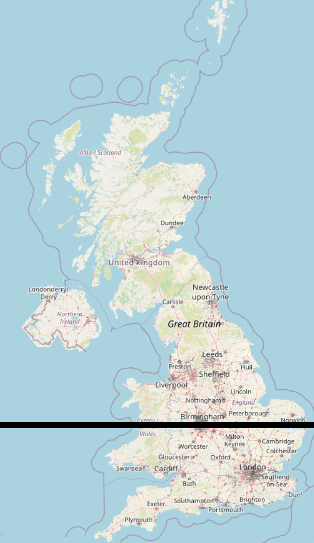
50% of the population live above the black line, 50% live below it.
Let's take the top half and split it vertically.
Python 3
df = df[8399921:]
df = df.sort_values(by = 'Lon', ignore_index = True)
total_population = df['Population'].sum()
half_population = total_population / 2
index = 0
cumulative_total = 0
for x in df["Population"] :
if (cumulative_total >= half_population):
df.iloc[index]
break
else :
cumulative_total += x
index += 1
Which gives us 52.675972,-2.082917 - an industrial estate in Wolverhampton.
In this map, 25% of the total population live to the East of the black line, and 25% to the West:
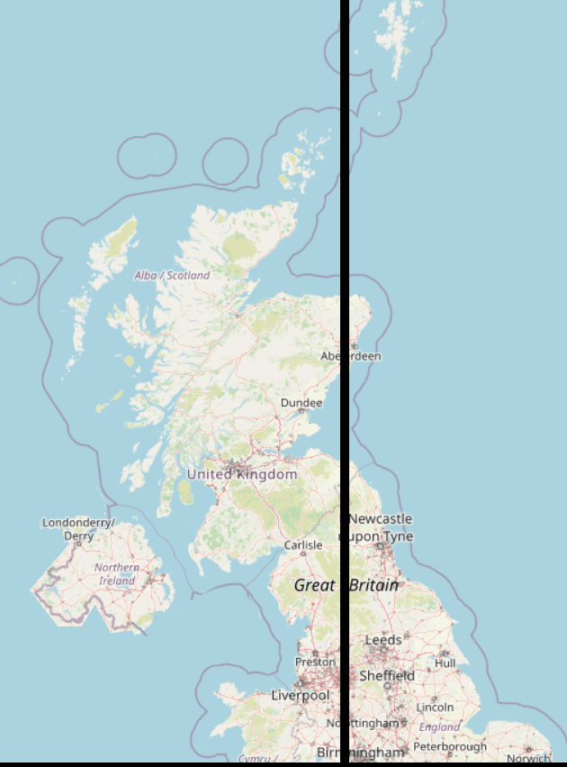
And this is where we start to see one of the problems with the naïve splitting algorithm. A chunk of Aberdeen has been sliced off from its neighbours. We can see that there will be a likely constituency of Shetlands, a bit of Aberdeen, and a slice of North-East England. These may not share common needs!
Straight-line slicing bisects otherwise "natural" groupings of people. Sure, gerrymandering is bad - but this sort of divvying up makes for the strangest bedfellows.
Shortest Splitline
The Shortest Splitline Algorithm doesn't is similar to the above but, rather than restricting itself to vertical and horizontal lines, looks for the line with the shortest distance which contains 50% of the population.
A Different Approach - South Up Algorithm
Let's just start at the bottom left of the map and work our way up.
Here's the South West (Scilly Isles not shown6.):
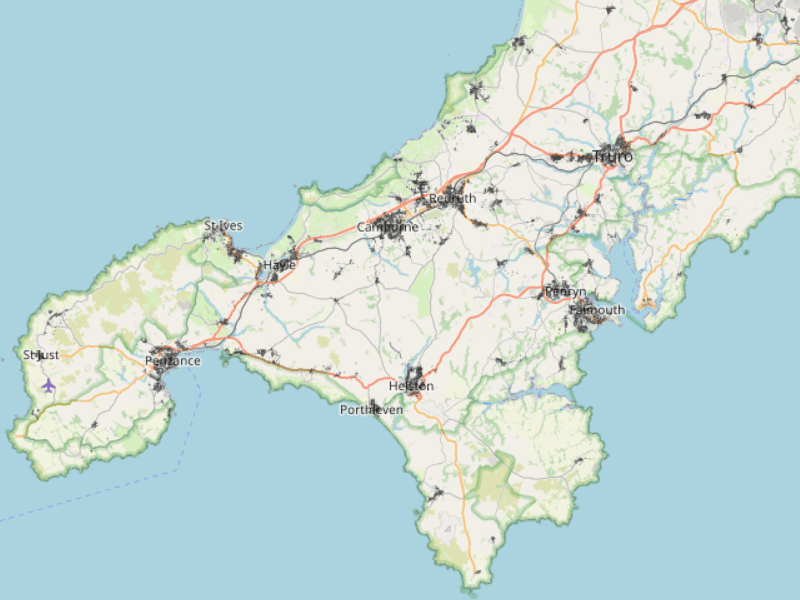
Let's plot everything, just to make sure the data are all there:
Python 3
import matplotlib.pyplot as plt
df.plot(x="Lon", y="Lat", kind="scatter", c="black")
plt.show()
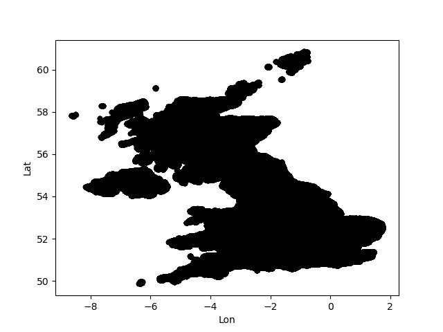
OK! Let's grab the first 100,000 people.
Python 3
df = df.sort_values(by = ['Lat', 'Lon'], ignore_index=True)
target = 100000
index = 0
cumulative_total = 0
for x in df["Population"] :
if (cumulative_total >= target):
df.iloc[index]
break
else :
cumulative_total += x
index += 1
area = df[:index]
area.plot(x="Lon", y="Lat", kind="scatter", c="black")
plt.show()
Which results in:

Hurrah! Scillies and South West England! Exactly 100,000 people live in that area.
Let's do the next few in different colours
Python 3
df = df.sort_values(by = ['Lat', 'Lon'], ignore_index=True)
df['Colour'] = pd.Series(dtype="U") # Add a Unicode string column for colour
target = 100000
index = 0
cumulative_total = 0
# There is probably a much more efficient way to do this loop
for x in df["Population"] :
if (cumulative_total <= target):
df.Colour.iloc[index] = "mistyrose"
elif (cumulative_total > target and cumulative_total <= target * 2):
df.Colour.iloc[index] = "peru"
elif (cumulative_total > target * 2 and cumulative_total <= target * 3):
df.Colour.iloc[index] = "mediumpurple"
elif (cumulative_total > target * 3 and cumulative_total <= target * 4):
df.Colour.iloc[index] = "olivedrab"
elif (cumulative_total > target * 4):
break
cumulative_total += x
index += 1
area = df[:index]
area.plot(x="Lon", y="Lat", kind="scatter", c="Colour")
plt.show()
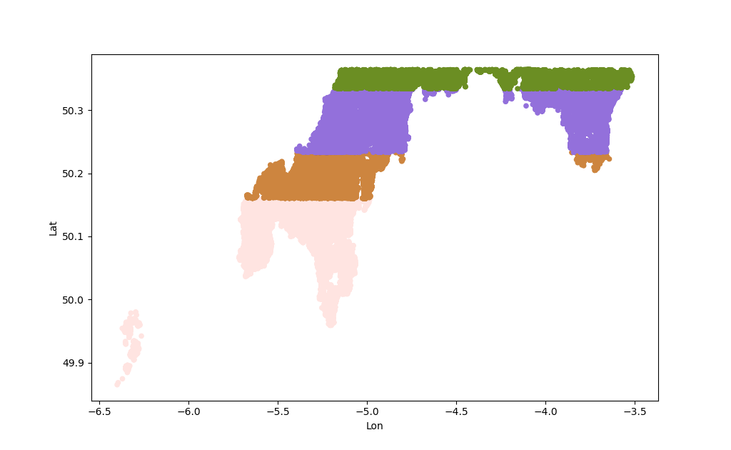 That's (mostly) going South to North, so we get those unnatural looking stripes which have weird incongruent chunks.
Bubble Split Algorithm
Rather than drawing lines, let's use a "Bubble Split" approach. Starting in, for example, the most South Westerly point in the dataset and then growing to its neighbours until it hits a population of 100,000.
This will use's SciPy's KDTree Algorithm
Python 3
from scipy import spatial
import pandas as pd
import matplotlib.pyplot as plt
import numpy as np
df = pd.read_csv("population_gbr_2019-07-01.csv")
df = df.sort_values(by = ['Lat', 'Lon'], ignore_index=True)
points = df[["Lat", "Lon"]].to_numpy()
kdtree = spatial.KDTree(points)
# To find the nearest neighbour of a specific point:
kdtree.query( [59.1,-6.2] )[1]
counter = 1
population = 0
target = 100
while (population <= target):
nearest_index = kdtree.query( [59.1,-6.2], [counter] )[1]
population += df.loc[nearest_index, "Population"].values[0]
counter += 1
population
Looping through is very slow and crawls to a halt after a few thousand iterations. So let's cheat. This grabs the nearest million points and finds their total population.
Python 3
nearest_million = kdtree.query( [59.1,-6.2], 1000000 )[1]
df["Population"].iloc[ nearest_million ].sum()
There's no way to iterate through the results, so its easiest to grab a bunch and iterate through that instead.
Python 3
counter = 0
population = 0
target = 100000
while (population <= target):
end = (counter + 1) * 10000
start = counter * 10000
population += df["Population"].iloc[ nearest_million[start:end] ].sum()
print("On " + str(end) + " Pop: " + str(population))
counter += 1
These can now be plotted using:
Python 3
indices = kdtree.query( [59.1,-6.2], end )[1]
to_plot = df.iloc[ indices ]
KDTrees are not designed to be altered - so deleting nodes from them is impossible. Instead, the nodes have to be deleted from the data, and then a new KDTree constructed.
Python 3
index_to_delete = kdtree.query( [59.1,-6.2], end )[1]
df = df.drop(index = index_to_delete)
points = df[["Lat", "Lon"]].to_numpy()
kdtree = spatial.KDTree(points)
Bounding Boxes
Drawing a box around some points is useful. It provides a geographic border and also means we don't need to worry about map colouring algorithms.
For this, we'll use SciPy's ConvexHull algorithm:
Python 3
import matplotlib.pyplot as plt
from scipy.spatial import ConvexHull, convex_hull_plot_2d
import numpy as np
indices = kdtree.query( [x,y], end )[1]
area = df.iloc[ indices ]
s_array = area[["Lat", "Lon"]].to_numpy()
hull = ConvexHull(s_array)
plt.plot(s_array[:,0], s_array[:,1], 'o') # Remove this to only display the hull
for simplex in hull.simplices:
plt.plot(s_array[simplex, 0], s_array[simplex, 1], 'k-')
plt.show()
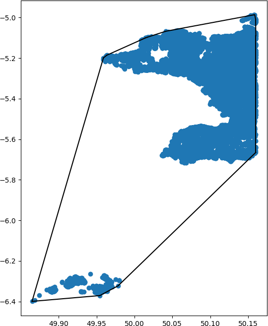
Here's the result - can you spot what I did wrong?
Putting it all together
This scrap of code reads the data, sorts it, constructs a KDTree, starts at the South West tip, finds the 100,000 people nearest to that point, and draws a bounding box around them:
Python 3
# Import the libraries
import pandas as pd
import matplotlib.pyplot as plt
from scipy import spatial
from scipy.spatial import ConvexHull, convex_hull_plot_2d
import numpy as np
# Read the data
df = pd.read_csv("population_gbr_2019-07-01.csv")
# Sort the data
df = df.sort_values(by = ['Lat', 'Lon'], ignore_index=True)
# Create KDTree
points = df[["Lat", "Lon"]].to_numpy()
kdtree = spatial.KDTree(points)
# Most South Westerly Point
sw_lat, sw_lon = points[0]
# Get first 100,000 people
counter = 0
population = 0
increment = 5000
target = 100000
while (population <= target):
end = (counter + 1) * increment
start = counter * increment
population += df["Population"].iloc[ nearest_million[start:end] ].sum()
print("On " + str(end) + " Pop: " + str(population))
counter += 1
# Get the index numbers of the points with 100,000 people
indices = kdtree.query( [sw_lat, sw_lon], end )[1]
# A separate DataFrame for drawing
to_plot = df.iloc[ indices ]
# Flip Lat & Lon, because Lon is the X Co-ord, Lat is Y Co-ord
plot_array = to_plot[["Lon", "Lat"]].to_numpy()
# Calculate the bounding box
hull = ConvexHull(plot_array)
# Plot the points
plt.plot(plot_array[:,0], plot_array[:,1], 'o') # Remove this to only display the hull
# Draw the hull
for simplex in hull.simplices:
plt.plot(plot_array[simplex, 0], plot_array[simplex, 1], 'k-')
# Display the plot
plt.show()
Which produces:

Running that a few more times gives this (sorry for chopping off the Scilly Isles):
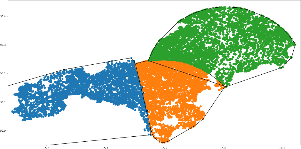
Can you see why I call this "Bubble Split"?
Already we can see the limits to this approach. The orange-coloured subdivision has a little incongruent bit across the estuary of the River Fal.
Here's the (hugely inefficient and slow) code to generate 40 areas of roughly 100,000 people:
Python 3
# Import the libraries
import pandas as pd
import matplotlib.pyplot as plt
from scipy import spatial
from scipy.spatial import ConvexHull, convex_hull_plot_2d
import numpy as np
def get_100k_people(df, nearest_million) :
counter = 0
population = 0
increment = 1000
target = 100000
while (population <= target):
end = (counter + 1) * increment
start = counter * increment
population += df["Population"].iloc[ nearest_million[start:end] ].sum()
#print("On " + str(end) + " Pop: " + str(population))
counter += 1
return end
def plot_hull(df, indices) :
# A separate DataFrame for drawing
to_plot = df.iloc[ indices ]
# Flip Lat & Lon, because Lon is the X Co-ord, Lat is Y Co-ord
plot_array = to_plot[["Lon", "Lat"]].to_numpy()
# Calculate the bounding box
#hull = ConvexHull(plot_array)
# Plot the points
plt.plot(plot_array[:,0], plot_array[:,1], 'o', markersize=1) # Remove this to only display the hull
# Draw the hull
#for simplex in hull.simplices:
# plt.plot(plot_array[simplex, 0], plot_array[simplex, 1], 'k-')
# Read the data
df = pd.read_csv("population_gbr_2019-07-01.csv")
# Sort the data
df = df.sort_values(by = ['Lat', 'Lon'], ignore_index=True)
for areas in range(40):
# Create KDTree
points = df[["Lat", "Lon"]].to_numpy()
kdtree = spatial.KDTree(points)
# Most South Westerly Point
sw_lat, sw_lon = points[0]
# Get the nearest 1 million points
nearest_million = kdtree.query( [sw_lat, sw_lon], 1000000 )[1]
# How many points contain a cumulative total of 100k people
end = get_100k_people(df, nearest_million)
# Get the index numbers of those points
indices = kdtree.query( [sw_lat, sw_lon], end )[1]
# Draw
plot_hull(df, indices)
# Delete used Indices
df = df.drop(index = indices)
df = df.reset_index(drop = True)
# Display the plot
plt.show()
Other Choices
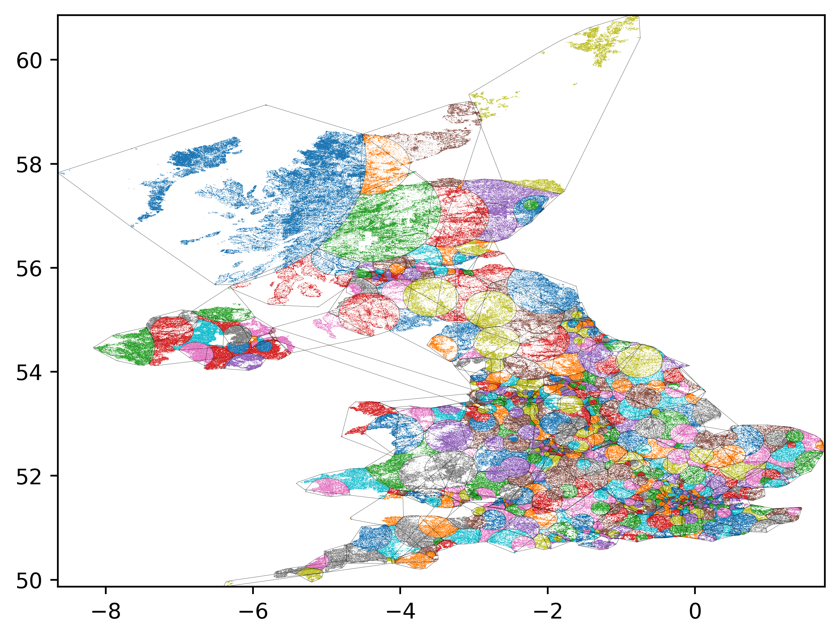
I made the rather arbitrary choice to start in the South West and proceed Northwards. What if, instead, we start with the point with the lowest population density and work upwards.
Here's a video of the sequence:
As you can see, it starts off pretty well, but the final few areas are randomly distributed throughout the map. I kinda like the idea of a meta-constituency of small villages. But I'm not sure if that's practical!
This next video starts with the highest population density and works downwards:


NB, there's no guarantee that the generated images will have dimensions be divisible by two - so here's some hacky ffmpeg code to crop the images!
ffmpeg -framerate 1 -pattern_type glob -i '*.png' -c:v libx264 -r 30 -pix_fmt yuv420p -vf "crop=trunc(iw/2)*2:trunc(ih/2)*2" output.mp4
Or, to scale the video to 1280 wide
ffmpeg -framerate 1 -pattern_type glob -i '*.png' -c:v libx264 -r 30 -pix_fmt yuv420p -vf scale=1280:-2 output.mp4
Algorithms aren't neutral
It's tempting to think that computer code is neutral. It isn't. Even something as seemingly innocuous as choosing a starting point can cause radical change. It may be aesthetically pleasing to draw straight lines on maps - but it can cause all sorts of tension when communities are divided, or combined, against their will7.
It's a fun exercise to take population density data and play around with it algorithmically. It shows the power and the limitations of automated decision making.
-
LOL! ↩︎
-
Even bigger LOL! ↩︎
-
This is a personal blog. I don't work for the Boundary Commission. I do not have the power to enact this. ↩︎
-
It is, of course, a lot more complicated than that. ↩︎
-
Go watch the entirely accurate documentary "Derry Girls". ↩︎
-
Look, OK, it's complicated. There are conventions about The Speaker and all sorts of other electoral gubbins. This is just a fun weekend exercise. Let's not get hung up on it. ↩︎
-
Sorry Scilly Isles! I had a lovely holiday there. You should go visit! ↩︎
-
See, for example, the entire history of colonialism. ↩︎