Mobile Badvertising - Nokia E72
Ahhh.... Nokia. Remember them? Once upon a time they were a global power-house. But now, with BlackBerry, iPhone and Android nipping at their heels, they are a shadow of their former self. I mean, Nokia "only" have a market share of 38% - and they "only" sold 108 million devices in the last quarter.... Hmmm.... Still - you know what will kick the arses of those American and Canadian rivals?
A Kick Arse Advertising Campaign!
 That's pretty strong stuff. For those of you with poor eyesight, let's zoom in on the significant detail
 Oh no they didn't! 🔗
In the UK, I'm unused to seeing adverts which directly mention their competitors - let alone attack them. But in other parts of the world it's quite common. Personally, this sort of advert amuses me - but I do wonder how many people will find it childish and unbecoming of a global business. To say nothing of the fact that by mentioning your rival, you're giving them free publicity.
So, with a humdinger of an advert - this is bound to lead on to an awesome site. Probably with downloadable video showing how cool the handset is, maybe some lush product shots, at the very least the basic stats on these E72 bad boys. Right?
Wrong
Oh. Is that it? It's just dumped me on the "Business Phones" page. A page which doesn't even work well on a mobile browser. Hey, Nokia, I know the BlackBerry's browser isn't the best in the world - but there's no need to rub it in! On top of that - there's no link to the E72. If I can be bothered to search for it, this is what I get.
Again, a non-mobile-friendly page which doesn't seem to say much.
It Doesn't Need To Be This Way
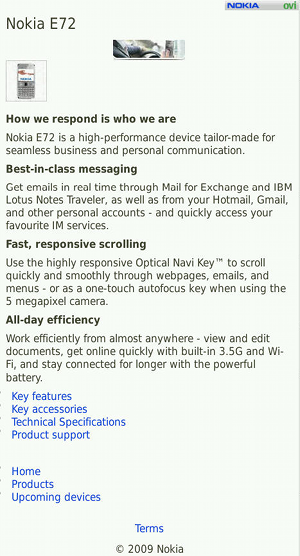
With a bit of judicious searching, I finally found my way to Nokia's mobile formatted E72 product page.
This is the page that the advert should have linked to. Yes, it's a bit dull. No, you can't buy the phone directly from here. But at least it goes directly to the product and focuses on its features.
It Really Doesn't Need To Be This Way
As good as that page is, there are some obvious failing. No product shots, no comparison with BlackBerry (the main thrust of the original advert), no links to buy the product.
The daft thing is, Nokia has some wonderfully designed mobile-friendly product pages.
They even - get this - have phone numbers so you can order one of their products. It's hardly a revolutionary idea - let your customers give you money - but it's totally absent from the first advert.
There are a whole mish-mash of different visual styles on offer.
It's probably enough to give Nokia's branding team a coronary - but there's no denying that these pages are visually interesting, and offer much more information in a much more engaging way than the E72 page.
Conclusion
Where to start...?
- Make sure your MOBILE advert links through to a MOBILE FRIENDLY page.
- If you're a mobile phone company - this is doubly true.
- Follow up on your advert's promise. If you say "This product is better than Brand X" - show that.
- Make a visually appealing site. This WWW medium isn't paper. You're not charged extra for printing in colour.
- Let your customers buy your product. Sounds simple, doesn't it? Add a phone number or an email address on there if they can't buy directly with their phone.
- Provide as much information about your product as you can. This is your chance to wow your customer. Plain text and small images just won't cut it. Again, you're not being charged per printed page - so go nuts. If you can, offer some video content.
- Finally, and this is a biggie, link directly to your products page. If I've clicked on an advert for a Gizmo XYZ, don't take me to Gizmo Corp's front page - take me directly to what I've said I want to see.
These are really basic points - yet we see big companies fail to deliver again and again. Mobile advertising is big business, but you wouldn't know it from looking at this advert.


