About a million years ago, my wife's work sent her on a training course optimistically titled "How To Use Excel As A Database."
We were both horrified. Excel is a perfectly good spreadsheet program - but it is categorically not a database!
OK, it has rows and columns which sorta look like a database table. And you can put constraints on cells which mimic a schema. And, yes, you can sort and query data. And you can join data across multiple tables. And... you know what...? Excel is a pretty decent visual introduction to databases. Sure, it isn't ACID and you wouldn't want to run a production environment off it. But Excel is a reasonable introduction to some database concepts.
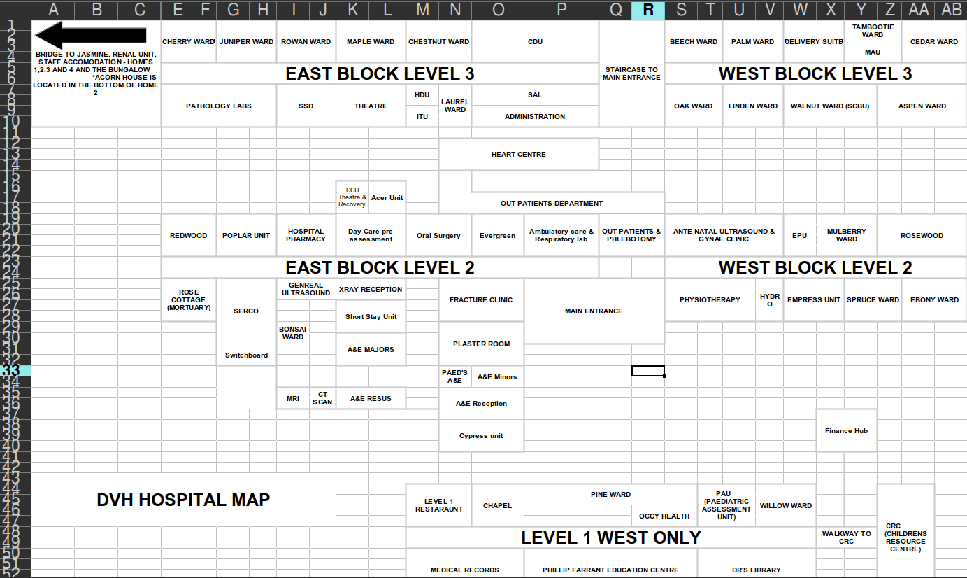
My wife had to visit a hospital recently for a COVID test. Hospitals are often large and confusing buildings. But the hospital's website had a handy "Click here for a map" link. She clicked it, and I heard her scream from across the house.

What?
WHAT?!!?
Yes, some enlightened person had decided to use Excel to draw a building map... I can't even...
There are many reasons why this is bad. A user might not have Excel installed on their phone. The thin grey lines are easy to confuse with thick grey lines. There's no way to see entrances. The plain text means it doesn't have familiar icons for toilets. I'm sure you can think of a dozen more reasons.
And yet... It was probably easier to get permission to install Excel on a machine than it was to procure a specialist graphics tool. Just about anyone can use Excel to draw boxes without training. It's easy to edit if a room is closed or changes function. The text is searchable, unlike a graphic. It doesn't overwhelm the user with colours and extraneous information. At 41KB it's easy to download over a crappy WiFi connection.
As a quick hack, to get a vaguely usable map up on the website, Excel is... well, it isn't fine. It is barely even adequate. But it fulfils the brief. I hope that this was a quick bodge done one day with the aim of fixing it later. But, 7 years later, it is still there. Do people complain, or do they sigh and move on?
Or am I wrong and Excel is the perfect tool for the job?
You can see people's reactions to this map in the following Twitter thread.


7 thoughts on “Excel as a mapping tool”
“you wouldn’t want to run a production environment off it”
👀 keeping an eye on your replies here for the horror-story potential…
| Reply to original comment on twitter.com
I'm not even sure this is the worst NHS hospital map I've seen! There are some extremely confusing ones about, and many hospitals don't even seem to have a map on their website for some reason.
| Reply to original comment on twitter.com
When the only tool in your toolbox is a hammer, every problem looks like a nail.
| Reply to original comment on twitter.com
In every single software company where I’ve ever worked, Excel was one of our chief competitors. It’s a Swiss army knife. It can be made to do anything. You might not enjoy the experience, but it can do it.
Oh, and: one company where I went to work, I found that Excel WAS the database. A prototype had been built and it got such good reception that they sold it to customers. First order of business: get off Excel, because it has an upper limit to the number of rows it can store.
Simon
I have to say that my immediate response is one of sympathy. As Spike implies, this is a result of someone being asked to do a job and not having the right skills to do it. I feel we have all been in that situation at some point in our lives. This map represents a failure in training/development, organisational culture and comms (who presumably allowed it to be published).
I almost found myself saying that at least they could have exported it as a PDF, but I’m not certain a PDF is really an improvement.
K Wong
My gut reaction is that this is the real world. I’d compare it to a multi-tool. It can do a lot of jobs but not quite the specialist tool required for specific jobs. I can see why they have done this even though the end result is very eye-friendly. At the bare minimum, they should have added some colour and some idea of zoning via colour coding and even a directory listing alphabetically, all of which is easy to do on Excel by most users. In the real world, it is used as a simple database where not much sophistication is needed. I work as a teacher in school. Having been on supply, I have worked in a variety of schools. No regular teacher ever uses a database in general. Group lists, setlists, pupil info (for teachers) and everything else in between is done in a spreadsheet. The closest thing to a database is SIMS (a propriety information package) for tracking attendance, extensive pupil information and reporting but even their exported data ends up as a spreadsheet. Its just the way people make do with the skills they have.