Lollipop UI Inconsistencies Represents Google's Failure Of QA
android ux · 6 comments · 600 words · Viewed ~4,424 times.
I don't get Google. I really don't. Some of my smartest friends work there - and yet, as an organisation, Google continually demonstrates an imbecilic attitude to quality.
I've already shared some of my thoughts on Android 5.0 Lollipop - it's slow, buggy, and shows that Google either doesn't bother with testing, or simply doesn't care about quality.
Let's take a look at a few examples - all taken from 5.0.2 (the latest release at time of writing) on the Nexus 7.
Widgets
The "Power control" widget allows users to quickly toggle settings. The top image is the widget in use, the bottom image is the preview of the widget as it is being dragged onto the screen.
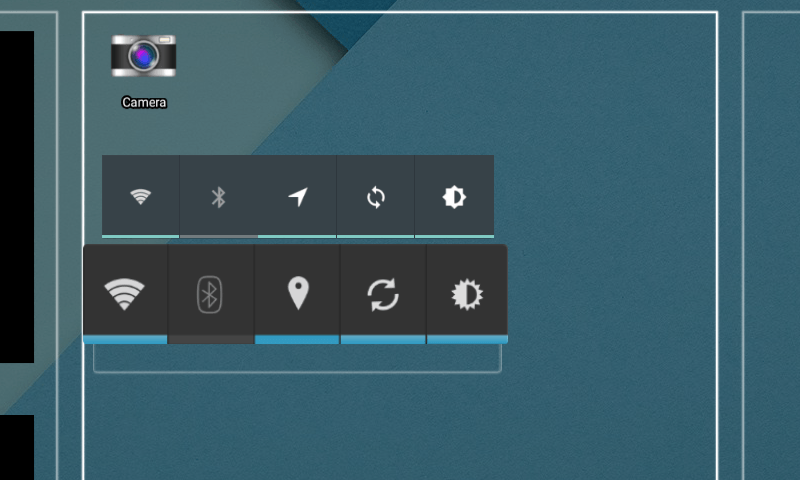
- The WiFi toggles are identical.
- The Bluetooth logo has lost its border.
- GPS has changed from the pin icon to an arrow icon.
- Sync looks like the same icon - but has been rotated a few degrees.
- Brightness goes from a 32 point star, to an 8 point star.
Why? I mean, seriously, did some designer have to justify their salary by convincing the team that rotating a sync icon was a worthwhile improvement?
Perhaps someone, somewhere, can explain to me why changing the icons that users are familiar with is a fantastic idea. But why did no one test the damned widget, notice the problem, and update the preview?
Still, all those beautiful new Material Design icons are consistent now, right?
Let's drag down from the top and take a look at the quick settings bar.

sigh
- Brightness icon has been updated.
- WiFi here is a solid block, rather than showing signal strength bars.
- Bluetooth seems consistent.
- GPS has reverted back to the old design!
And, if we delve into the settings, we find the the Sync icon has shifted by another few degrees.
Want to share something with a friend? Have yet another Bluetooth icon!

That's the share menu, by the way - it's a list on the bottom of the screen. Except when the share menu is this style of list.

Or sometimes the share menu appears in the centre of the screen.
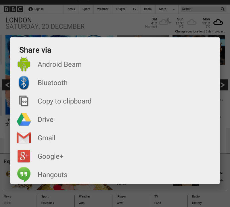
You get to the share menu by pressing this icon.
![]() Or, sometimes, this icon.
Or, sometimes, this icon.

And this is the Photos icon.
![]() Except when it's the Terrain icon in Google Maps.
Except when it's the Terrain icon in Google Maps.

Still, at least the new Material Design has completely taken over the cold, austere Holo Blue Theme, right?
 Every so often, a little bit of Holo seeps through - to remind you that Google never quite finishes anything.
When you start the device, it tells you that you can resize widgets using the blue dots.
 They're actually white though. #LOL.

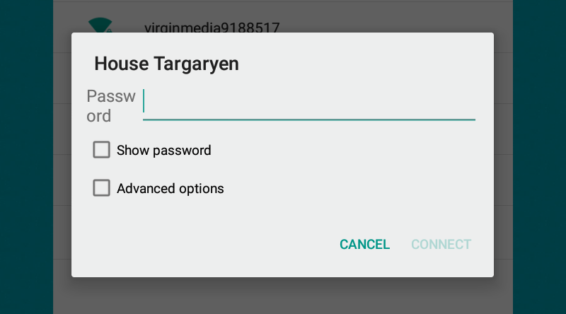
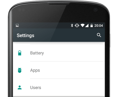
Perhaps these are all obscure settings which no one in their right mind will notice. Surely they don't affect parts of the system which are used with any regularity like, say, connecting to WiFi?
Or installing apps from Google Play?
GAH!
I'd raise a bug with Android - but they've all but abandoned their public issue tracker.
Don't get me wrong, I'd much rather use Android than the offerings from RIM, Apple, and Microsoft - but this kind of half-arsed effort just looks like Google has gotten bored of making a mobile OS which is fast, free, usable, and consistent.
There are dozens of little irritants like this. They're not show-stopper bugs, just a sign that the release team and QA team haven't bothered to do their jobs. If they've missed these basic flaws - what else have they overlooked?
 Do All Google Employees Have Perfect Eyesight?
Terence Eden says:
Mac says:
Armin says: