It has been a while since I last posted in the Mobile Badvertising section. Mobile adverts are slowly improving. By every once in a while, I spot an advert of such mind numbing ineptitude that I am compelled to post.
Orange
Take a look at the latest offering from Orange - a large UK mobile network operator.
Spot it? It's the microscopic banner hidden away on the mobile site of the Guardian newspaper.
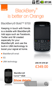
The advertiser has little choice in the poor placement. And it's not their fault if the Guardian has resized it. Let's take a look at the full size animated GIF.
Orange Advert
Ah.
Still, I'm sure the rewards for the eager-eyed viewer are magnificent....
Not so much.
The potential customer is presented with a poorly resized image. The only link at the bottom takes them to a seemingly identical page.
What Else Does It Do?
So, let's look at the purchase experience.
Oh, there isn't one. No nearest store finder. No mobile YouTube video showing off the phones. No click to call so you can buy one right now.
Nothing.
To recap, a tiny banner takes you to a poster. That's it. No though has been given to the unique opportunities that mobile affords. There's no way to convert an interested browser into a paying customer. If we're being honest, there's not really enough information in this microsite to justify an advert.
It is small, feeble and pointless.
Lessons To Learn
Ensure that your advertising assets are available n a variety of screen sizes. Small adverts are hard to click on. Worse still, they may be completely ignored.
If you can't resize your images, unplug your computer and go home.
Think about what you want to achieve from the advert. Are you trying to increase sales? Give the potential customer a direct route to purchase from you. Are you trying to excite or interest potential customers? Provide enough interesting information. This isn't print. You're not limited by page size - only by your imagination.
Take advantage of the medium. Mobile is so much more useful than print. Orange seem stuck in the mindset that a single image is all an advert needs to be.
Message To Orange
You're a mobile company. Make your adverts reflect that. You should be promoting excellence - not mediocrity.


2 thoughts on “Orange Mobile Badvertising”
Interesting. Most mobile ad networks (including ours at Adfonic) choose image size based on the user agent of the device. Your screenshot is 480x800, so I assume that's your native resolution.
MMA 6:1 banners come in four standard sizes: 120x20, 168x28, 216x36, and 300x50. As you say, this one seems to be 252x42, and it's been sloppily upsized from 168x28. That is pretty egregious, but it means both the Guardian and the ad network are at fault.
1) The ad network should at least be serving the 300x50 version. True, a quandary in mobile advertising at the moment is that there is no standard 6:1 banner size above this size. The standards simply aren't keeping up with the rapid evolution in device resolution, so a growing number of high-end devices are missing out.
2) As you say, the Guardian shouldn't be resizing the image -- clearly this is being done in the template.
And yeah, the ad isn't actionable.. that's just dumb.
The two 'identical' pages are for two different handsets - the two sets of details cross-link each other. The lack of any useful call to action is a bit daft though, given that they presumably already have all the infrastructure for selling phones online.