If you're outside of the UK, you will see adverts on the BBC site. This also happens on the mobile site.
Here's a typical example.
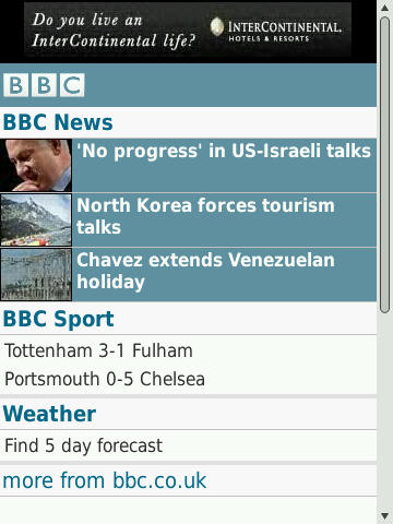
BBC Advert
Intercontinental are a premium brand. No doubt their mobile advertising is really good. Right?
First Impression
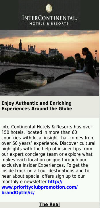
Intercontinental Advert Page 1
We start off with a mobile friendly page. Almost. There are five flaws here.
- Large image. While visually appealing, consider that not everyone has a fast mobile Internet connection. They may also have to pay per KB. Is there a way to use multiple, smaller images to make things just as appealing as well as being quick and cheap?
- Exposing a hyperlink. It's rarely a good idea to show the http:// and other inner workings of your systems. It breaks the understood convention of the web and exposes your URL structure. In this case it also shows that the website you're sending people to neither belongs to Intercontinental nor the BBC.
- Hyperlink colouring. Convention is that links are in blue - or at the very least a different colour from the rest of the text - and underlined. This allows customers to quickly and easily see where the clickable parts of the site are.
- This is a mobile advert - where is the mobile mindset? Why am I signing up for an email newsletter? Why not a monthly SMS or MMS? Why not a mobile video showing how wonderful the Intercontinental is? Why not a mobile voucher to present at my next visit? What a missed opportunity.
- Bearing numbers 2 and 3 in mind, is "The Real" clickable? If so, where does it lead? A consistent style helps with navigation. Clearly explaining what lies behind a link encourages clickthrough.
Speaking of clickthrough - let's go and sign up for this e-newsletter.
Disaster!
Regular readers of this blog know what's coming next.
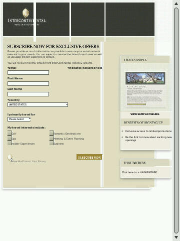
Not exactly mobile friendly
Yup. It's a desktop web page which is totally unsuitable for mobiles. Poorly formatted, hard to use and generally a disaster. How much did they spend on mobile advertising? Could they not have spared a few € for a mobile friendly sign up page?
Back a Step
Let's go back to that first page and click on "The Real". Maybe it's the real link to the mobile sign up form?

The Real
Ah! Now we see why InterContinental were advertising on the BBC - they have a tie in show. The link right at the bottom goes back to the first page, what about www.bbc.com/thereal ?
Notice that, yet again, we have a different style of URL. It isn't underlined, it isn't a different colour, but it is clickable. This is the third style of URL on this site - totally confusing.
Let's click (you all know where this is going, right?)
Calamity!
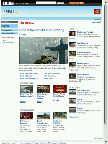
Non-Mobile BBC Site
To be sure, this is a lovely site - but it's not exactly what you'd call mobile friendly. What is the point of putting a link to a slow to download, expensive and poorly rendered desktop page within a mobile advert?
It doesn't have to be this way!
The BBC excels at producing mobile tie in content. Take a look at the mobile friendly Doctor Who page.
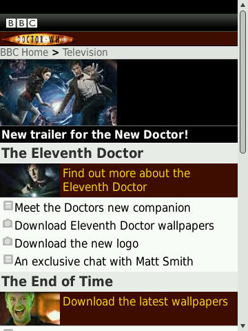
Doctor Who Mobile
Mobile formatted, downloads, videos, loads of interesting and engaging content. Just the way it should be.
Conclusions
There is one important lesson to be learned here.
Make sure all of your site is mobile friendly. That doesn't just mean all pages are suitable for mobiles - it also means that the offer is suitable for mobile.