Seesmic, a service I've not tried before, have released a Twitter client for the BlackBerry. Is it any good? How does it compare with the features of Dabr or the usability of UberTwitter? Find out!
Getting the client was fairly simple, but could be better. Simply visiting http://seesmic.com was enough to bring up a mobile friendly page with download instructions.
 However, scrolling down presented this mess.
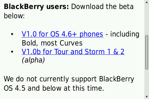 You simply can't rely on users to know what make, model or firmware version they have. Use the user-agent string to do as much of the hard work as possible. If a user tries to install an incompatible version, it won't work and they'll blame you.
The download itself is a sprightly 172KB and installs very quickly - it also doesn't require a reboot.
 Once you've signed in, the main interface is very simple. UberTwitter, for example, presents the user with complex set-up options on the first run. Seesmic gets straight to the action.
 Seesmic is entirely menu driven - there are no shortcut keys. UberTwitter allows me to hit R for reply - on Seesmic, I have to delve into the menus. Luckily, they're short and have obvious names.
 Reading a tweet gives the usual option, hashtags and @s are hyperlinked - as are web addresses.
 On usability flaw, the cursor is at the top of the screen. A user has to scroll through the "Web" hyperlink before getting to the links within the tweet.
Again, because there are no keyboard shortcuts, everything has to go through the menu.
 Searching is problematic.
 Pressing enter doesn't start a search, it inserts a new line.
The search button isn't the first thing you get to when you scroll down.
While the results are standard, this odd error message kept popping up.
 I encountered this error several times.
Writing new tweet has some great usability touches - and some real clunkers.
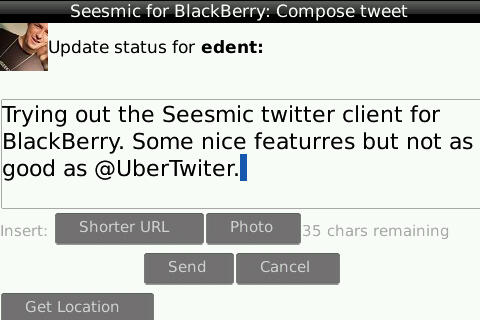 The closer a user gets to filling the 140 characters, the more red the screen turns.
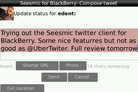
 URLs can be automatically shortened and images can be added. This shows one of the great usability failures of Seesmic.
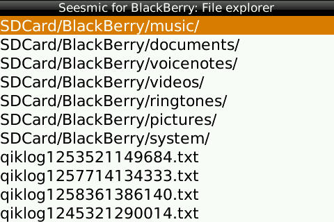 Rather than use the BlackBerry's file select utility, it uses its own - and it's dreadful. Ugly looking, no ability to search, slow, no preview. Overall, a real let-down.
I don't know why companies often insist on creating their own versions of well established system functions. Especially when they add nothing and remove plenty.
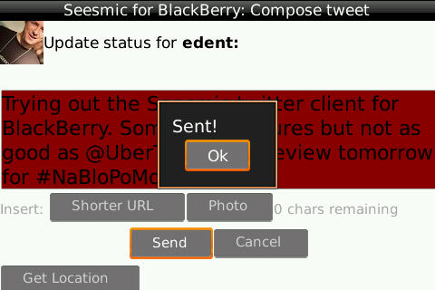
Sending a tweet was continually problematic for me.
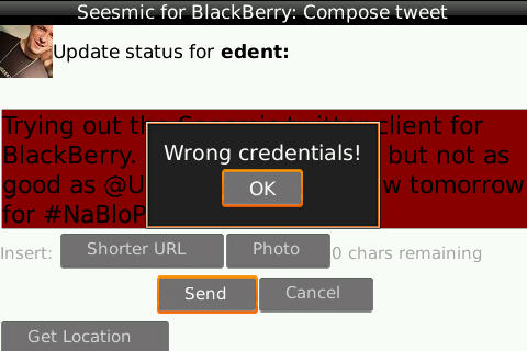 Although it eventually relented.
 Seesmic also makes great use of notifies, showing you on your home screen how many unread tweets you have.
 Overall, Seesmic isn't a bad client. There are a few rough-around-the-edges bugs and the file selection is atrocious but other than that, it works. Power users like me will miss the shortcut keys of UberTwitter, and UT's system-wide integration (uploading photos, capturing hashtags in emails etc.). It lacks other features such as in-line photos, ability to see followers and friends, it also has no way of marking a tweet as a favourite or seeing favourites.
One feature it does have - a first in mobile twitter clients - is the ability to view lists. You can't add, edit or create - but you can see the lists you have created or are following.
Conclusion
Seesmic works well enough as a basic twitter client for BlackBerry - but there's nothing exciting about it.

2 thoughts on “Seesmic Twitter Client for BlackBerry”
Hello Terence, thank you for this comprehensive review that has many great points of improvement that we will work on to make our app more exciting for you. It is a first version and we will iterate very fast from there. Thank you for taking the time to review it and we hope you will keep an eye on our future versions.
I certainly will keep an eye on it. It's a great start.