I feel a bit guilty about including NatWest's latest mobile advert in my Badvertising section - because it's mostly very good. But it shows exactly why you need to carefully examine every link within your site and see how useful it is for your customers.
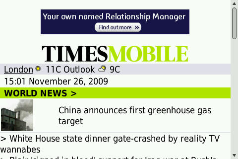
You may have noticed this animate banner as you wander around the mobile web.

NatWest Advert
Here it is in context

NatWest Ad on Times Site
So, what do we see when we click on it?
The Good

NatWest Mobile Site
Now, this is pretty good! An attractive site, seems on brand, gives details of the benefit. What's this at the bottom? Could it be...?
Click To Call

Click To Call
Click to call is such basic functionality - I'm shocked that more mobile sites don't make better use of it. It saves the customer from having to scribble down your number or worse, try to remember it. If you're smart, you will set up a separate number for the mobile site so you can track how effective the site is.
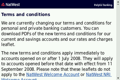
Terms and Conditions
The one thing you learn from looking at your site stats is that no-one reads the terms and conditions. However, it's the first thing your lawyers will look for. So make it prominent so you can't get sued later.
While the NatWest T&Cs are fairly mobile friendly - this is where the site starts breaking down.

Terms and Conditions
Linking Out
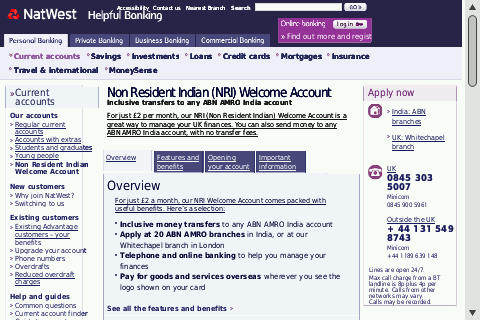
The first problem is that the two links that are given aren't mobile friendly.
The first appears to be a pop-up from their Polish site.

Polish Popup
The second is from their main site.

Full Site
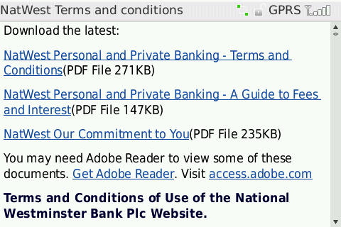
As we go further down the T&Cs page, we see some links to further documents.

Pop quiz, hotshot, what percentage of mobiles can read PDFs? Some S60 phones can read PDF, as can Android and iPhone. But the majority of phones in the market simply can't access these documents.
Length
Around eleven thousand words! All on one page.
Conclusions
When designing a mobile site, keep these points in mind.
- Don't link to any non-mobile sites.
- If you have to link to non-mobile sites, ensure you give the user a warning so they know not to click if they have a less capable phone.
- Make sure that the formats you use on your site can be accessed via mobile. Convert PDFs to HTML if you can.
- While you may need to have Terms and Conditions on your site, they should never be more prominent than your main call to action. In this case, the "Call Us Now" button should be shown to the user before the T&Cs.
- Consider splitting pages in to "chunks". Many phones will have a low memory limit and won't be able to display your pages.
- Even if they can display the page, scrolling through hundreds of lines can be a painful experience.
Overall, this is an excellent microsite which is let down by a few silly mistakes.