I'm a huge fan of TasteLondon. Their card gives discounts in hundreds of restaurants around London. It's saved me quite a bit of money and I really recommend the service to anyone who likes eating out.
There is a small problem with it, though. The directory of restaurants it covers is a fairly heavy paperback book Rather inconvenient to carry around on the off chance that you fancy popping out for some dinner . They do have a rather good website - tastelondon.co.uk/ - but it doesn't work on mobile. Nope. Not even if you've got a Cadbury's iPhone.
Last year I asked TasteLondon if they were planning on developing a mobile site. They said "yes" and here it is. It's a textbook example of how not to design for mobile. Let me take you through it.
Where is it?
How would you expect to get to the TasteLondon mobile site? Their news page annouces the service but doesn't give the URL! The site is meant to auto-detect a mobile browser but failed to do so on BlackBerry or Android.
I tried guessing the URL. Was it m.tastelondon.co.uk? Perhaps mobile.tastelondon.co.uk? Surely not wap.tastelondon.co.uk? I know tastelondon.mobi? Nope - none of those. After much perseverance I discovered it was tastelondon.co.uk/iphone
Solutions
- TELL YOUR CUSTOMERS WHERE YOUR SITE IS!
- Mobile detection is hard. You can use services like DeviceAtlas or WURFL to detect if a device is mobile.
- Always offer a link on your main page just in case your detection is wrong.
- If there are several standards, make sure you redirect your customers if they go to the wrong URL. A simple redirect in .htaccess would have send everyone visiting the m.tastelondon URL to the correct location.
- Don't choose technology specific names in your addresses. /iphone would indicate that you're not interested in the hundreds of millions of devices which aren't made by Apple. While the iPhone is popular now - will it be in a year's time? Choose something vendor neutral.
So, here's the front page on my BlackBerry.
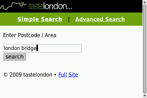
Front Page - KISS
I quite like this. It's simple. There's a link back to the full site. The bold indicates that I'm in simple search and, if I want, I can go to Advanced Search. I wouldn't have made "Simple Search" a link as I'm already here. Overall, not bad. Let's see what the search results are like.
JavaScript
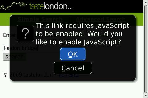
So, I hit the button and what do I see?
JavaScript
Don't get me wrong, I love JavaScript. It does all sorts of amazing things and usually makes usability a lot better. But on mobile? True, many newer high-end phones have JavaScript - but literally billions don't. Why would you alienate so many potential customers?
What makes it worse, is that this is a simple form. We've had forms on the web since its inception. It's a standard HTML element. Why would a simple search box need JavaScript?
Is It Necessary?
- KISS
- If you're desperate to use a whizzy new feature - check how widely supported it is. Make sure there's a fallback option for those users who won't or can't upgrade.
- Whenever you create a new service, test it as thoroughly as possible. Remember, you are probably not your typical user. Find out what technology your users have and design for them - not for what's "cool".
Ok, let me grab my Android handset and carry on testing...
Where am I?
So, I've just arrived at Waterloo Station when I see all the trains home are cancelled. Let's grab a bite to eat nearby. I'll search for Waterloo.

Searching near Waterloo
This is what I get back.

Results from searching for Waterloo
There are three serious errors with this page
- The result is wrong. I know the postcode of my home and my workplace. I've no idea what the postcode is for anywhere else. Given this is a London based service, I was expecting that a major train station would suffice.
- No feedback on what I've searched for. That search bar should be pre-populated with my search. Just like every other search engine. This gives allows me to correct any misspellings and serves as a reminder of what I was looking for.
- Location. The Prezzo in Peterborough is 265.31 Miles away. Away from where? I haven't given my location and, as far as I can tell, the site hasn't automatically detected it. Where does this figure derive from?
User Needs
- Think about how the user thinks. Does anyone know the postcode of the pub they're sat in? If you need a street name for accuracy, tell the user.
- Give the user feedback. Keep them in the loop.
- Detect the user's location. This may be complicated for you - but it's easier for the user.
Success!
I'll try again. I've got the feeling that I'm in the postal area of W2. Here's what success looks like.
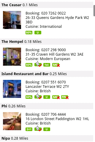
Is this as good as it can be?
A really good page. Pretty, well formatted, lots of information. Can you spot the four glaring usability issues?
- I can't click on the phone numbers. Some advanced phones will detect the number string and allow you dial it. If not, you've got to find a scrap of paper, scribble down the number, close the browser, go to the phone's dialer and type the number in yourself.
- Where is Craven Hill Gardens? Why not link to Google Maps. Or Yahoo Maps. Or any mapping service.
- What do those icons mean? Anyone already intimately familiar with the TasteLondon system may know what they mean.
- Where do I go for more information? The names of the venues aren't clickable.
Is This As Easy As It Could Be?
Make everything as easy as possible for your users. In four simple steps the usability of this site could dramatically be increased.
- Make phone numbers easy to dial. Your user is on a phone, they need to book a restaurant, you've given them the number - why wouldn't you make it easy for them to call? You can use WTAI or tel: to make it easy for any user to dial the number you've presented.
- Maps. On the desktop, users are quite happy to copy and paste text into another page or application. It's not so easy on mobile. If something can be a link - it probably should be.
- Familiarity. Because we spend all day in our jobs, we often forget that not everyone understands the acronyms and syntax we use. Don't hide behind obscure icons unless you hyperlink those icons to a page describing what they mean. Consider having a "key" or "legend" at the top of a jargon heavy page.
- Have you given me enough information to make a decision? Perhaps I want to see the menu, prices, review or some other information. If the information is available on your main site, it should be available on mobile. This is the central tenent of the One Web.
The Tyranny Of Choice
Let's pop into Advanced Search. It's fairly comprehensive.
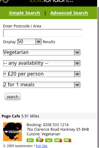
Advance search result
There's a sensible amount of options. Availability, Cost, and Offers all have 3 - 4 options. Cuisine obviously has rather a lot of choices - 40 of them from African to Vietnamese. Yummy!
How many results do I want to see? According to TasteLondon, it could be over 500!
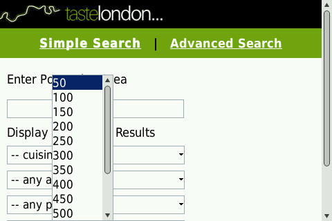
How many results
Rational Choices
- Too many choices can be confusing and distressing for the user.
- How much information does a user want to see?
- How long will it take a user to download 500 results onto their phone?
- If you are going to offer a large results set, give the user a way to sort.
- Rationalise the choices you offer and how you offer them. Is a list the best way? How about radio buttons or check boxes?
Sharing Is Caring
So, I've found the perfect restaurant for me and my friends. I guess I'd better check that it's OK with them all. How can I do that? I know! I'll SMS them the URL.
Ah... A problem. The URL isn't specific to the restaurant.

The Site URL
Take Advantage of the Platform
- If you want people to visit your site, make it easy for them to share it with their friends.
- Consider having a "Send To Friend" button which will save your users the cost of a text message.
- Create useful URLs. Watch this presentation about URL design or read it direct from the mouths of experts - Cool URLs Don't Change.
- For this site, I'd use two different types of URLs.
- The URL for the search page should be similar to m.tastelondon.co.uk/?l=w2&c=veg&a=1&c=2&o=3 This enables your users to send the message "Hey, which one do you like the best?"
- The URL for each restaurant should be similar to m.tastelondon.co.uk/?r=1234 This enables your users to send the message "Hey, do you like this restaurant?"
- You can use " smsto://" on some phones to make it easier to send the URL by text.
Conclusion
I love my TasteLondon card. It is tremendously valuable. It has paid for itself many times over. The mobile site is, frankly, a bit disappointing. It works - on some phones. It gives me information - but only the bare minimum. It tries to be clever - but gets the basics wrong.
If I were dining on my own, didn't really care about the menu and hoped cabbies knew London as well as they're meant to - this wouldn't be a bad site. I do use it - but find myself skipping into Google Maps and external restaurant review sites. I have to copy and paste details or take a screenshot if I want to share information with friends.
TasteLondon's mobile site has only been live for a few weeks - I look forward to watching its evolution.

4 thoughts on “How Not To Design A Mobile Site - TasteLondon”
Having launched multiple sites simultaneously before, day one isn't perfect... especially for a startup. Think about it, they're not Apple and they don't have backup web design teams like Google.
What is surprising though, is that they didn't get this feedback implemented after a few weeks. One would at least hope that there was enough buzz and feedback generated that they could act quickly to tweak the service.
So, I would add a simple suggestion: As a chef would say; taste, taste, taste. Continuous improvement would go a long way to catching a lot of these issues on its own.
Just to nit pick a few more suggestions, I'd suggest a mobile sitemap using real-world names. r=1234 isn't going to pick up as many Google Mobile Web results as mcdonalds-3221-wilshire-blvd.
There are a lot of examples of how not to design a mobile website. May I humbly submit examples of how I think they should work:
please visit http://www.whenimmobile.com on your mobile device of choice. Examples of our work will be found on the Portfolio link.
This comment is not intendeed to be a sales-pitch, but is submitted to further my evangelical mission: to let people know how good the mobile web user experience can and should be, regardless of the device being used. And I don't claim to have it down perfectly, but I definitely feel this is the right path and direction to take.
We are all (most of us, anyway) walking around with very capable web devices which are for the most part under-utilized in terms of the mobile web. It is frustrating to know that those of us who are working to make it better are under-publicized and working against the tide of the carriers, who have a vested interest in keeping people distracted with carrier-based content subscription services and stand-alone app strategies.
Thank you all in advance for your attention and your thoughts.
Jonathan Thaler Founder, When I'm Mobile
ling
Besides having a bad website, what they also don't tell you is that if you sign up for this one year they will automatically charge you for a membership every subsquent year.
Apparently it is in their terms and conditions but if you (like me) signed up over the phone and they take down your wrong email address, you will never find out about this until you're charged next year and this company does not under any circumstances have a contact to speak to regarding complaints or refunds, the do not have a postal address and they do not respond to emails on complaints.
Hi Ling,
The contact number for TasteLondon is on their website - it's 0800 5677 241.
While I have had some problems renewing, I've found them fairly helpful in resolving the problem. That said, they don't appear to list their address - the one I have for them is Taste Marketing Ltd PO Box 208 Holmfirth HD9 9AH
HTH
T