I've seen two very different adverts recently which, in my opinion are bad. Very bad. I'd even go so far as to say that they are terrible.
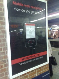
The first is a poster advert seen at my local train station.
 A tagline, a shot of the service and a URL.
Let's break it down. 1) The URL. I initially typed in w4mobile rather than w4mobiles - and got a non-mobile friendly page. It would have been better if they'd bought a few similar sounding domains or set up a mobile friendly .mobi address.
2) The URL. I have to type it in myself! What, is this 2005? Where's the QR Code? Where's the mobile shortcode? If you're going to have an easy to mistype URL - make it easy to get onto the phone.
3) It's just so dull! Why not have a bigger and more colourful shot of the service? A more descriptive idea of what the service is for?
4) Black text on a red background!
The service itself is nothing special. It's a list of links to various mobile friendly sites. I was expecting something a bit more dynamic. Some social bookmarking for mobile users. It's very 1998.
Next up, a mobile advert seen on Vodafone live! (I work for Vodafone, these are my opinions, not theirs).
Click-to-Call. Great stuff. Too many mobile websites insist you remember their number, exit the browser and manually dial. With this, click and you're dialling.
The bad....
Again, a fairly dull advert. 1 Image, and a few lines of text. This isn't a newspaper - you're not paying per word or per image - why not brighten it up?
What the click-to-call giveth the "this is a chargeable call" taketh away! Why use a premium rate number that isn't included in anyone's bundle when you could use a geographic number that would be free for all your customers to call?
Finally, take a look at that advert again. What do Avis do? What exactly can I rent for £10 a day?
Mobile Advertising is big business. You wouldn't know it to look at these two adverts.
