Mobile Badvertising: Peugeot

Peugeot's new mobile advert has a couple of critical flaws - but has just enough innovation to redeem it in my eyes. Read on to find the two basic mistakes they made, how to solve them, and the cool feature you should be incorporating into your adverts.
Clicking on the advert takes you onto a fairly swish looking landing page. There are some clear calls-to-action, and some attractive graphics.
I find the text a little hard to read. Let's zoom in.
Yikes! The whole site is an image! This is incredibly bad practice for several reasons.
- The page weight will be excessive. This means your site will be slow to load and possibly cost your customers more to access it.
- Inability to zoom in. With some smartphones like the X10mini having tiny screen, you need to consider how your site will look over a wide range of devices.
- SEO. Search engines can't read images. Plain text will ensure your site is spidered.
- Reflowing - what happens when the user rotates the screen? Your image won't scale and reflow as well as text.
- Updating. If you need to update the site, you'll have to edit a series of images - one for each screen size. With text, one change and you're done.
In Praise of...
The usual "Find A Dealer" service asks the user to type in their postcode or some other location based detail. I'm very pleased to say that Peugeot goes one step beyond this. They take advantage of the geo-location api of the phone so that the user doesn't have to do any extra work. Brilliant.
 This is a great use of the technology. Let computers do what they do best and reduce the need of your user to type data in.
You can use a cross-platform geo-location solution like Google Gears to detect your users' location.
Ideally, the domain name should be that of the product. The user probably doesn't know who "sevenal-fit.com" are - but they would recognise "peugeot.com".
Text Effects
This is the final fly in the ointment. Is this piece of text a link? How about this one? What about this?
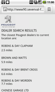
By convention - and good usability practice - links are styled differently than regular text. Usually by underlining or displaying in a different colour. It helps the user see what actions they can take on a page. Have a look at this results page and see if you can tell what you can click on.
Not very intuitive - is it? It looks like a list of results with no further information.
As it happens, you can click on the dealer names.
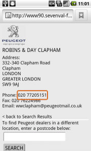
 Again, there's no text decoration. While it's good that they've used click-to-call for the phone numbers, there's no indication until you've placed your finger or cursor over the text that it's a link.
Don't make your users think. Clearly signpost the actions which are available to them.
It's also worth including a map of the area - or even directions from the user's current location. Remember, the end goal of this advert is to make someone buy a car. Make it as easy as possible for your users to go from advert to purchase.
Conclusion
Text is better than images.
Remember to decorate your text correctly.
Geo-location is awesome - but don't forget to display a map.
Finally, consider which domain name the users will see and if they will trust it to store their data securely.


The artefacts around the lettering are the result of some pretty aggressive JPG compression. I'm guessing the advert is still quite lightweight because of this.