After much kerfuffle, the world has finally got used to the new Google logo. Well, almost. My eye is continually caught by the poor contrast of the yellow "O" against its background. Take a look... This is Google's default logo on its regular grey background. The contrast ratio between the yellow and grey is 1.50. That fails to meet current accessibility guidelines. This is just awful - I …
Continue reading →

Another in my occasional series on the usability of toilets! It's hard wandering around seeing the mistakes which are made by designers. Perhaps it's poor keming on fonts, or a hotel room light switch which makes no sense, or - in my case - bogs. Lots of toilets incorporate a "dual flush." Press one button to unleash a deluge sufficient to sink all but the hardiest of bowel-movements, press a…
Continue reading →
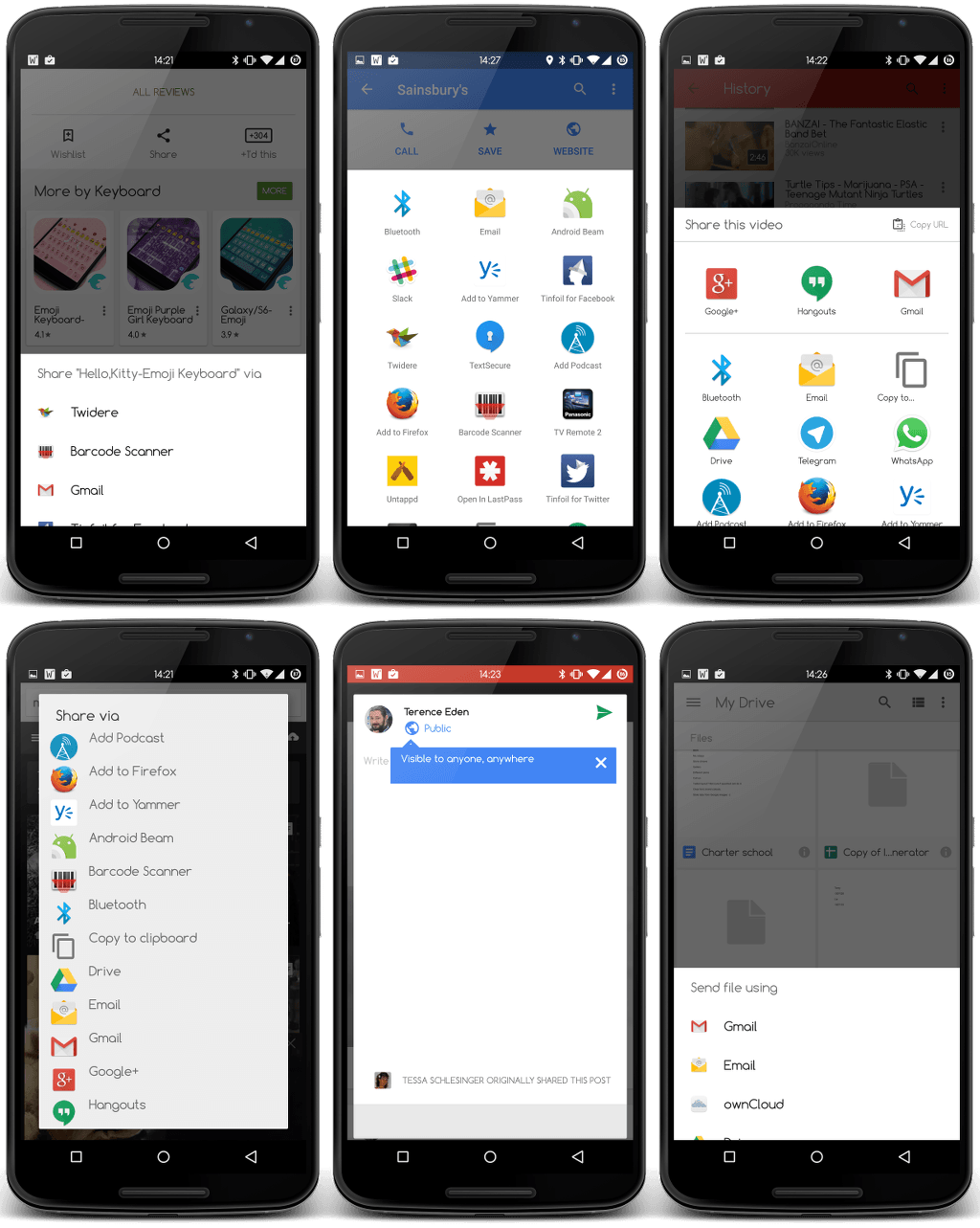
As I get older, I begin to lose neuroplaciticy. I get angry and confused when I don't understand things. I get frustrated when I have to change my behaviour. It happens to all of us, to some extent, and it's one of the major reasons you should design your apps in a clear and consistent manner. I've been using Android - Google's mobile OS - it since before it was launched. I now love and…
Continue reading →

My good friend Dan Appelquist recent wrote a fascinating blog post on solipsism as a design decision. He has a set of Lifx Internet Controlled Lightbulbs. They're great fun, but have some seriously screwy ideas about how people live. One key design of the app is to allow you to automatically switch off all your lights when you exit your house. That's pretty nifty, right? I am still…
Continue reading →

(An adaptation of my earlier blog post on the same topic.) This is a case study focusing on the usability of encryption systems as used by political dissidents in Apartheid era South Africa. Background - South Africa Between 1948 and 1994, the nation of South Africa was ruled by an ethnically white minority. They set in place a system of government – known as Apartheid - which suppressed, b…
Continue reading →

Earlier this year I was playing around with DogeCoin. Try as hard as I might, I just couldn't get their API working. I delved into the settings, to see what was up. Take a look at this setting, is it obvious to you which state is active? I clicked around on it, and the state changed. Had this enabled it or disabled it? By carefully hovering my mouse over the options, I could see what I…
Continue reading →

I was playing one of those stupid "Which X Are You?!?!?!?" quizzes which seem to be the rage these day. I'm weak willed, I know. One of the questions had a particularly interesting UI issue. It's not a particularly subtle problem. The image on the left related to the button on the right, and vice versa. We know, from countless studies, that people don't read websites. They scan and they…
Continue reading →
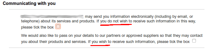
Hanlon's Razor states, "Never attribute to malice that which is adequately explained by stupidity." It would be nice to think that all mistakes and errors we encounter are just the result of bone-headedness. Sadly, that's not the case. Quite often malicious people deliberately try to trick you into taking actions you would normally have ignored. In usability, we call this a "Dark Pattern". A …
Continue reading →

We're all changing our passwords in the light of Heartbleed, right? Good! If you are a developer or designer, I want to explain to you exactly how not to create a password dialogue box for your users. We're all used to seeing this: Input password: Change Password This is incorrect! Why? Because it leads to this? Input password: Change Password ERROR! Your password must be longer than …
Continue reading →

What does the design of cables tell us about the men who invented them? Computer designers often strictly gender the components they create. The most obvious example is the motherboard - the central hub of the computer from which all electronic life descends. As well as circuit boards (often called daughter-boards) - cables are also subject to strict gender rules. The convention is that the…
Continue reading →

I'm really late to the party on this one - so this blog post is mostly an aide-mémoire. The web is built on three fundamental components: HTML - the structure of the page. CSS - how the page is styled. JavaScript - the interactivity. Typically, the website owner sets up the CSS to say links are blue, headlines are big, images have borders etc. etc. Users, however, can over-ride …
Continue reading →

In app design, we often talk about designing for the user in context. For example, a taxi app can't rely on a perfect GPS signal in a crowded city, a user in the countryside may not have brilliant bandwidth, battery life is not infinite so we should limit certain features when power levels are low. The common theme in those examples is that we are designing for the phone's context, not the…
Continue reading →