For years, my email address was registered with our electricity supplier. I got the monthly bills sent to me. My wife's email was used for the water supplier. This made sense when we were a young couple with separate finances - but now we're a smug an old married couple, with a joint bank account, it's a bit annoying. We both want to see the bills, and we don't want to rely on the other…
Continue reading →

Back when I used to help people design mobile phone apps, I would talk about the platonic ideal of an app. It's quite simple and effective. You press the button in the middle of your screen - and it makes everything better! You push that button and a taxi arrives, or a pizza is delivered, or your photos are backed up, or you fall in love, or you learn a language. Life is rarely that simple…
Continue reading →

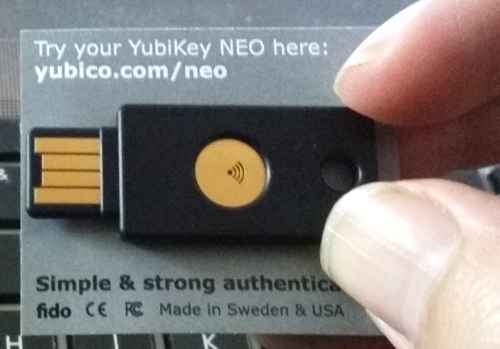
Twenty One. I have 21 accounts which use Two-Factor Authentication. I use the Authy app to manage them all, but it is still a pain to scroll through and find the exact 2FA token I need. Encouraged by my friend Tom Morris's blog post, I picked up a YubiKey NEO for £50. It implements the FIDO U2F standard. Sadly, the YubiKey is substandard and frustrating to use. Here's what I found. First …
Continue reading →

I'm incredibly disappointed with "Doctor" Emmett Brown. His forays into time-travel could have extremely profound consequences for the space/time continuum. Worse than that, his time machine has a crap user interface. In this clip from "Back To The Future" we get a brief glimpse at the controls for setting the destination date: Ok, we can forgive Brown for not sticking to ISO-8601 - that is…
Continue reading →

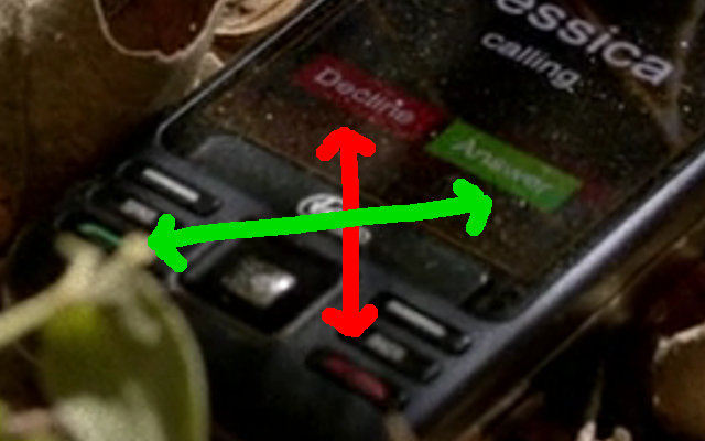
I love the TV Show True Blood. I really only watch it for the insightful social commentary and tasteful depictions of interspecies erotica. And the User Interface mistakes, obviously. During the recent episode "I Found You", the Jessica (the Vampire) places a phone call to Sookie (a sort of telepathic fairy... it doesn't really matter...) Sadly, Sookie has dropped her phone. Notice the…
Continue reading →

I love Android, I really do. I'm chuffed to bits with the Galaxy Nexus I won recently. I've had a dozen Android phones before that - stretching all the way back to the HTC Magic. But it's getting obvious that Android has a serious design problem - even with the gorgeous new "Holo" theme for ICS. The issue is one of consistency. Users have limited cognitive surplus and often rely on muscle…
Continue reading →

I've been thinking a lot about APIs and their design recently. I stumbled on this fantastic quote from Greg Parker: Greg Parker@gparkerA programming language is a user interface for developers. Language authors should learn from HCI principles.❤️ 41💬 6🔁 019:10 - Wed 22 February 2012 When I first started learning C++ (back in the bad old days) I was convinced that any 1st year student could desi…
Continue reading →

I'm not the biggest fan of Microsoft. Both my original Xboxes now run Linux, I've converted my laptop and computers to Ubuntu, and I generally laugh in the face of Microsoft's increasingly desperate attempts to stay relevant. So it was with great mirth that I went along to a BizSpark event a few weeks ago. Microsoft were going to be showing off their latest "innovation" - Windows Phone 7. I…
Continue reading →

I am greatly enjoying playing Zynga's Mafia Wars on the Cadbury's iPhone. There are two fairly interesting UI flaws which I'd like to point out... The first is the screen which allows you to alter your stats - this is what it looks like. However, this is what most people will see. Can you spot the subtle but important distinction? Proximity implies relation. The word "Energy" is nearer to…
Continue reading →

This is a necropost - resurrected from one of my ancient USENET posts. Some web-browsers use "Stop Loading" icons that were represented with USA stop signs. To anyone else in the world, that's just a red octagon. Similarly the spell-check button in MS products is a tick over an "ABC". I don't know what the spell check button is like in countries with a different lexicography. Also, in…
Continue reading →


