Graphing the connections between my blog posts


A force directed graph showing how four different posts link to each other and how their hashtags relate.

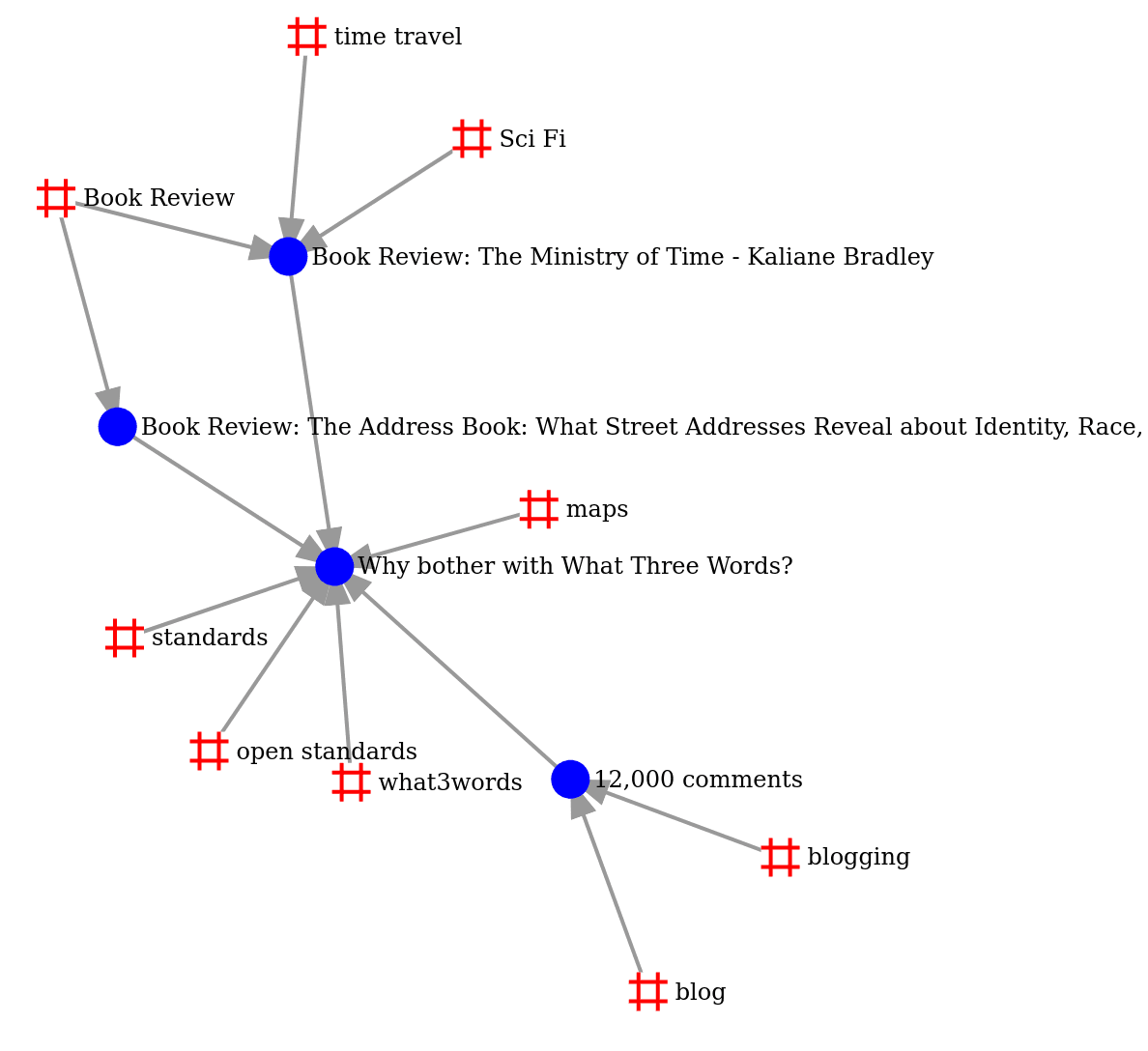
I love ripping off good ideas from other people's blogs. I was reading Alvaro Graves-Fuenzalida's blog when I saw this nifty little force-directed graph: When zoomed in, it shows the relation between posts and tags. In this case, I can see that the posts about Small Gods and Pyramids both share the tags of Discworld, Fantasy, and Book Review. But only Small Gods has the tag of Religion. Isn't that cool! It is a native feature of Quartz's GraphView. How can I build something like that…

Continue reading →

Surrey Police and the Case of The Misleading Pie Charts


Surrey County Council have sent every household in the county a booklet explaining how our council tax is being spent. Within it is a highly political comment from Kevin Hurley, the newly elected Police and Crime Commissioner. He presents a pie chart showing how the police force spend its money. Take a look at it and ask yourself this question: what percentage is spent on "Employees". Please use this poll to record your guess - answers at the end of this blog. Pie charts have a long and…

Continue reading →