
First up, you should go and watch The Importance of Being Earnest with Ncuti Gatwa. It is a brilliant set of performances and a joy to see. While perusing the programme on the National Theatre website I stumbled upon a little bug. The incredible Ronkẹ Adékọluẹ́jọ́ has her name rendered in a most unusual style: It rendered just fine in Chrome - but both Firefox and Safari misrendered some of t…
Continue reading →

I want to make emoji bigger than the text that surrounds them. At my age and eyesight, it can be difficult to tell the difference between 😃, 😄, and 😊 when they are as small as the text. Is there a way to use CSS to increase the font size of specific characters without having to wrap them in an extra <span> or similar? Yes! Although it is a bit of a hack. This relies on 3 CSS features: src: lo…
Continue reading →
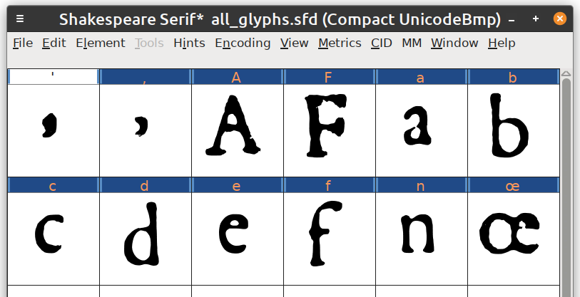
Disclaimer! Work In Progress! See source code. I recently read this wonderful blog post about using 17th Century Dutch fonts on the web. And, because I'm an idiot, I decided to try and build something similar using Shakespeare's first folio as a template. Now, before setting off on a journey, it is worth seeing if anyone else has tried this before. I found David Pustansky's First Folio Font.…
Continue reading →

I was browsing the web recently when I can across this utter horror show of a font. Warning, not for the faint of heart. The thing is, I can't adequately describe why I - and many others - find it so disturbing. In all my years of reading English, I've never found a font which slants backwards. I'm used to italics so there's no reason it should seem weird. And yet... it's like the uncanny…
Continue reading →
Some background reading. Skip if you're familiar with fonts. A font file contains a list of characters (usually letters, numbers, and punctuation) and glyphs (the drawn representation of that character). It is, of course, a lot more complicated than that. Each character has a codepoint which is represented in hexadecimal. For example, U+0057 is the Latin letter Capital W, U+20AC is the Euro…
Continue reading →

As part of my silly floppy artwork, I wanted to find a retro computer font. Then I remembered that there's a 1960s Doctor Who serial with this beauty. The War Machines is a cracking slice of 60s sci-fi. It's very groovy. But what font is it? It isn't Westminster. The W is completely wrong. And the letter T is mirrored. Westminster has a surprising and interesting history. It isn't Data…
Continue reading →

There are loads of really delightful Simplified and Traditional Chinese True Type Fonts available on the web. There's only one issue - the file sizes are really large. In many cases, too large to effectively use as a web-font. For example, this calligraphy style font is 3.4MB. The beautiful Paper Cut Font weighs in at 14MB! That file-size is far to heavy to embed on a web page. …
Continue reading →

The latest version of the Chrome Browser for Android has introduced a curious rendering bug. When scrolling, I notice that the font hinting seems to break down. This makes the text very "juddery". It looks like the fonts shrink and grow and they scroll. This is very disorienting when reading. In this example I've noticed that once I've stopped scrolled the page, the fonts are hinted…
Continue reading →