
My friend, the photographer Paul Clarke has an uncanny eye for detail. Every single shot he publishes is beautiful - they capture life in a way that I don't have the language to describe. I'm quite content to point my phone at someone, use the default settings, and grab a snap. My photos lack composition, clarity, focus, mise-en-scène, proper lighting and a thousand-and-one details that I've …
Continue reading →
Some of my best friends are designers. But I think we can all agree that - however well-meaning - they can be a little obsessive. Whether it is fretting over tiny details, or trying to align to a grid which doesn't exist, or spending time removing useful affordances in the name of æsthetics - they always find a way to make something prettier at the expense of usability. Google used to have some …
Continue reading →

How do you know you're looking at an old website? You may have found a page which has lots of interesting information, but how can you tell it's a modern and relevant result? Some websites don't contain dates in their URls. There may not be a © date or publication date shown on the page. And the <meta> tags might not contain anything useful. If you're lucky, the site will look old fashioned: …
Continue reading →

This is an interesting - although frustrating at times - book. It asks a pretty big question - how do we embed justice in to the ways we designs apps and services? I couldn't find much to disagree with (although I have the odd quibble) but some of the language it uses is very exclusionary unless you're terminally online in very specific communities. "Undocuqueer", "heteropatriarchy",…
Continue reading →

There was an interesting discussion at UKGovCamp a few months ago. UKGC is an unofficial yearly gathering of public sector people, who chat informally about thorny issues at work. Suppose a digital design team has to support a policy which charges people money every time they do a thing. Let's say driving a car across a bridge. There's all sorts of cool tech that you could use in order to make …
Continue reading →

This is a sequel to Shouting Zeros and Ones - Digital Technology, Ethics and Policy in New Zealand and follows a familiar pattern. It's a series of essays looking at digital issues from a uniquely NZ perspective. There is a fair bit of Te reo Māori (Māori language) in the book. It's great that the language is enjoying a resurgence. Most concepts are explained in context - although you may need t…
Continue reading →

I am grumpy. As my very clever wife summarised, I hate when designers prioritise their æsthetic preferences over my usability needs. I tried sharing a website using Google Chrome for Android. I hit the share button, and a panel popped-up from the bottom of the screen. Hmmm. It didn't have the share destination that I wanted. It was early in the morning - when I'm not at my cognitive best - …
Continue reading →

(For the new reader, there is a famous essay called Falsehoods Programmers Believe About Names. It has since spawned a long list of Falsehoods Programmers Believe About....) Everyone has fingerprints! The BBC has a grim tale of a family with a genetic mutation which means they have no fingerprints. It details the issues they have getting official ID. In 2010, fingerprints became mandatory for…
Continue reading →
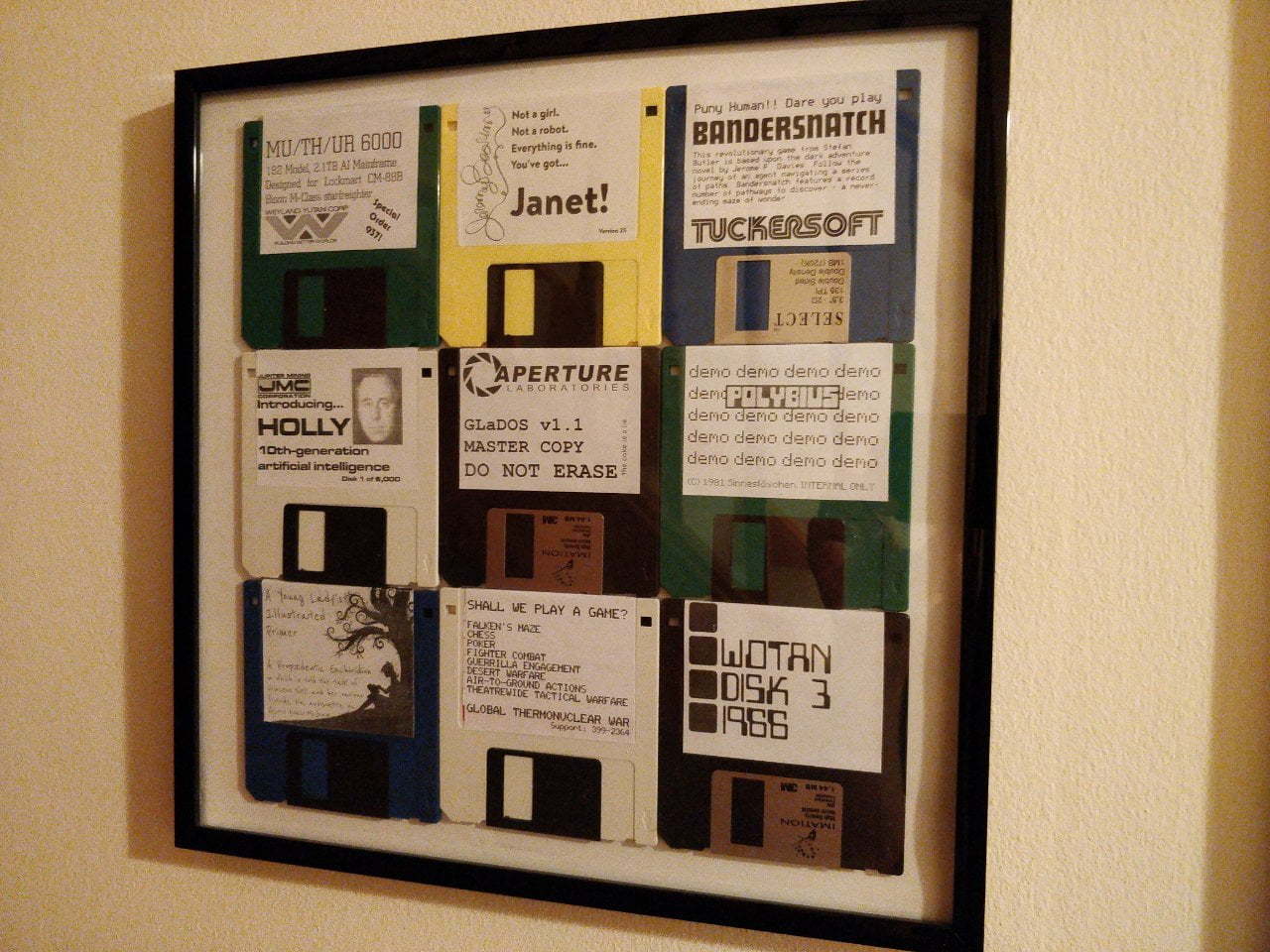
I've built myself a framed set of imaginary software. This is not available to buy in the shops. Mostly because some of the artwork is not my copyright. All the parts are listed if you want to build it yourself. Parts Floppy Disks Printer Labels Frame Background As part of my Floppy Disk Walkman project, I asked my friends to send me a couple of floppies. Alistair and @gas_liverpool both…
Continue reading →

I was signing up to a website the other day, and it wanted to know my title. Here are the options it offered me: Look, I get it. If I'm ever daft enough to undertake a PhD and masochistic enough to complete it - I am going to demand that everyone addresses me as Doctor Who Doom Octopus. But why this ordering? Why distinguish between male and female doctors? Let's see if the source code holds…
Continue reading →
I've been building digital products and services since the dial-up era. I spent many years working in the private sector. Good design is seen as a necessity. Customers will switch to another service which is easier to use, has a better app, or offers a nicer experience. I now work in the public sector, where things are a little different. Jeffrey Allen@jallen300We're hiring #servicedesign-ers…
Continue reading →
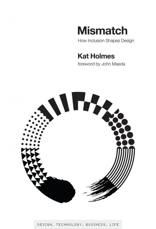
In Mismatch, Kat Holmes describes how design can lead to exclusion, and how design can also remedy exclusion. Inclusive design methods—designing objects with rather than for excluded users—can create elegant solutions that work well and benefit all. Holmes tells stories of pioneers of inclusive design, many of whom were drawn to work on inclusion because of their own experiences of exclusion. P…
Continue reading →