I was in need of a new laptop, so I bought a cheap ChromeBook - mostly because Amazon could deliver it the same day. Sadly, the trackpad was broken. Before I sent it back, I thought I'd try using a mouse with it. That's when I discovered that accessibility is very much a second thought for all the young and healthy people Google employ. I have RSI and use a vertical mouse. After decades of regular left-clicking, my index finger is worn out. So I use a thumb button to click. Changing the…
Continue reading →

I've blogged before about how backward the Co-op bank is - sadly, they've not improved in the last few years. I needed to close down my business bank account. I hopped on to online banking, provided all my details, went through 2FA with a physical token, remembered my mother's maiden name and began searching the site. There was no way to close the account. Oh well, I guess I'll give them a call. After 30 minutes on hold I was told "The account closing team leave at 4pm, sorry." It was 5…
Continue reading →

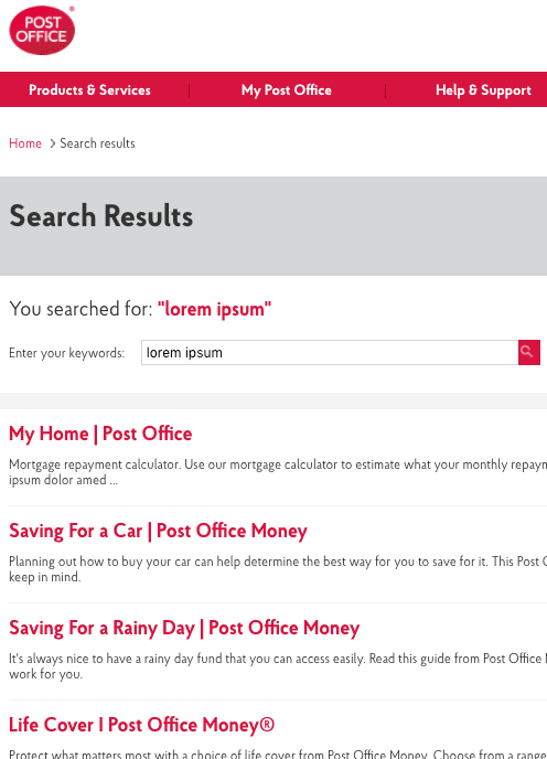
When I'm bored, I like to search websites for the "Lorem Ipsum" placeholder text. It's a quick way to find discarded pages and test content. I was particularly confused that the UK's Post Office had a dozen pages containing that little Latin phrase. A quick dive into one of the pages, found this enlightening snippet of code: This is a monumentally inconsiderate thing to do. I can guess exactly why it happened - a developer got a warning from an HTML validator that alt-text was required. …
Continue reading →

My mate Laura has written a book! She has very kindly sent me a review copy ahead of its release. The first thing to mention is that this is not a technical manual. There's the odd smattering of HTML in there - but this book is much more focussed on why accessibility matters and how to implement an accessibility positive culture - rather than which specific tags to use in your code. This is a book for managers, designers, and programmers. As she points out, Accessibility is… a team e…
Continue reading →

This is a blog post about user interfaces. I was wandering along the beach one day, when I noticed some clever chap had drawn some arrows in the sand. Can you guess where they led? The more astute of you will have realised that these are not human drawn arrows. They are, of course, footprints left by birds. A bird's foot is a "backwards" arrow. The apex points to the bird's rear. It is conceivable that had birds evolved greater intelligence and developed a writing system then their → …
Continue reading →

Twitter has recently improved the accessibility of its site. When uploading an image, a user can add alt text - a short description of the image for people with visual impairments. Here's an example: Terence Eden is on Mastodon@edentThis is a test to see if alt-text in images is searchable on Twitter.alpaca omnithorp pic.x.com/jhgcsaxpkd❤️ 1💬 0🔁 010:37 - Sun 19 February 2017 If you take a look at the HTML source, you can see that I've added a unique string as the alt text. That should make …
Continue reading →

Is email dead? I don't think so - but I know lots of people who either don't have an email account or deliberately don't check it. And why should they? Is email a requirement for modern life? All the major chat apps - WhatsApp, Line, Signal, Wire, Skype - only require a mobile phone number. Hey presto I can communicate with anyone around the world. No email required. But, suppose I wish to engage in a more public social network - can I do that without an email address? Absolutely! The…
Continue reading →

Cheques (checks if you're American) are an amazing legacy technology. Invented in the 17th Century, they immediately transformed the financial landscape. They allowed anyone to transfer both vast and trivial sums of wealth with ease. Whole industries grew up around them - one of my first jobs was programming binary loadlifters repairing computerised cheque-readers - they're an example of a technology which "just works". Which, of course, is nonsense. They're fragile, easy to forge, have…
Continue reading →

I love my keyboards. I mean, I have an unhealthy obsession with them. I spend a lot of time typing and the cramped keyboards which come with most laptops and MacBooks just don't cut it for me. Their poor ergonomics leave my wrists in pain. For years I was a devotee of the Microsoft 4000 Keyboard. It's a big old beast - and that's its main drawback; it's just too large to carry around. It could also do with an integrated USB hub if it's going to take up one of my precious laptop ports. So…
Continue reading →

After much kerfuffle, the world has finally got used to the new Google logo. Well, almost. My eye is continually caught by the poor contrast of the yellow "O" against its background. Take a look... This is Google's default logo on its regular grey background. The contrast ratio between the yellow and grey is 1.50. That fails to meet current accessibility guidelines. This is just awful - I find it quite hard to read, especially for long passages. The text seems to shimmer about the…
Continue reading →

A short chat on why accessibility matters - and what we can do to improve how we approach it. 🔊 Accessibility with Laura Kalbag🎤 Terence Eden 💾 Download this audio file. Get About A Minute as soon as each episode goes live. Stick this Podcast Feed into your podcatcher Or you can Subscribe on iTunes Intro music "Gran Vals" performed by Brian Streckfus. Stopwatch Icon by Ilsur Aptukov from The Noun Project. This podcast is licensed under a Creative Commons Attribut…
Continue reading →

