Mobile Badvertising – Part 3
Another in the occasional series looking at mobile advertising gone bad.
Who doesn't enjoy a good, clean game of scrabble. After a busy day reading The Times, nothing takes the edge off the day like a word puzzle. Wait! What's this?

Scrabble Banner
So far, so good. A clear, professional banner. It clearly emphasises that - although it's an advert - it's endorsed by The Times; so you won't get scammed.
Three mentions of the word "mobile" might be overdoing it though.
Let's click...

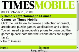
Standing between me and my game
I'm not a fan of interstitials. There's a lot of rubbish talked about the three click rule, but sticking needless pages between your customer and your content isn't a smart idea. Have you ever been to a supermarket which made sure you really wanted to enter its hallowed halls before you started buying milk?
One of the great things about computers is that they can do hard and boring things for us. One task they are particularly suited for doing is looking up data. Never rely on the customer to know whether they've got a "Java-capable" phone. You may as well say "Only phones with 16 bogomips or greater". If something won't work under certain conditions, don't show it under those conditions.
Your site should be set up so it doesn't show inappropriate adverts. If you're showing that advert to an iPhone user, you've wasted their time and you've wasted your advertising inventory.
Luckily, my BlackBerry will run Java games, so I click.
Onwards!

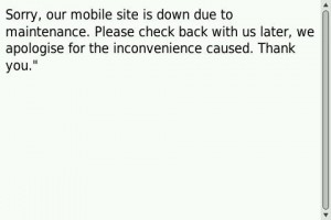
What The...?
To borrow a phrase from Ewan Mcleod: "Arse". After all that, you're not even going to work.
Just a one off? No. I tried this several times over the week. It failed. Every time.
Now, this isn't The Times' fault, oh no.

Oh Jamster...
So this is a compound failure by Jamster, The Times and whoever is their advert manager.
Conclusions
- Make sure your advert links to a site that works!
- Monitor your site - count the number of error pages it serves. If you see a high volume of 40x errors - fix them.
- Test the adverts on your site - pull them if they don't work. This is especially true if you co-brand them.
- Make sure you only show relevant adverts. Not only will showing an iPhone specific advert to a non-iPhone user cause annoyance, it's a waste of your advertising resources.
- Don't put unnecessary barriers between a customer and the content.
- If you have to show a maintenance page - give the user an indication of when you expect things to be working again so they know when to come back.
- Put the same amount of effort into your error pages as you do your main pages.
Overall, it wasn't the advert that was the problem - it was the infrastructure behind it.