I am a regular user of Transport for London's services. On my phone I have the TfL Go app for finding my way around the city, and a web shortcut to a specific bus stop so I can find my way home.
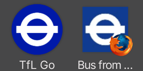
Why are they different shades of blue⁉️⁉️⁉️
TfL, like most large organisations, have brand guidelines. It enables them to set a consistent look and feel across their services which, hopefully, makes it easier for users to identify them. A glowing roundel in the night tells you you're near a tube station, the colours of the lines reassures you that you jumped on the right train, even the font lets you know you're in the right place.
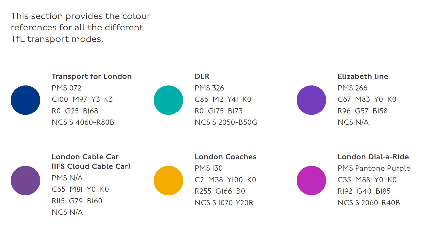
They publish the TfL Colour Standard - a short document which explains what all their colours are.
If you examine the TfL Go app you'll see that its icon is R0 G25 B168 (#0019A8).
But on the web, their standard Favicon uses R17 G64 B145 (#114091).
Yet their Apple Favicon uses R17 G59 B146 (#113B92).
Over the years, the colour standard has been refined. Issue 1 from 2003 had the corporate blue as R0 G45 B115 (#002D73) with a "web safe" version of #003399.
By Issue 2 in 2007, the corporate colour was set at R0 G25 B168, with a web safe version of #000099. The same is present in 2007's Issue 3.
Given the RGB value has been in set in stone for over 15 years, where does this discrepancy come from?
I don't think it is an accessibility issue. TfL have great documentation on how they meet WCAG and I can't see the correct corporate colour causing any issues.
As far as I can tell, the #113B92 colour first appeared on the web around 2012.
The #114091 Facicon first appeared around 2014.
Along the way, they also had this nifty iPhone icon with, you guessed it, another shade of blue #0044a3.
Perhaps it is a conversion issue? What's the CMYK?
The colour standard says corporate blue is C100 M97 Y3 K3 But the TfL elements standard says it is C100 M88 Y0 K5.
Both agree that it should be Pantone 072.
Looking at the Pantone website that blue is #1007a0.
Which, If I convert to CMYK is C90 M96 Y0 K37.
Any way you slice it, that's several completely different shades of blue!
For You, Blue
Colours are hard. Humans have varying perceptions of shades and hues. We have several different ways of representing these colours. Applying colour to a screen is different to applying it in paint or fabric.
True consistency across different media is almost impossible.
But, on digital media, having a single colour is a relatively simple technical issue. Pick a single RGB (or HSL) colour and stick to it.
There's no reason that I can fathom that these two icons should be different. If you disagree, please let me know what basic error I have made.
2 thoughts on “Singing the TfL Blues”
Ah, yeah we should fix that 😃 The website is getting quite old now, so there are definitely some pieces that are not quite right. Btw, what would we need to do in TfL Go that would mean you didn't need the web link anymore for your bus info?
| Reply to original comment on bsky.app
More comments on Mastodon.
Trackbacks and Pingbacks
[…] Why TfL “appears” to use two shades of blue for its app and website Terence Eden’s Blog […]