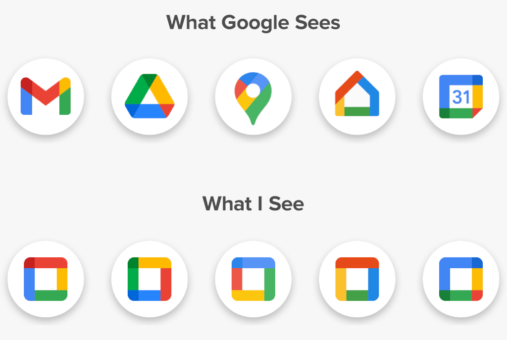
Some of my best friends are designers. But I think we can all agree that - however well-meaning - they can be a little obsessive. Whether it is fretting over tiny details, or trying to align to a grid which doesn't exist, or spending time removing useful affordances in the name of æsthetics - they always find a way to make something prettier at the expense of usability.
Google used to have some beautiful logos for its apps. Each had a distinct shape, style, and colour. Then, someone decided that they all needed a consistent visual language. And this mess was born.
*sigh* I get it. I really do. Brand is a thing. Users often use visual heuristics to identify similar groups. Having each team go wild on an icon design doesn't always reflect the professionalism and consistency that you want to project. The logos aren't awful - but I find them a little boring. Not the worst sin in the world. Though that's only half the problem.
In Google's Android, they've decided that - for consistency - all icons must be firmly encased in a white circle. It makes everything look clean, consistent, friendly, and...
...oh.
I apologise for getting old. My visual acuity isn't what it once was. When I'm staring at my phone, with its screen caked in fingerprint grease, on a juddering bus, after a long day at work, all I want is a quick way to identify the app I want to use.
Like most people, my brain has evolved to take mental shortcuts. It looks for a distinct shape and colour to identify things. I simply can't do that with modern Android's adaptive icons. They all look like white circles with a splodge of colour in the middle.
A few years ago, I wrote about fixing Android's circular icons. Sadly, I don't have the skill to produce my own icon pack. But using the open source Iconeration I was able to manually set my icons to be beautifully inconsistent.
With a glance, I can immediately see which is which. Do I care that they're not all aligned perfectly? Nope!
I've got a high-resolution screen, I want high-resolution artwork. Look at that Firefox icon! It is gorgeous! It isn't a pale, flat, blob - it has texture and uniqueness.
Phones used to be wild and unique - now they're all boring black rectangles. User Interfaces used to reflect the aspirations of their designers - now they're just a bland corporate mediocrity.
I hope, one day soon, the fashion pendulum will swing back and interfaces can become interesting again. Until that day, I'll use Iconeration to make my phone easier and more delightful for me.

6 thoughts on “Inconsistency is a feature, not a bug”
Eric
I agree completely! I often have apps installed on my Android phone that I only use rarely. But when I do want to use them (such as the Google Play Store or whatever it's called these days), I have to slowly search through the icons because it no longer stands out---even when I know what it should look like, too many are too similar! (And my eyes aren't that old.)
Google and Apple have been driving towards greater uniformity and less variation in their software design languages over the past few years, but their uniformity…
| Reply to original comment on toot.cafe
@baldur Skeuomorphs of skeuomorphs?
| Reply to original comment on dice.camp
@baldur@toot.cafe Yah I never liked Android UI at all. So I went full LCARS years ago... and never looked back.
| Reply to original comment on notroot.online
I feel so seen by this blogpost 😄 I really miss the old Google logos
| Reply to original comment on bsky.app
@Edent I save a bunch of icons just for this purpose. On Android I use the Nova Launcher and it has the best support for setting custom icons. Mostly I do this out of a desire for consistent look. Not change for the sake of change
| Reply to original comment on mastodon.social
More comments on Mastodon.