OK, first off, you have to read this amazing judgement about whether Walker's Sensations Poppadoms count as a potato-based snack for VAT purposes. Like most judgements, it is written in fairly plain and accessible language. The arguments are easy to follow and it even manages to throw in a little humour.
But if you read closely, you'll see there are a few instances where an errant question-mark pops up:

From context, it is pretty clear the word should be "flour" but is rendered as "?our" - why is that?
The original PDF judgement can be downloaded from the official Tribunals website (an ancient service which is long overdue for an update).
If you search the PDF the word "flour" and select it, notice what happens:
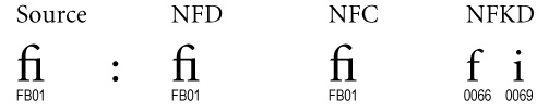
Looking at the metadata of the PDF, it appears the file was created with Office 365 which has "helpfully" used a typographic ligature - "fl".
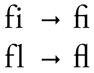
Ligatures are handy for displaying characters in a pleasing manner - but they can really confuse some software.
One way to deal with this is to use a process called "Unicode Normalisation". It is rather dull and technical, but there are plenty of libraries which will split these characters.
Here's how it works for the "fi" ligature:
There are a few issues here.
Firstly, Office 365 should not be using Unicode ligatures. The text should have the letters "f" and "l" but it is the font which should display as a ligature.
Secondly, Bailii's processing of the PDF should either cope with normalisation or it should throw loud and explicit warnings when it runs into something it doesn't understand.
Thirdly, as well as Bailii and the Tribunal Service, the PDF is also available at the more modern Case Law service from The National Archive. Their HTML and PDF documents also have the ligatures, but have subtly different layouts because they have been re-rendered with LibreOffice 7.2.
I've reported the issue to Bailii via their contact form. I've also raised a bug with The National Archive.
And now I'm off to enjoy some tasty potato-based snacks which have been assessed at the correct level of tax!
12 thoughts on “A small text rendering bug in legal judgements”
@Edent I hope you have success in your report to Bailii, I hope it turns out well. When I corresponded on a technical issue years ago, I was sent away with a flea in my ear—but did receive a kind apology later, so there is always a possibility of improvement!
| Reply to original comment on indieweb.social
@Edent The next time I get mildly scolded for pedantic textual analysis of something, I'm going to point to the time a real live judge wrote
| Reply to original comment on social.chatty.monster
@losttourist @Edent
I'm suing for damages as my wagon wheels crumbled into a biscuity mallowy mess the first time I tried to haul my wagon over a bumpy trail... .. 😉
| Reply to original comment on masto.alittleofnothing.co.uk
@Edent These court cases of food manufacturers versus HMRC about VAT liability are like high stakes and expensive versions of the arguments people have about whether a hot dog is a sandwich.
| Reply to original comment on romancelandia.club
@beecycling or indeed, if a jaffa cake is a cake or a biscuit (yes I know this has been ruled on already)
| Reply to original comment on mastodon.social
@Edent we see this in the supplementary sections of the science journal I work on (i.e the bits not typeset or edited). Of course we try and fix it up if we notice but it’s a pain!
| Reply to original comment on mastodon.me.uk
@Edent Seriously, hedgehog-flavoured crisps? Or was it a test to see who'd managed to read that far?
| Reply to original comment on lingo.lol
@Edent I had a copy of the Routledge Introduction to Descartes that was just completely missing all the fi and fl ligatures. Just blank space where they should have been. In an honest to god printed book.
| Reply to original comment on mathstodon.xyz
Frankly, I feel like the "fi" and "fl" ligatures are less pleasing and more confusing to the eye. The dot above the "i" is gone, and the two letters don't look like two distinct letters anymore, "fl" looks like "A".
At least with Firefox on Linux at 2024-01-23T20:12:02Z it appears as two separate characters, at least in the first link to the HTML version.
@edent
They appear to have fixed it after I contacted them.
rerdavies
Ironically, you have presented the evidence that fi/fl ligatures should NOT be decomposed. Documents should store text in either NFC or NFD format. NFKD normalization is destructive, and is used only for... searching/comparison. In the table you have presented, fi is composed in both NFC and NFD, which clearly indicates that fi/fl should not be decomposed even if stored in NFD (decomposed) form.
More comments on Mastodon.