Should Android's Dark Mode Invert Contact Photos?
I don't know if this is a bug, or just the way the world works now.
Several of the people who live in my phone use artistic black and white headshots. They look very cool. But my Android phone shows their image with inverted colours - so they look like pure shite.
Here's what my very real human girlfriend looks like when I ring her to go for brunch:

Come the evening, my phone switches to Dark Mode™ - so this is what she looks like when I ring her for a late-night booty call:
What's causing this? And is it expected behaviour?
I'm running com.android.contacts version 1.7.34 which appears to be the latest version of the AOSP contacts app. It's bundled with LineageOS.
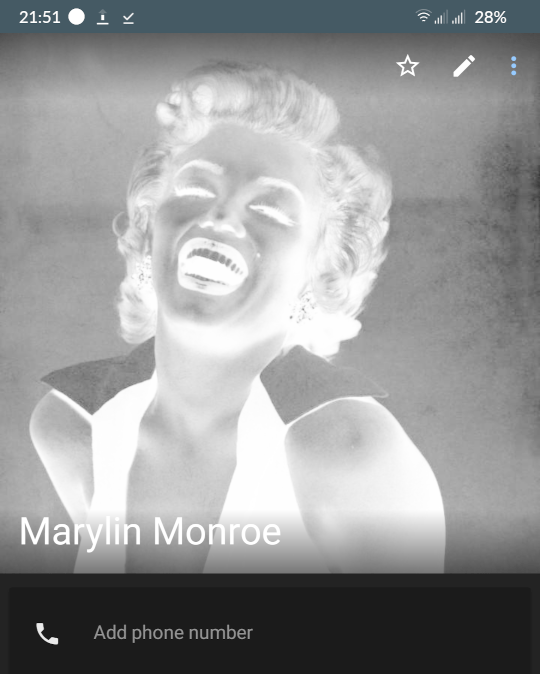
Demo
If you're not lucky enough to be dating Marylin Monroe, here's a demo image for you to try:

Is this expected behaviour?
Based on some quick tests, it appears that the contacts app will invert some monochrome images when it thinks there's "too much" bright white in the image.
Interestingly, the contacts list doesn't invert avatars when in Dark Mode.

And... I don't know if I want this to happen. I guess that most people who use Dark Mode want to avoid blinding bright white light searing into their precious eyeballs. But, presumably, they don't want the photos of their friends inverted into a weird artefact-ridden mess?
So, before I get lost in Google's Kafka-esque bug reporting process - do you think this is expected or desirable behaviour?
mike says:
Undesirable. Avatars are part of how you recognise a contact. Inverting the colours messes with that. If preventing eyeball searing is the goal, make the image dimmer. Something like, slap a black PNG over it, set the opacity of that layer to 10%.
It's a possibly useful behavior while viewing PDFs, but for me it's absolutely undesired for any kind of photo, including those for contacts.
You know what would be better? If it reduced the brightness for any image it considers too bright. That's still recognizeable and better-looking than reversing their colors.
I would say this is neither expected nor desirable
DinoNerd says:
Cynically speaking:
Desirable behaviour: hell no.
Expected behaviour: whatever's least convenient for users, and maximally violates the principle of least astonishment.
Less cynically: I don't understand dark mode. It's not something I felt a need for, before it came out, or voluntarily use now that it exists. (Sometimes it's on by default, or otherwise intrudes on me.) So I can't speak to what someone who valued dark mode would want.
More comments on Mastodon.