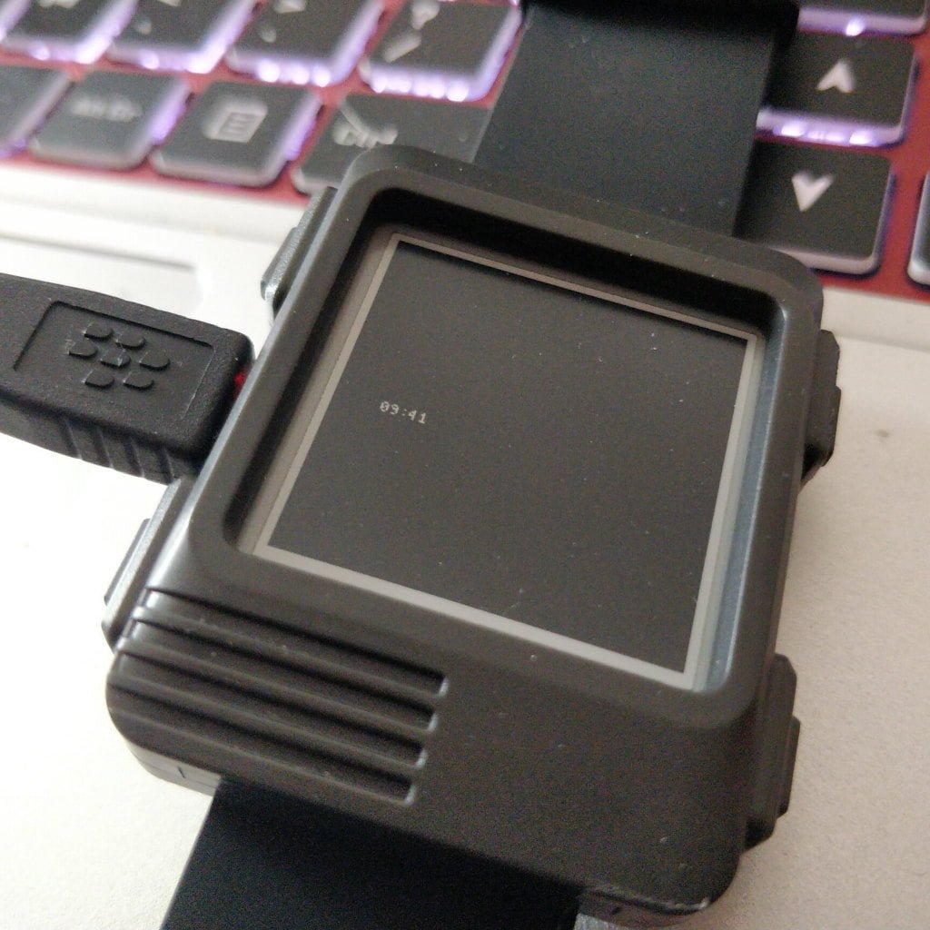
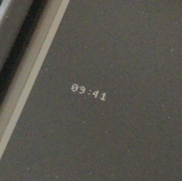
I have the new Watchy eInk watch. It has a cute little screen with a resolution of 200x200 pixels. How much text can we cram in there?
A typical watch face looks like this:

My new watch face is far superior and looks like this:

That's using the GNU Unifont - which works brilliantly on tiny devices.
HOWTO
- Download the GNU Unifont
- Download and compile HarfBuzz
- Run the HarfBuzz Font Subsetter
-
./hb-subset unifont-15.0.06.ttf abcdefghijklmnopqrstuvwxyzABCDEFGHIJKLMNOPQRSTUVWXYZ0123456789\!\"\£\$\%\^\&\*\(\)\-\_\=\+\@\~\'\#\,\.\/\?\:\;\<\>\\\| -o latin.ttf - Convert the output to AdaFruit's GFX format using truetype2gfx (set the Font Size to 5 points for about the smallest you can reasonably go. But Font Size of 8 is a better compromise between size and readability.)
- Follow the
tutorial to create a new watch face
-
NOTE
If you put the font file in the same director as the
.inofile, you need to include it using#include "latin5pt7b.h"
-
NOTE
If you put the font file in the same director as the
- Compile and upload to your watchy via USB.

Nice!
Next Steps
I dunno. Make it bounce around? Print a Shakespearean sonnet? Give me some suggestions!
2 thoughts on “Stupidly Small eInk Font”
You could display many timestamps simultaneously (every minute this hour, or ±30 minutes, etc.) and use color inversion to highlight the current time.
Or make it a progress bar, where the time moves through the hour or day.
Or maybe show recently-edited Wikipedia pages. Maybe you'll see something interesting.
Or StackExchange hot network questions.
Or check out what productivity/PIM apps were popular on the old 160x160 PalmOS devices, maybe there's inspiration to be had there.
@Edent Given how far back your blog covers, you could build an "at this hour" feature, selecting a blogpost from history that you posted around the current time and display the title, publishing date and intro
| Reply to original comment on mastodon.bentasker.co.uk
More comments on Mastodon.