Introducing Paper Prototype CSS.
When I first started designing the OpenBenches website, I wanted to make it look deliberately crappy. I didn't want the people testing it getting too hung up on what it looked like. I've found that some beta testers can only focus on whether the colours are right, or if things should be placed on the left or right.
So I wanted something which mimicked "Paper Prototyping". A website which looked vaguely hand-drawn. As though it were scraps of paper and Post-It® Notes stuck on a roll of canvas.

That way, people can immediately see that the design is deliberately "scrappy" and temporary.
I've decided to go a little further than my last experiment and create a fairly comprehensive Style Sheet which you can use on any new project - Paper Prototype CSS.
Here's what it looks like:


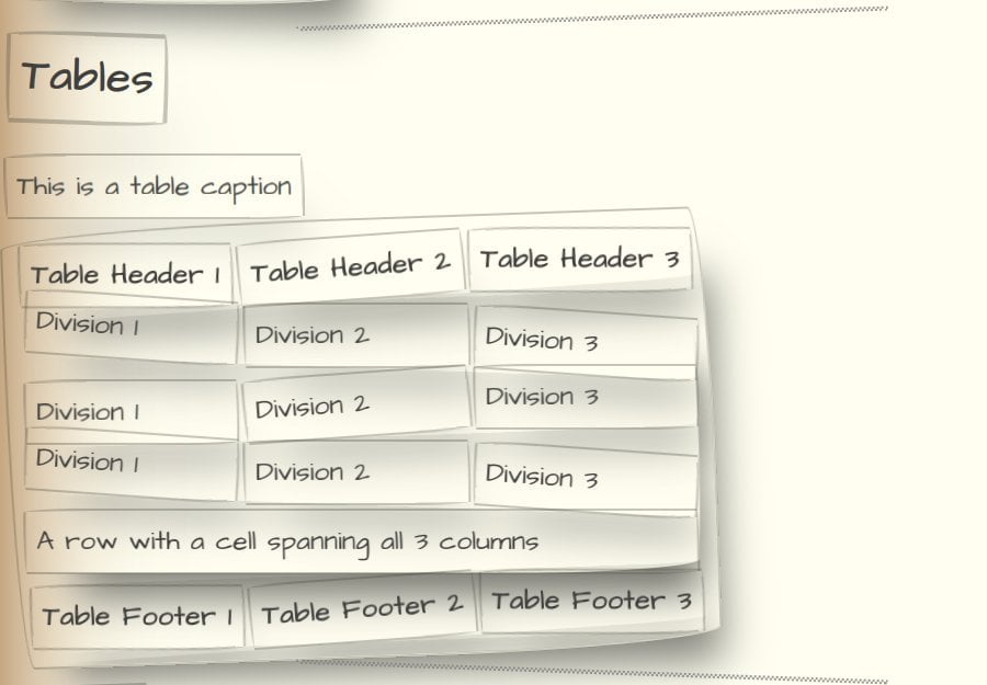
To be clear, this is not designed to look good - quite the opposite. It is a base to build on so you can build something quick and dirty.
Use it to throw together something where you want to concentrate on the content, not the presentation.
Features
The askew elements use nth child selectors to rotate them in different directions:
CSS
*:nth-child(odd):not(body):not(html){ transform: rotate(2deg); } *:nth-child(even):not(body):not(html) { transform: rotate(-2deg); }
The weird border radius uses:
border-radius: 255px 15px 225px 15px/15px 225px 15px 255px;
With thanks to
Everything is based on something else. I took heavy inspiration from, and made liberal use of:
- Handdrawn CSS
- Doodle CSS
- Poor Man's Styleguide
- Paper Texture Background
- Handwritten body font and monospace font
Download
You can clone the repo to get started. If you find it useful, please let me know. Pull Requests very welcome.
11 thoughts on “Paper Prototype CSS”
@Edent It's designed to not look pretty, but hey, look at the examples!! A complete failure 🤪
| Reply to original comment on idf.social
This is very cool. One challenge I have found though is while having lo-fi visuals helps getting feedback, you still need real text / data content to get relevant feedback.
| Reply to original comment on twitter.com
Uhm I love this 😍
| Reply to original comment on twitter.com
This is really neat. I remember playing with a Swing (I think) theme that did this for Java apps many years ago - being able to make unfinished prototypes deliberately look unfinished is such a useful capability
| Reply to original comment on twitter.com
I know what I'm playing with on Tuesday!
| Reply to original comment on twitter.com
15 years later, people are still recreating Microsoft Sketchflow.
| Reply to original comment on twitter.com
This is absolutely amazing! Thanks for sharing.
| Reply to original comment on twitter.com
Paper Prototype CSSlobste.rs/s/sraojh #css #webshkspr.mobi/blog/2022/06/p…
| Reply to original comment on twitter.com
Johannes Rexx
You make an excellent point. When the initial website already look polished the "project managers" and likely the customer representatives will get the impression that the work is much further along than it really is. That sets expectations that the website is much closer to completion than it really is. Using rough looking place savers like this CSS goes a long way to avoiding wrong perceptions.
This Article was mentioned on speckyboy.com
| Reply to original comment on speckyboy.com
More comments on Mastodon.
Trackbacks and Pingbacks
[…] 演示和代码 […]