I'm not a big fan of Virtual Reality. I find it claustrophobic and impractical for most uses.
There are some areas which it does impress though.
Scale.
Half-a-dozen years ago - during one of VR's periodic hype-phases - an employer asked me and my team to "do something interesting" with all the expensive VR kit they'd bought on a whim.
We looked at virtual store walkthroughs, simulating the view from a theatre seat, or a view of the country from above overlaid with shiny graphics. None really sparked the imagination.
Then, we had the genius idea of graphs.
Yup! Bar charts!
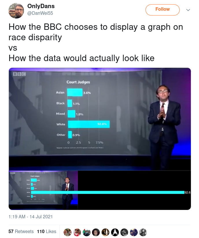
The tyranny of the A4 print out can't be overstated. Every graph is reduced to the same size. Differences are erased. The massive disparity between columns are squished down. Even a 65 inch, 4K TV doesn't really show scale.
But VR does!
We tried a few different things - riding roller coasters over the data, sky diving through the numbers, even rendering the data as monsters and shooting them with lasers.
But, in the end, the thing that impressed was scale.
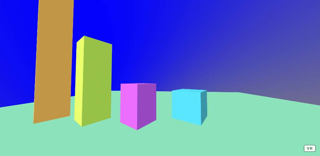
Here's a quick demo I knocked up in A-Frame. (I don't have the original data or hoards of graphic designers to make things look halfway decent. Nor a copy of Unity. Just fill in with your imagination.)

It's a pretty OK way to visualise the data. Imagine some labels and axis on there - you can see how wandering around it would give you a sense of the data.
"Now," you tell your CEO, "gaze upwards..."

Whoa! From playing around with small numbers to suddenly being confronted by the overwhelming power of a giant number.
Look, is this the best way to visualise data? No! Probably not. Is it a good way to visualise data? Also no!
But it is good at preventing a certain class of problem when viewing data:
Most of the time, statistical graphs are static. Occasionally, they're animated. But when you need to impress on someone the magnitude of a number - sometimes VR is the answer.

2 thoughts on “VR for Statistics”
AR would work a lot better here because then you don't have the claustrophobia although then you have the problem of fitting it into the user's existing space.
| Reply to original comment on twitter.com
Merton Hale
Wow, cool idea. I’d love to see the graphics produced by Hans Rosling, Gapminder, presented with VR. See https://www.youtube.com/watch?v=hVimVzgtD6w&t=658s as an example. For more just search “Hans Rosling” in Youtube. His Gapminder software is the most impressive I have ever seen for presenting data graphically. It seems like nobody uses it, and its free (sort of). Can you imagine sports stats displayed with this software? I’m sort of a “graphical presentation of data” geek. In my experience most people/companies, etc. do it very poorly.