I'm doing an apprenticeship MSc in Digital Technology. In the spirit of openness, I'm blogging my research and my assignments.
This is my paper from the Data Analytics module. I enjoyed it far more than the previous module.
This was my second assignment, and I was amazed to score 72%. In the English system 50% is a pass, 60% is a commendation, 70% is distinction. Nice!
A few disclaimers:
- I don't claim it to be brilliant. I am not very good at academic-style writing. I was marked down for over-reliance on bullet points.
- This isn't how I'd write a normal document for work - and the numbers have not been independently verified.
- This isn't the policy of my employer, nor does it represent their opinions. It has only been assessed from an academic point of view.
- It has not been peer reviewed, nor are the data guaranteed to be an accurate reflection of reality. Cite at your own peril.
- I've quickly converted this from Google Docs + Zotero into MarkDown. Who knows what weird formatting that'll introduce!
- All references are clickable - going straight to the source. Reference list is at the end.
And, once more, this is not official policy. It was not commissioned by anyone. It is an academic exercise. Adjust your expectations accordingly.
Abstract
We describe a method of visualising change of data over time using an animated TreeMap. This is used to display how government policies affect the type of files that government departments publish.
This research forms part of a MSc project to better analyse the data and metadata generated by the UK government. It will inform future storage space requirements and what incentives are needed to help the government meet its Open Government Partnership commitments.
This project was brought about following the Prime Minister and Cabinet's recent commitment to ensure that data are published in formats which are as open as possible (Johnson, 2021).
The use of time-series visualisations forms an essential part of our department's ability to monitor the effectiveness of our policies and guidance in an intuitive way.
The end result is a short video which shows the volume of files uploaded over time, and whether they meet our department's standards for openness.
1. Business Challenge Context
The UK Government publishes tens of thousands of documents per year. Each government department has responsibility for their own publishing. The Data Standards Authority (DSA) is responsible for ensuring that documents are published in an open format.
There is growing concern about the number of documents being published as PDF files (Williams, 2018).
The following questions have been identified as important to the organisation:
- How many different document formats are regularly used?
- How is the ratio between open:closed changing over time?
- Are the number of PDF files published increasing or decreasing?
- Which departments publish in non-standard formats?
- How can we visualise the data?
Answering these questions will involve analysing a large amount of data to produce a visualisation which can be used by the organisation to improve its business practices and quality of output.
The analysis is undertaken with the understanding that retaining the trust of our users and community is paramount (Véliz, 2020).
2. Data Analytics Principles
How key algorithms and models are applied in developing analytical solutions and how analytical solutions can deliver benefits to organisations.
Machine Learning (ML) provides the following key benefits:
- ML allows us to dedicate cheap and reliable computational resources to problems which would otherwise use expensive human resources of inconsistent quality.
- For example, ML can be used to extract text from documents and perform sentiment analysis to determine how they should be classified ( Arundel, 2018).
There are two main models of ML:
- Supervised learning:
- If data has already been gathered and classified by humans, it can be used in ML training.
- A portion of the data is used as a training set - for the ML algorithm to process and derive rules.
- A random sampling of the data is withheld from the training set. The ML process is run against this validation set to see if it can correctly predict their classifications.
- Unsupervised learning:
- Uses unclassified data to discover inherent clustering patterns within the data.
- There are multiple clustering algorithms, each with a different bias, and so choosing the correct one can be difficult ( Xu and WunschII, 2005).
In both cases, ML seeks correlation between multiple variables:
- Pearson correlation coefficient assigns a value between -1 and +1 based on the relationship between two variables, divided by the sum of their standard deviations ( Pearson, 1895)
- Linear Regression attempts to find a "best fit" linear relationship, usually via a sum of squared errors.
- With any results it is important for analysts to understand that correlation does not imply causation.
Another model is Big Data:
- Although facetiously referred to as "larger than can fit in excel" ( Skomoroch, 2009), Big Data usually refers to the "Four Vs" of Velocity, Volume, Variety, and Veracity ( Kepner et al., 2014 ).
- While Big Data can be helpful in gaining insights, complex approaches such as MapReduce ( Dean and Ghemawat, 2008) are needed to efficiently analyse datasets using parallel processing.
- As a government department, we need to be mindful of the dangers to the public caused by Big Data ( Zuboff, 2020).
All algorithms suffer from learning bias:
- Systemic bias is present when data are captured, when decisions are made about how to classify data, and when data are analysed ( Noble, 2018).
- Failure to correct for this bias could be unlawful ( Equality Act, 2010 ).
- Finally, we must recognise that a training dataset will always be inferior to the full data record. This is commonly known as the "no such thing as a free lunch" problem ( Wolpert and Macready, 1997).
2. The information governance requirements that exist in the UK, and the relevant organisational and legislative data protection and data security standards that exist. The legal, social and ethical concerns involved in data management and analysis.
The UK Government is bound by several pieces of legislation. The following are the key areas which impact data management and analysis:
- GDPR is the main legislation covering the processing of personal data.
- It also covers automated decision making and the right of data subjects to view, correct, and port their data ( Data Protection Act, 2018 ).
- This project does not use personal data and is thus exempt.
- Data created by public authorities is subject to laws concerning transparency and openness (
Freedom of Information Act, 2000
) - colloquially known as FOI.
- The data and reports created from this dashboard will be subject to FOI.
- By publishing the data and code in the open on GitHub, we believe that our obligations under FOI are satisfied under a s21 exemption ( National Archives, 2019).
- Accessibility Requirements. All government websites must meet a minimum level of accessibility (
CDDO, 2021).
- If this were to be published, they would need to be tested against modern standards for features like alt text, colour contrast, and keyboard accessibility ( W3C, 2018).
- Members of the Houses of Commons and Lords are able to ask Parliamentary Questions of our department (
Cole, 1999).
- The ability to quickly and accurately answer members' questions is part of our core business activity.
- It is a civil servant's responsibility to allow Ministers to give accurate and truthful information ( Cabinet Office, 2011)
- The Centre for Data Ethics and Innovation is a department which acts as a "watchdog" for ethical use of government data.
- They consider "dashboard" style reports as having an important role in communicating data effectively ( CDEI, 2021).
- The UK is a multilingual country. We have an obligation to consider whether the reports should be published in Welsh (
Welsh Language Act, 1993
)
- A further exercise may need to be carried out to determine how many publications are wedi'i ysgrifennu yn y Gymraeg .
3. The properties of different data storage solutions, and the transmission, processing and analytics of data from an enterprise system perspective. This should include the platform choices available for designing and implementing solutions for data storage, processing and analytics in different data scenarios.
Governments around the world have adopted a Cloud First strategy (Busch et al., 2014), and the UK is no exception. Rather than traditional on-premises equipment or dedicated remote servers, we use a set of scalable resources which automatically adapt to our needs. Along with edge processing, caching, and associated features, this paradigm is commonly known as "Dew Computing" (Ray, 2018). This allows us to tightly control our costs, reduce our carbon footprint, and scale to meet demand. We can "shard" our data (that is, store it across multiple, redundant locations) (Koster, 2009). However, this requires careful management of transactions to ensure eventual consistency (Tewari and Adam, 1992).
The majority of our documents are stored as unstructured data in an Amazon S3 Bucket. Because of the lack of structured data, they are retrieved via a key-value store using NoSQL (Sadalage and Fowler, 2012). This reduces the overhead of creating and maintaining a schema, at the expense of the ability to construct deterministic queries.
Our enterprise storage needs generally follow the "Inmon Model" (Inmon, 2005) where multiple data publishers store their data in a "data warehouse" - then further processing takes place in separate datamarts.
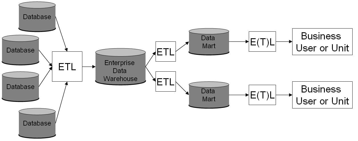
Fig 01 Enterprise Data Warehouse diagram © (vlntn, 2009)
The ability to Extract, Transform, and Load (ETL) data allows users to construct their own queries rather than relying on predefined methods (Theodorou et al., 2017). This increases their utility and decreases our support costs.
Because of the lack of detailed metadata, a search index is generated using term frequency–inverse document frequency (TF-IDF) (Spärck Jones, 1972). TF-IDF is the most common method of building recommendation engines (Beel et al., 2016), and allows us to sort search results by relevance.
Basic metadata is stored in relational databases. This gives us the ability to use Structured Query Language to interrogate the database and retrieve information.
Manually exchanging data using outdated formats or standards is unreliable. During the COVID-19 crisis, contact-tracing data was lost due to the limitations of Microsoft's proprietary Excel format (Fetzer and Graeber, 2020). This has accelerated our adoption of APIs which should not suffer from such data loss. As per the National Data Strategy (Dowden, 2020), we now advocate an API first strategy to ensure that data can flow freely.
Storage and transfer of data aren't the only factors to consider. We also have a mandate to provide "Linked Data" (Shadbolt et al., 2012).
4. How relevant data hierarchies or taxonomies are identified and properly documented.
Taxonomies are useful tools for helping both humans and machines navigate data.
The taxonomy currently used in our data warehouse was identified through a process of ongoing user research involving stakeholders inside and outside the organisation.
Content stored on GOV.UK is subject to a sophisticated taxonomy which was intentionally designed to capture published information within a specific domain (GDS, 2019).
In order to meet the criteria for a well-defined taxonomy, the taxonomy is documented in a format which complies with ANSI/NISO Z39.19-2005 (National Information Standards Organization, 2010). The taxonomy documentation must also retain compatibility with other vocabularies used worldwide (ISO, 2011).
Taxonomies within the content area generally fall into multiple categories:
- Department - who published the content (e.g. Department for Education),
- Topic - what the content relates to (e.g. Starting a Business),
- Metadata - information about the content (e.g. filetype, date of publication, etc).
Documentation is stored in GitHub (GDS, 2021) in order to be easily discoverable and editable.
A supervised Machine Learning process was used to classify content which had not been tagged (Zachariou et al, 2018). This has led to an increase in correctly identified content.
The use of Convolutional Neural Networks to assist in Natural-Language Processing increases the accuracy of the identified data while reducing the human resources needed to keep the taxonomy up to date.
Because individual users and departments are free to create their own tagging structure, the overall effect is that of an unstructured "Folksonomy" (Vander Wal, 2004).
In the future, we may allow users of our service to create their own tags in a collaborative environment. We recognise that this may introduce challenges around diversity and inclusiveness (Lambiotte and Ausloos, 2006).
3. Product Design, Development & Evaluation
The application of data analysis principles. Include here the approach, the selected data, the fitted models and evaluations used in the development of your product.
Approach:
- In order to create a beneficial analytic visualisation, it is important to understand how the graphic will enable interpretation and comprehension of the underlying data (
Kirk, 2021).
- I carried out a brief research exercise to understand the organisational need.
- Stakeholders wanted a way to dynamically visualise the change in proportion of open:closed document formats uploaded to the GOV.UK publishing platform.
Selected Data:
- Both Structured and Unstructured data were available.
- The Structured data was in the metadata of the files - date of upload, name of uploading party, and Media Type ( IANA, 2021).
- The Unstructured data was the contents of documents. Further analysis may be taken on this to determine the conformance of the documents to their purported standard.
- I decided to create a time-series visualisation based on the following structured data:
- Nominal data - the Media Type of the document,
- Ratio-scale numeric data - the number of files uploaded,
- Interval-scale numeric data - the date the file was uploaded.
Fitted Models:
- Representing data in an area, such as a Pie Chart, was conceptually understood by stakeholders. But there are numerous problems with people being able to correctly evaluate the area represented in charts - especially small slices ( Cleveland, 1985)
- An attempt was made at "Data Sonification" ( Kaper, Wiebel and Tipei, 1999). This converts the data into an audio wave so that changes and patterns can be discerned by ear, rather than by eye. The stakeholders considered the resultant "music" to be too experimental to be useful.
Evaluation:
An evaluation was undertaken using the Seven Hats of Visualisation Design (Kirk, 2021).
- Constraints
- Time
- Due to the recent changes in departmental priorities, it was uncertain whether newer, more complete, data could be obtained in time.
- In order to quickly produce experimental results, I reused an existing dataset. Once the complete data were available, I was able to run my developed code against it.
- Budget
- The visualisation tools available (R and Python) were both cost-free.
- The cost of obtaining and storing the data was met out of the existing analytics budget.
- Technology
- We retain enough cloud computing resources for both the storage and processing of this data.
- Reports can be periodically run via a scheduled task manager like
cron, or on demand. - Hosting and transcoding of video content is best suited to a dedicated resource like YouTube.
- Politics
- Any visualisation of data which identified individual departments could be interpreted as a rebuke from our department.
- Our department's role sometimes involves having difficult conversations with other departments; however we strive to do this privately.
- It was agreed that any public visualisation should anonymise departments as far as possible, and that publication would not occur without consultation.
- Time
- Deliverables
- Presentation
- While a static visualisation is common for changes over time, stakeholders suggested a dynamic presentation would be more engaging.
- Animation requires specific consideration of accessibility needs.
- Actionable items
- Stakeholders wanted to know whether past policies had any effect on the publication rate of documents by media type.
- Stakeholders wanted to see the scale of the problem so they could know how much resource to dedicate to it.
- Proactive alerting
- Any report would have to be run periodically.
- Large changes will be immediately visible and can be used as the basis for further investigation.
- Presentation
Our department's mandate is to directly influence the future behaviour of people contributing to the data set. After assessing the various predictive models, stakeholders determined that the ability to predict future data using ML on current trends was not useful. We expect those behavioural patterns to change following our interventions.
Similarly, the ability to predict media type or openness based on filename or publisher was considered irrelevant due to the metadata being already available.
Pie Charts were felt to be an old-fashioned way of representing data - with their use in the UK Government first being popularised by Florence Nightingale during the mid-1800s (Anderson, 2011).
For these reasons, I decided to implement the TreeMap algorithm (Shneiderman, 1992).
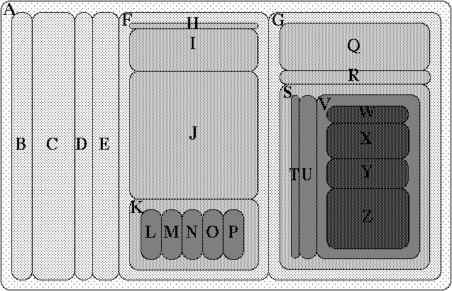
Fig 02 A-Z Treemap with Common Child Offsets © (Johnson, 1993)
TreeMap provides several advantages over visualisations like Pie Charts:
- TreeMap allows users to more quickly understand large and/or complex data structures ( Long et al., 2017 ).
- TreeMap supports sub-groups. That is, a section of the graph can contain sub-sections. This allows for more detail to be displayed.
Initial views of the TreeMap produced non-deterministic results which made comparing a time-series challenging.
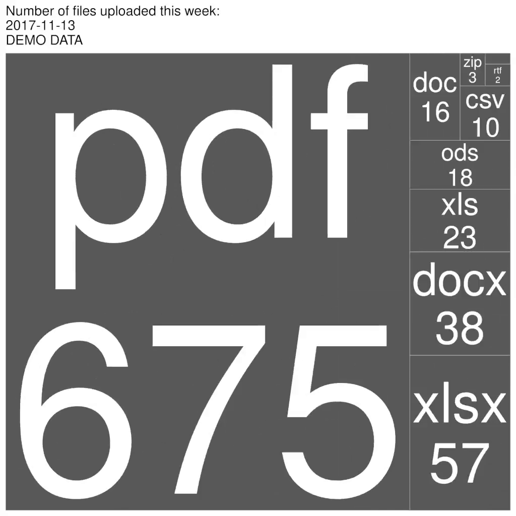
|
|
| Fig 03 Demonstration TreeMaps showing random ordering of results across time periods. | |
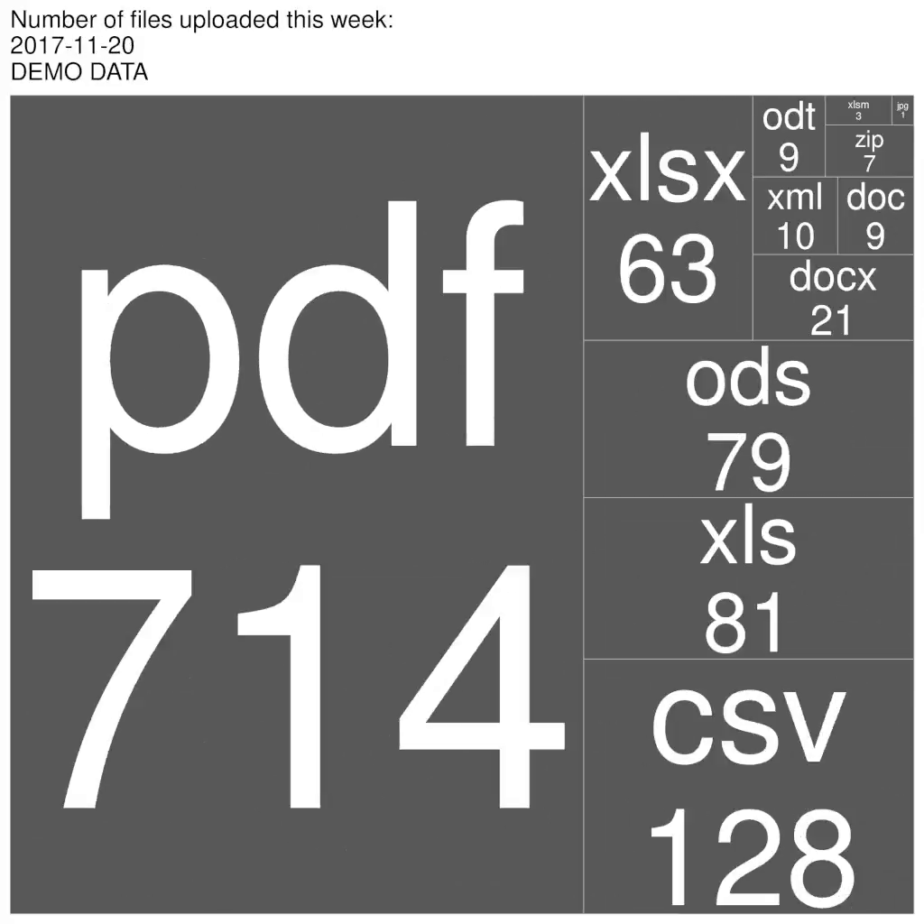
I investigated alternative approaches and discovered that using a squarifying algorithm (Bruls, Huizing and van Wijk, 2000) produced results which were more easily comparable.
|
|
| Fig 04 Demonstration TreeMaps showing results in the same order across time periods. | |
Business Implications and Benefits
- The results of this analysis have been shared with the organisation. We now have a coherent understanding of the size of the problem, and its current trajectory.
- Individual departments will be notified about their results.
- Where departments are continuing to publish data in an unsuitable format, we are able to provide them with support.
- The report can now be run on a regular basis, and used to monitor ongoing compliance.
6. The application of concepts, tools and techniques for data visualisation, including how this provides a qualitative understanding of the information on which decisions can be based. Include here the visualisation aspects applicable to your product.
Our goal when producing visualisations is to be "Trustworthy, Accessible, Elegant" (Kirk, 2021).
Trustworthy:
- Accurate and definitive data was retrieved from the warehouse.
- Raw data was stored for others to verify our results.
- Open source scripts showed how the data are transformed into usable dataframes.
- Ensured the output is deterministic so that others can reproduce the results.
Accessible
- In this context, accessible means both meeting legal accessibility requirements (
W3C, 2018) and available to those that need to see the data.
- Accessibility:
- Care was taken to meet minimum contrast guidelines between text and background.
- Due to the high prevalence of colour blindness in the population ( National Eye Institute, 2019), it was necessary to add labels to ensure that the visualisation was accessible.
- The minimum font size was challenging because, by its nature, some segments of the diagram are small.
- The frame-rate of the animation was set at a suitable frequency to ensure photosensitivity needs were met.
- The final animation was provided as a series of still frames for those that required it.
- Access
- The animations were made available internally via our Wiki, email, Slack, and during presentations.
- The data and graphs were published to GitHub under a permissive licence to encourage access and reuse.
- Accessibility:
Elegant
- As well as accessibility concerns (see above) there were æsthetic considerations. The default colouring provided by the TreeMap library was used.
- User research showed that viewers intuitively understood that area size was proportional to volume of published documents.
When testing with users, the TreeMap performed well compared to the common issues of visualising noted in literature (Cleveland, 1985):
- Over-emphasising small results was not a problem. Due to the visually smaller sizes of the area, and the proportionately smaller font size, insignificant results were ignored.
- Many charts use multiple similar colours. By restricting the TreeMap to four colours there was less distracting visual noise.
- While users were able to intuitively understand that size is proportionate to volume of documents, some shapes produced by the squarified algorithm were not always easily comparable.
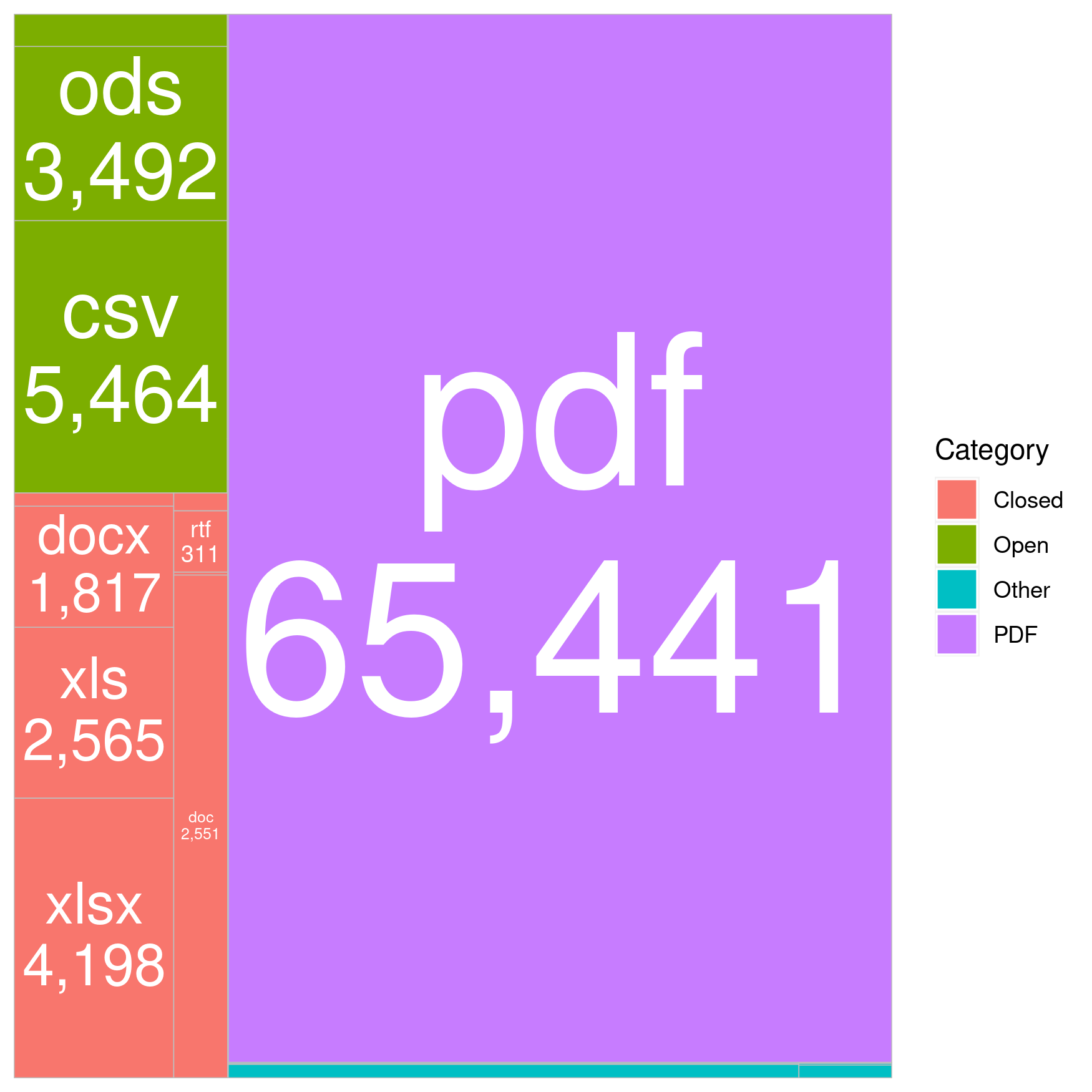
Fig 05 In this example, the tall and thin shape (doc) has a similar area than the more square shape on its left (xls), but users felt it looked significantly smaller.
Due to the use of animation, I followed the example of the animated bubble maps demonstrated by Hans Rosling (Rosling, 2019).
The use of animation was crucial to showing both the scale of the data, and the momentum of change.
Clustering and grouping:
- Another advantage of TreeMap is the ability to subdivide data into groups.
- In this test image, there is no grouping, so it is not possible to see which Media Types are open and which are closed.
Fig 06 Uncoloured TreeMap.
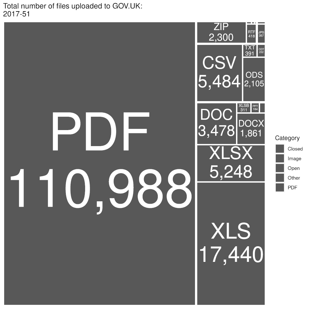
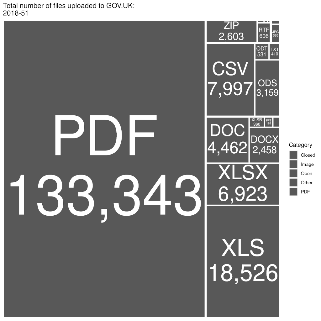
- Once groupings were added, similar Media Types were congruent - which made assessing their relative volume easier:
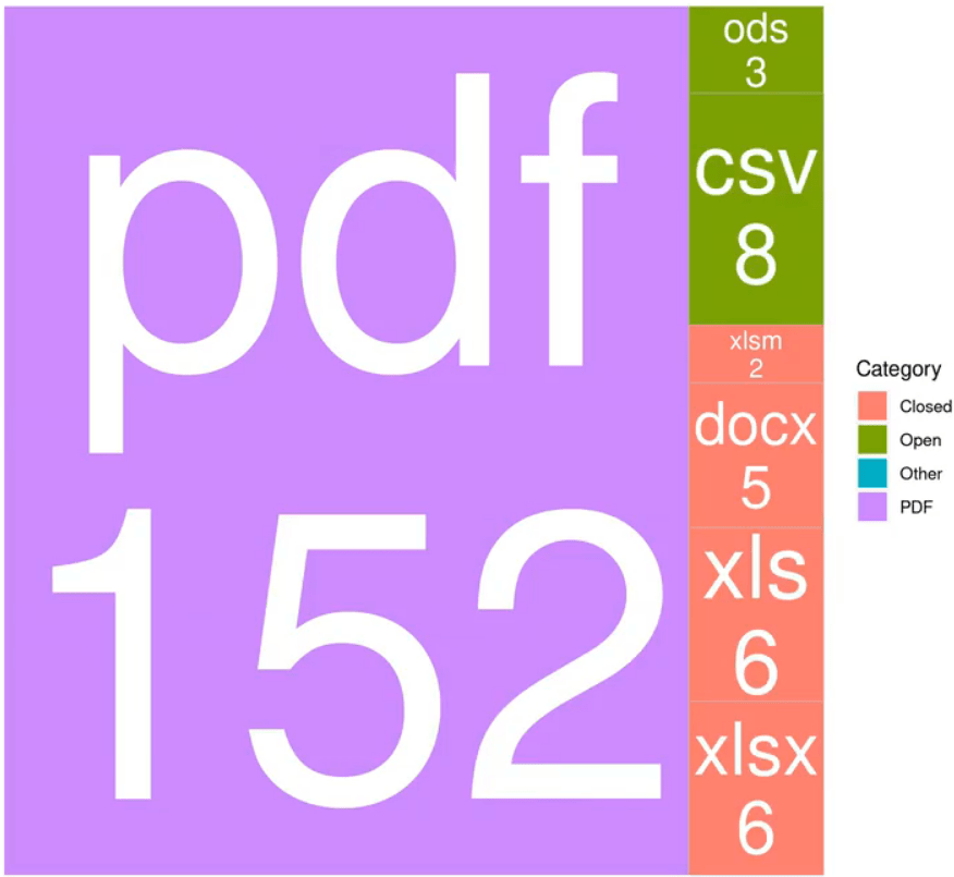
Fig 07 Coloured TreeMap demonstrating grouping.
Alternate view on data:
- The data can be arranged in a multidimensional array and be considered as a "Data Cube" ( Gray et al., 1996 ).
- This allows us to manipulate and slice the data in a variety of ways to more deeply examine relationships between data facets.
- The most requested view by stakeholders was the ability to cluster by department.
- Being able to "slice and dice" this data ( Zaïane, 1999) gives us a more detailed view of the data.
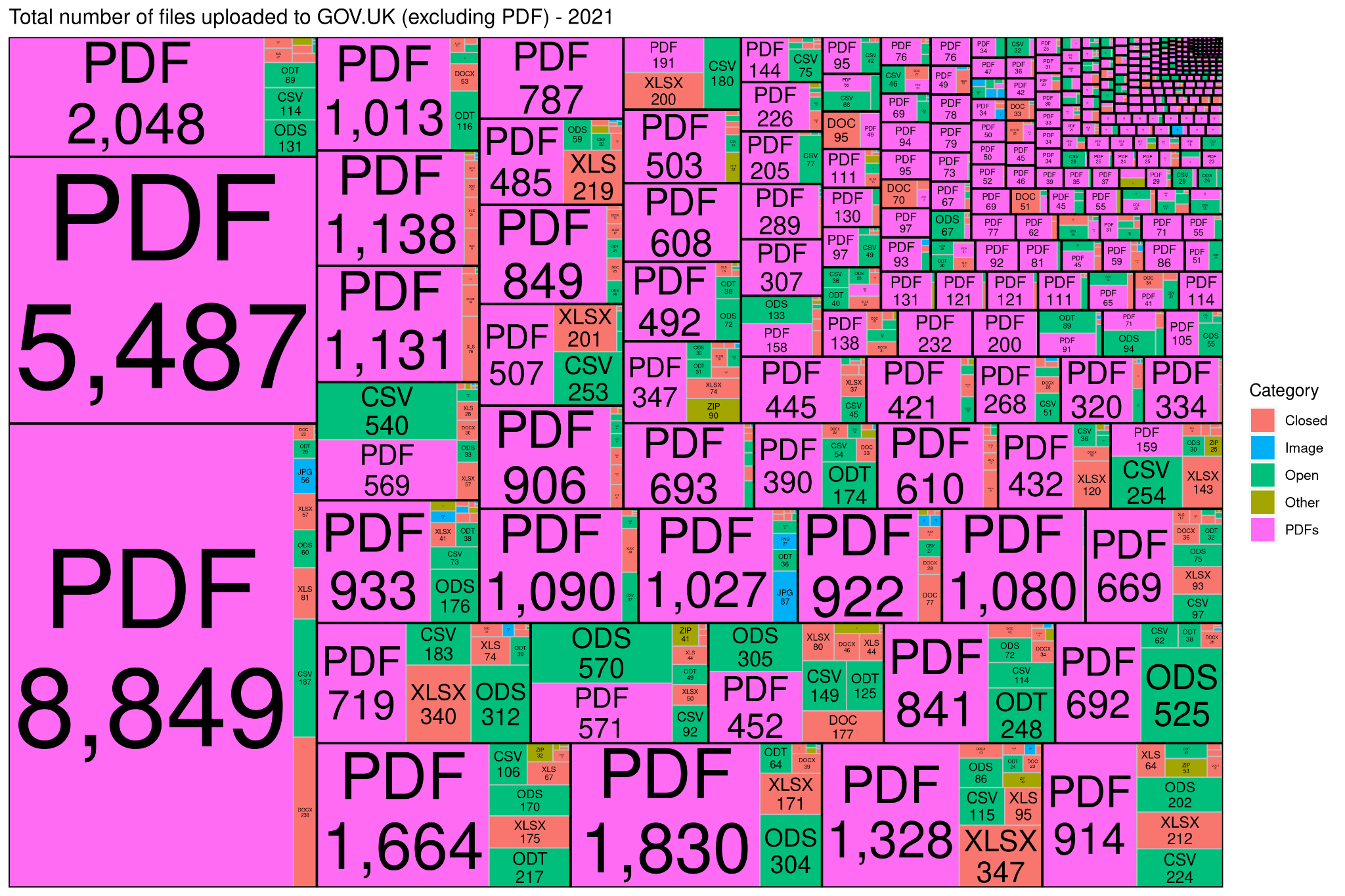
Fig 08 Each black-bordered cell shows a single department, and the number and type of documents they published this year. Department names have been redacted for publication.
The final visualisation was a 30 second animation which demonstrated the rate of change of volume of uploads of different Media Types and their categories.
4. Personal Reflection
A reflective evaluation of the implications of conducting this investigation for your learning development on this programme.
I will evaluate my experience using Gibbs' Model of reflection (Gibbs, 1998)
Description of the experience:
- This was an excellent module which helped me learn useful concepts, tools and techniques.
- Data Science is seen by Number 10 as a hugely important civil service competency ( Cummings, 2020). The ability to quickly gather, analyse, and interpret data is a key skill in the modern civil service.
Feelings and thoughts about the experience:
- This module introduced me to new algorithmic ideas, and provided me with valuable insights into how they can be effectively applied.
- I enjoyed sharing my expertise with classmates during our workshops, and explaining some of the vaugeries and limitations of the various languages we learned.
- I would have preferred to have gone into more depth on a single tool, rather than having a variety of tools and techniques to learn.
Evaluation of the experience, both good and bad:
- I had previous experience with both R and Python, but I had never used Azure or PowerBI.
- I discovered I have the ability to quickly apply learnings from other domains when I am confronted with a new piece of software or programming paradigm.
- I found some of the lessons a little too focussed on the syntax of tools, rather than understanding the underlying principles.
Analysis to make sense of the situation:
- This module has strengthened my belief that data science alone isn't the answer to government's problems.
- To tackle new and existing problems, we need expertise which goes beyond data science and which encompasses ethics, psychology, and social sciences ( Shah, 2020)
Conclusion about what you learned and what you could have done differently:
- I underestimated the amount of time needed to get the precise data that I required, so I initially relied on an older data set. I should have been more explicit around timescales in my initial request.
- Visualisations are not well understood in our department, so I should have spent more time explaining their value to my team.
Action plan:
- Work with the existing cross-government R community to better understand how I can integrate R into our department's workflow.
- Introduce TreeMaps into more presentations.
- Improve my existing knowledge of Python and commit to blogging about my experience of this module.
Appendix: Code
This R code reads in a generated CSV and then produces the TreeMap images used in the animation:
R
library(gganimate) library(treemapify) library(plotly) # Read in the data uploaded_files <- read.csv("report.csv", header=TRUE) # Get a vector of file extensions mime_types <- unique(uploaded_files[c("Filetype")]) rownames(mime_types) = NULL # Get a vector of Organisations organisations <- unique(uploaded_files[c("Organisation")]) rownames(organisations) = NULL # Get a vector of each week file_dates <- unique(uploaded_files[c("Published.Date")]) rownames(file_dates) = NULL # Find broken dates broken_dates <- subset(uploaded_files, Published.Date == "") # Remove rows with null dates if (count(broken_dates)[,1] > 0 ) { uploaded_files <- uploaded_files[uploaded_files$Published.Date != "", ] } # Convert timestamps to Date objects uploaded_files <- mutate(uploaded_files, Published.Date = as.Date(Published.Date)) # Remove rows with too old dates uploaded_files <- uploaded_files[as.Date(uploaded_files$Published.Date) >= as.Date("2013-01-01"), ] # Add Week Column uploaded_files["Week"] <- format(uploaded_files$Published.Date, format = "%Y-%W") # Get the file extensions - more accurate than MIME type file_ext <- gsub("^.*\\.", "", uploaded_files$Filename) file_ext <- sapply(file_ext, toupper) uploaded_files$Filetype <- file_ext # Add category uploaded_files["Category"] <- "" uploaded_files$Category[uploaded_files$Filetype == "PDF"] <- "PDFs" uploaded_files$Category[uploaded_files$Filetype == "DXF"] <- "Other" uploaded_files$Category[uploaded_files$Filetype == "PS"] <- "Other" uploaded_files$Category[uploaded_files$Filetype == "RDF"] <- "Other" uploaded_files$Category[uploaded_files$Filetype == "RTF"] <- "Other" uploaded_files$Category[uploaded_files$Filetype == "XSD"] <- "Other" uploaded_files$Category[uploaded_files$Filetype == "XML"] <- "Other" uploaded_files$Category[uploaded_files$Filetype == "ZIP"] <- "Other" uploaded_files$Category[uploaded_files$Filetype == "JPG"] <- "Image" uploaded_files$Category[uploaded_files$Filetype == "EPS"] <- "Image" uploaded_files$Category[uploaded_files$Filetype == "PNG"] <- "Image" uploaded_files$Category[uploaded_files$Filetype == "GIF"] <- "Image" uploaded_files$Category[uploaded_files$Filetype == "CSV"] <- "Open" uploaded_files$Category[uploaded_files$Filetype == "ODP"] <- "Open" uploaded_files$Category[uploaded_files$Filetype == "ODS"] <- "Open" uploaded_files$Category[uploaded_files$Filetype == "ODT"] <- "Open" uploaded_files$Category[uploaded_files$Filetype == "TXT"] <- "Open" uploaded_files$Category[uploaded_files$Filetype == "DOC"] <- "Closed" uploaded_files$Category[uploaded_files$Filetype == "DOCX"] <- "Closed" uploaded_files$Category[uploaded_files$Filetype == "DOT"] <- "Closed" uploaded_files$Category[uploaded_files$Filetype == "PPT"] <- "Closed" uploaded_files$Category[uploaded_files$Filetype == "PPTX"] <- "Closed" uploaded_files$Category[uploaded_files$Filetype == "XLS"] <- "Closed" uploaded_files$Category[uploaded_files$Filetype == "XLSB"] <- "Closed" uploaded_files$Category[uploaded_files$Filetype == "XLSM"] <- "Closed" uploaded_files$Category[uploaded_files$Filetype == "XLSX"] <- "Closed" uploaded_files$Category[uploaded_files$Filetype == "XLT"] <- "Closed" # Vector of all filetypes file_extensions <- unique(uploaded_files[c("Filetype")])[,1] # Vector of the filetype's category file_categories <- data.frame(Category=character()) for(e in file_extensions) { temp_row <- (uploaded_files[uploaded_files$Filetype == e,]$Category[1]) file_categories <- rbind(file_categories, temp_row) } colnames(file_categories)[1] = "Category" # Sort by date, then file type uploaded_files <- uploaded_files[order(uploaded_files$Week, uploaded_files$Filetype),] # Weekly graph weeks <- unique(uploaded_files$Week) # Create weekly summary weekly_data <- data.frame( Week =character(), Filetype =character(), Count =integer(), Category =character(), stringsAsFactors=FALSE) # Loop through the weeks for(week in weeks) { temp_data <- subset(uploaded_files, Week == week) # Loop through and add up all the previous uploads of this filetype for (ex in file_extensions) { # How many of this file are there? file_count <- count( temp_data[temp_data$Filetype == ex,]) # What category is it in? cat <- subset(temp_data, Filetype == ex)$Category[1] # Populate the row temp_row <- data.frame(Week = week, Filetype = ex, Count = file_count, Category = cat ) # Add the row to the existing data weekly_data <- rbind(weekly_data, temp_row) } } # Ensure the column names are right colnames(weekly_data)[1] = "Week" colnames(weekly_data)[2] = "Filetype" colnames(weekly_data)[3] = "Count" colnames(weekly_data)[4] = "Category" # Ensure Count is an integer weekly_data$Count <- as.integer(weekly_data$Count) # Generate the images # Keep track of the running total running_total <- data.frame( file_extensions, file_categories, total = integer(length(file_extensions)), stringsAsFactors=FALSE) # Loop through the weeks for(week in weeks) { # Data used for the output image image_data <- subset(weekly_data, Week == week) print(week) # Keep track of where we are # Loop through and add up all the previous uploads of this filetype for (ex in file_extensions) { current_count <- running_total[ running_total$file_extensions == ex, ]$total new_data <- image_data[ image_data$Filetype == ex, ]$Count new_total <- current_count + new_data running_total[ running_total$file_extensions == ex, ]$total <- new_total } # Small images don't render - force the smallest ones to a valid size size <- sqrt(sum(running_total$total)) / 2 if (size < 40) { size <- 40 } # Remove PDF (optional) # running_total <- running_total[running_total$file_extensions != "PDF", ] # Optional layouts layout_style <- "squarified" #"fixed" "squarified" "scol" "srow" # Colour scheme Closed Other Open Image PDF fill_colours <- c("#f8766d","#00b0f6", "#00bf7d", "#a3a500", "#ff6bf3") # Generate the TreeMap map <- ggplot(running_total, aes(area = total, label = paste( file_extensions, formatC(total, big.mark = ",") ,sep = "\n" ), subgroup = Category, fill=Category)) + geom_treemap(layout = layout_style, size = 2, color = "white") + # Border of internal rectangles scale_fill_manual(values = fill_colours)+ geom_treemap_text(colour = "white", place = "centre", grow = TRUE, min.size = 0.5, layout = layout_style) + geom_treemap_subgroup_border(colour = "white", size = 2, layout = layout_style) + ggtitle( paste("Total number of files uploaded to GOV.UK:", week, sep = "\n") ) file_name <- paste("media/", week, ".png", sep = "") ggsave(file_name, map, width = size, height = size, units = "mm") }
References
Anderson, R. J. Florence Nightingale: The Biostatistician
() CLOCKSS Archive. Molecular Interventions. Page: 63. DOI: https://doi.org/10.1124/mi.11.2.1
Arundel, Z. (2018) The Write Stuff: how we used AI to help us handle correspondence - Department for Transport digital. Available at: https://dftdigital.blog.gov.uk/2018/04/09/the-write-stuff-how-we-used-ai-to-help-us-handle-correspondence/ (Accessed: 16 June 2021).
Beel, Joeran & Gipp, Bela & Langer, Stefan & Breitinger, Corinna Research-paper recommender systems: a literature survey
() Springer Science and Business Media LLC. International Journal on Digital Libraries. Page: 305. DOI: https://doi.org/10.1007/s00799-015-0156-0
Bruls, Mark & Huizing, Kees & van Wijk, Jarke J. Squarified Treemaps
() Springer Science and Business Media LLC. Eurographics. DOI: https://doi.org/10.1007/978-3-7091-6783-0_4
Busch, P. et al. (2014) ‘A study of government cloud adoption: The Australian context’. Available at: https://opus.lib.uts.edu.au/handle/10453/121604 (Accessed: 6 June 2021).
Cabinet Office (2011) Drafting answers to parliamentary questions: guidance, GOV.UK. Available at: https://www.gov.uk/government/publications/drafting-answers-to-parliamentary-questions-guidance (Accessed: 6 June 2021).
CDDO (2021) Understanding accessibility requirements for public sector bodies, GOV.UK. Available at: https://www.gov.uk/guidance/accessibility-requirements-for-public-sector-websites-and-apps (Accessed: 6 June 2021).
CDEI (2021) Local government use of data during the pandemic, GOV.UK. Available at: https://www.gov.uk/government/publications/local-government-use-of-data-during-the-pandemic (Accessed: 6 June 2021).
Cleveland, W. S. (1985) The elements of graphing data. Monterey, Calif: Wadsworth Advanced Books and Software. doi: 10.5555/4084
Cole, Michael Accountability and quasi‐government: The role of parliamentary questions
() Informa UK Limited. The Journal of Legislative Studies. Page: 77. DOI: https://doi.org/10.1080/13572339908420584
Cummings, D. (2020) ‘“Two hands are a lot”’, Dominic Cummings’s Blog, 2 January. Available at: https://dominiccummings.com/2020/01/02/two-hands-are-a-lot-were-hiring-data-scientists-project-managers-policy-experts-assorted-weirdos/ (Accessed: 18 April 2021).
Data Protection Act (2018). Queen’s Printer of Acts of Parliament. Available at: https://www.legislation.gov.uk/ukpga/2018/12/contents/enacted (Accessed: 6 June 2021).
Dean, Jeffrey & Ghemawat, Sanjay MapReduce
() Association for Computing Machinery (ACM). Communications of the ACM. Page: 107. DOI: https://doi.org/10.1145/1327452.1327492
Dowden, O. (2020) National Data Strategy, GOV.UK. Available at: https://www.gov.uk/government/publications/uk-national-data-strategy/national-data-strategy (Accessed: 12 June 2021).
Equality Act (2010). Statute Law Database. Available at: https://www.legislation.gov.uk/ukpga/2010/15/contents (Accessed: 16 June 2021).
Fetzer, T. and Graeber, T. (2020) Does Contact Tracing Work? Quasi-Experimental Evidence from an Excel Error in England. SSRN Scholarly Paper ID 3753893. Rochester, NY: Social Science Research Network. Available at: https://papers.ssrn.com/abstract=3753893 (Accessed: 12 June 2021).
Freedom of Information Act (2000). Statute Law Database. Available at: https://www.legislation.gov.uk/ukpga/2000/36/contents (Accessed: 6 June 2021).
GDS (2019) GOV.UK Taxonomy principles, GOV.UK. Available at: https://www.gov.uk/government/publications/govuk-topic-taxonomy-principles/govuk-taxonomy-principles (Accessed: 6 June 2021).
GDS (2021) alphagov/govuk-developer-docs. Available at: https://github.com/alphagov/govuk-developer-docs/blob/faabf3ecceed0443db1d5243feecfd6d8ca4b0f8/source/manual/taxonomy.html.md (Accessed: 6 June 2021).
Gibbs, G. (1998) ‘Learning by Doing’, p. 134.
Gray, J. & Bosworth, A. & Lyaman, A. & Pirahesh, H. Data cube: a relational aggregation operator generalizing GROUP-BY, CROSS-TAB, and SUB-TOTALS
() Institute of Electrical and Electronics Engineers (IEEE). DOI: https://doi.org/10.1109/icde.1996.492099
IANA (2021) Media Types. Available at: https://www.iana.org/assignments/media-types/media-types.xhtml (Accessed: 12 June 2021).
Inmon, W. (2005) Building the Data Warehouse, 4th Edition | Wiley, Wiley.com. Available at: https://www.wiley.com/en-gb/Building+the+Data+Warehouse%2C+4th+Edition-p-9780764599446 (Accessed: 12 June 2021).
ISO (2011) ISO 25964-1:2011, ISO. Available at: https://www.iso.org/cms/render/live/en/sites/isoorg/contents/data/standard/05/36/53657.html (Accessed: 6 June 2021).
Johnson, B. (2021) Declaration on Government Reform, GOV.UK. Available at: https://www.gov.uk/government/publications/declaration-on-government-reform (Accessed: 15 June 2021).
Johnson, B. S. (1993) ‘Title of Dissertation: Treemaps: Visualizing Hierarchical and Categorical Data’, p. 272.
Kaper, H.G. & Wiebel, E. & Tipei, S. Data sonification and sound visualization
() Institute of Electrical and Electronics Engineers (IEEE). Computing in Science & Engineering. Page: 48. DOI: https://doi.org/10.1109/5992.774840
Kepner, Jeremy & Gadepally, Vijay & Michaleas, Pete & Schear, Nabil & Varia, Mayank & Yerukhimovich, Arkady & Cunningham, Robert K. Computing on masked data: a high performance method for improving big data veracity
() Institute of Electrical and Electronics Engineers (IEEE). DOI: https://doi.org/10.1109/hpec.2014.7040946
Kirk, A. (2021) Data Visualisation, SAGE Publications Ltd. Available at: https://uk.sagepub.com/en-gb/eur/data-visualisation/book266150 (Accessed: 6 June 2021).
Koster, R. (2009) Database “sharding” came from UO?, Raph’s Website. Available at: https://www.raphkoster.com/2009/01/08/database-sharding-came-from-uo/ (Accessed: 20 June 2021).
Lambiotte, Renaud & Ausloos, Marcel Collaborative Tagging as a Tripartite Network
() Springer Science and Business Media LLC. Lecture Notes in Computer Science. DOI: https://doi.org/10.1007/11758532_152
Long, Lim Kian & Hui, Lim Chien & Fook, Gim Yeong & Wan Zainon, Wan Mohd Nazmee A Study on the Effectiveness of Tree-Maps as Tree Visualization Techniques
() Elsevier BV. Procedia Computer Science. Page: 108. DOI: https://doi.org/10.1016/j.procs.2017.12.136
National Archives (2019) ‘Freedom of Information exemptions’, https://www.nationalarchives.gov.uk/documents/information-management/freedom-of-information-exemptions.pdf.
National Eye Institute (2019) Color Blindness | National Eye Institute. Available at: https://www.nei.nih.gov/learn-about-eye-health/eye-conditions-and-diseases/color-blindness (Accessed: 13 June 2021).
National Information Standards Organization (2010) ANSI/NISO Z39.19-2005 (R2010) Guidelines for the Construction, Format, and Management of Monolingual Controlled Vocabularies | NISO website. Available at: https://www.niso.org/publications/ansiniso-z3919-2005-r2010 (Accessed: 6 June 2021).
Noble, S. U. (2018) Algorithms of oppression: how search engines reinforce racism. Available at: https://www.degruyter.com/isbn/9781479833641 (Accessed: 16 June 2021).
Pearson, K VII. Note on regression and inheritance in the case of two parents
() The Royal Society. Proceedings of the Royal Society of London. Page: 240. DOI: https://doi.org/10.1098/rspl.1895.0041
Ray, Partha Pratim An Introduction to Dew Computing: Definition, Concept and Implications
() Institute of Electrical and Electronics Engineers (IEEE). IEEE Access. Page: 723. DOI: https://doi.org/10.1109/access.2017.2775042
Rosling, H. (2019) ‘World Health Chart | Gapminder’. Available at: https://www.gapminder.org/fw/world-health-chart/ (Accessed: 12 June 2021).
Sadalage, P. J. and Fowler, M. (2012) NoSQL Distilled: A Brief Guide to the Emerging World of Polyglot Persistence. 1st edn. Addison-Wesley Professional.
Shadbolt, Nigel & O'Hara, Kieron & Berners-Lee, Tim & Gibbins, Nicholas & Glaser, Hugh & Hall, Wendy & schraefel, m.c. Linked Open Government Data: Lessons from Data.gov.uk
() Institute of Electrical and Electronics Engineers (IEEE). IEEE Intelligent Systems. Page: 16. DOI: https://doi.org/10.1109/mis.2012.23
Shah, Hetan Global problems need social science
() Springer Science and Business Media LLC. Nature. Page: 295. DOI: https://doi.org/10.1038/d41586-020-00064-x
Shneiderman, Ben Tree visualization with tree-maps
() Association for Computing Machinery (ACM). ACM Transactions on Graphics. Page: 92. DOI: https://doi.org/10.1145/102377.115768
Skomoroch, P. (2009) ‘@jakehofman was pondering a blog post on that, often people contact me about “big data” where big = slightly larger than can fit in excel :)’, @peteskomoroch, 6 March. Available at: https://twitter.com/peteskomoroch/status/1290703113 (Accessed: 23 June 2021).
SPARCK JONES, KAREN A STATISTICAL INTERPRETATION OF TERM SPECIFICITY AND ITS APPLICATION IN RETRIEVAL
() Emerald. Journal of Documentation. Page: 11. DOI: https://doi.org/10.1108/eb026526
Tewari, Rajiv & Adam, Nabil R Using semantic knowledge of transactions to improve recovery and availability of replicated data
() Elsevier BV. Information Systems. Page: 477. DOI: https://doi.org/10.1016/0306-4379(92)90027-k
Theodorou, Vasileios & Abelló, Alberto & Thiele, Maik & Lehner, Wolfgang Frequent patterns in ETL workflows: An empirical approach
() Elsevier BV. Data & Knowledge Engineering. Page: 1. DOI: https://doi.org/10.1016/j.datak.2017.08.004
Vander Wal, T. (2004) Folksonomy :: vanderwal.net. Available at: https://vanderwal.net/folksonomy.html (Accessed: 12 June 2021).
Véliz, C. (2020) Privacy is power: why and how you should take back control of your data.
vlntn, J. (2009) English: Data Warehouse Feeding Data Marts. Available at: https://commons.wikimedia.org/wiki/File:Data_Warehouse_Feeding_Data_Mart.jpg (Accessed: 16 June 2021).
W3C (2018) Web Content Accessibility Guidelines (WCAG) 2.1. Available at: https://www.w3.org/TR/WCAG21/ (Accessed: 6 June 2021).
Welsh Language Act (1993). Statute Law Database. Available at: https://www.legislation.gov.uk/ukpga/1993/38/contents (Accessed: 6 June 2021).
Williams, N. (2018) Why GOV.UK content should be published in HTML and not PDF - Government Digital Service. Available at: https://gds.blog.gov.uk/2018/07/16/why-gov-uk-content-should-be-published-in-html-and-not-pdf/ (Accessed: 14 June 2021).
Wolpert, D.H. & Macready, W.G. No free lunch theorems for optimization
() Institute of Electrical and Electronics Engineers (IEEE). IEEE Transactions on Evolutionary Computation. Page: 67. DOI: https://doi.org/10.1109/4235.585893
Xu, R. & WunschII, D. Survey of Clustering Algorithms
() Institute of Electrical and Electronics Engineers (IEEE). IEEE Transactions on Neural Networks. Page: 645. DOI: https://doi.org/10.1109/tnn.2005.845141
Zachariou et al (2018) How we used deep learning to structure GOV.UK’s content - Data in government. Available at: https://dataingovernment.blog.gov.uk/2018/10/19/how-we-used-deep-learning-to-structure-gov-uks-content/ (Accessed: 6 June 2021).
Zaïane, O. (1999) Glossary of Data Mining Terms. Available at: https://webdocs.cs.ualberta.ca/~zaiane/courses/cmput690/glossary.html#D (Accessed: 13 June 2021).
Zuboff, S. (2020) The age of surveillance capitalism: the fight for a human future at the new frontier of power. First Trade Paperback Edition. New York: PublicAffairs.
Copyright and Copyleft
This document is 🄯 Terence Eden CC-BY-NC.
It may not be used or retained in electronic systems for the detection of plagiarism. No part of it may be used for commercial purposes without prior permission.
R code is under the MIT Licence.
This document contains public sector information licensed under the Open Government Licence v3.0.
2 thoughts on “MSc Assignment 2 - Data Analytics Principles”
David Wilkins
Hi Terence, thanks for sharing this! You may be aware already, but I just want to point out that treemapify includes a layout algorithm called 'fixed' which is intended for use with animated treemaps. It places the tiles deterministically, such that if the same set of tiles is used for each frame of the treemap (which means including tiles with an area value of 0), they will appear in the same location in each frame. The downside is that the layout is less aesthetically pleasing than the squarified layout, and smaller tiles may be harder to appreciate.
@edent
Thanks David - especially for your great work with the library. I did look at the fixed layout but, due to word count limitations, didn't discuss it too much. As you said, the aesthetics make it tricky to use.
What links here from around this blog?