Just because I have a vertical screen, doesn't mean I'm on a phone!
By @edent · css javascript · 10 comments · 650 words · read ~31,118 times.
I'm a weirdo - I fully admit that. As part of my home working set up, I use a vertical monitor. I read and write a lot of long documents - and this form factor suits me perfectly.

I've been doing this for a long time. It is a natural part of my workflow. For anything longer than an email, it's the perfect orientation. Most Linux apps work just fine like this - although menu buttons tend to hide behind overflows.
Websites though, ah! That's where the problem begins. Lots of websites think "Vertical Screen == Mobile User"!
This is a minor problem - and one of my own making - but I thought it worth explaining the problems it brings, why it occurs, & how to stop it.
Examples
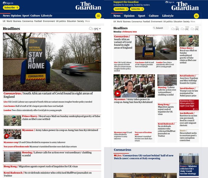
Here are some typical websites viewed on my 24″ vertical monitor. On the left if how it renders, and on the right how it should render.


Problems
Generally, there are several problems I encounter:
- Navigation is hidden behind a burger / ☰ menu.
- Some elements, like carousels, only work with touchscreen controls.
- Images are served as low resolution, for 6 inch screens and then blown up to 24 inches.
- Lots of wasted space taken up with "hero images" and finger-friendly buttons.
- Some content simply not available to mobile users.
Why this occurs
My monitor's native resolution is 1080x1920. But I find the fonts slightly too small at that resolution - given how far I sit from the screen. I use Pop_OS Linux, which lets me scale the fonts rather than the screen resolution.

A scale factor of 1.5 translates to an effective screen resolution of 720x1280.
User Agent "sniffing" is considered an antipattern and is discouraged. So most websites don't bother to check if I'm browsing on an iPhone or Android, instead, they use JavaScript or CSS to get my screen resolution.
They - somewhat reasonably - see a 720p screen in a vertical orientation and assume it is a small screen device.
How to tackle this (user side)
Zoom out! That's the obvious answer. If I hit CTRL+- 3 times, my resolution becomes 1080x1920. But that can leave some sites too small to read properly. I need to zoom out the page, and zoom in the font.
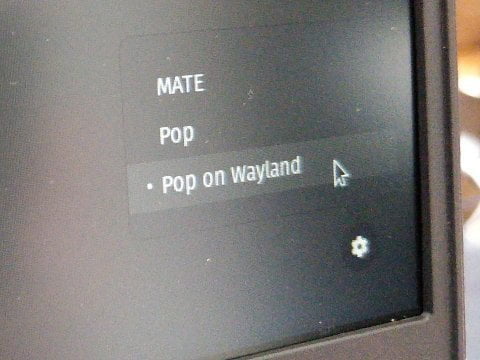
I have tried "Fractional Scaling" - it works OK on Wayland, but leaves all the fonts looking soft and fuzzy.
So I've set my font scaling to 1.36, which gives me a resolution of 864x1536 - which is enough to stop most sites assuming I'm on a tiny mobile phone.
But this shouldn't be my problem to solve.
How to tackle this (website side)
STOP NAÏVELY USING SCREEN RESOLUTION!
OK, there's no way to get the physical size of a user's screen. That functionality just doesn't exist in either JavaScript or CSS.
But you can get the Dots Per Inch (DPI). Well, sort of...
CSS allows you to get the DPI of the screen.
If I go to Lea Verou's https://DPI.lv/ I see that my monitor's resolution is correctly detected as 1080x1920! No matter what zoom level or font scaling I use - it is always the correct resolution.
var dppx = window.devicePixelRatio;
var screenWidth  = screen.width  * dppx;
var screenHeight = screen.height * dppx;
That's how you get the real resolution, unencumbered by whatever the OS is doing to the scaling.
If I go to a different DPI detector, I can see exactly how many pixels there are per inch. My vertical monitor is detected as 120px/inch.
This isn't quite right. And different browser engines calculate this differently. On Linux, I got these results with the three main rendering engines:
Chrome: 5.14px/mm.
Firefox: 4.73px/mm.
Webkit: 3.78px/mm.
When I physically measure the screen, it's about 3.62px/mm!
Obviously that's not incredibly accurate - but it is useful in giving a web developer a rough idea of physical screen size.
 Mastodon
 Twitter
 Facebook
 LinkedIn
 Reddit
 HackerNews
 Lobsters
 Pocket
 WhatsApp
 Telegram

This applies to ultrawide monitors too, if you have three windows set up (which is what the default is w/ powertool on Windows), you’ll get the mobile sites for Facebook, YouTube etc. on the left and right windows
Web developers: conflating screen size, operating system, available bandwidth and context of use since media queries became a thing.
I really want a dual-monitor setup, with one of them in a vertical direction. Would be very useful for writing code.
Image source: shkspr.mobi/blog/2021/02/j…
Nice. I'm trying to decide on the best vert screen to buy. Which one are ya using?
Iiyama ProLite B2482HS-B1 24″. Here's my review.
Just because I have a vertical screen, doesn’t mean I’m on a phone shkspr.mobi/blog/2021/02/j… (news.ycombinator.com/item?id=260004…)
That certainly does not work in every case.
dpi.lv detects my 16" Macbook Pro as 3584x2240. Real resolution unscaled 3072 x 1920 (you can't even use that resolution, max apple allow is 2048x1280 - so it looks sharper/retina). I am using 1536x960, otherwise, the image is too small.
Also, my external monitor, which is 4K, is being detected as 6K (6016x3384). Perhaps because I scaled the 4K image to 3K (3008x1692) so text is sharper and not too small, so it's detecting twice as that?
Same thing for the Mac screen. It's detecting double my resolution.
I've run your formula and I think I found out why. Apple seems to be correcting the
screen.widthto the correct value. I get1792which is my correct width. window.devicePixelRatio is 2, so thus why I get 3584x2240 (twice of what I have)I hear your complain, but I think the only way to play with websites is doing what apple is doing. Correcting screen.width and screen.height depending on how you scale your monitor. And the fact that it breaks for all apple hardware, is also a clue that this can't be used and apple seems to be correctly informing proper width, height and devicePixelRatio.
Thanks for sharing! Great information for me to consider in my web app development! This is the first thing I've ever read about looking at DPI for responsive design.
I've ranted about "don't use viewport size as a proxy to guess other things, such as 'touch only' (which nowadays is meaningless anyway, as you can have keyboard/mouse paired even with a nominally 'touch only' phone), slow network connection, etc" for aeons. There are now much better/cleaner APIs to determine those aspects.
However, in terms of layout decisions, I'd say that "it depends". The approach of making a decision of how best to use the available viewport space should be driven by the nature of the content, and what the designer thinks is the best use of the space. I personally have no problem with layout adapting to a more "vertical/portrait aspect" friendly approach, as long as it's well considered.
On the "getting the actual real screen size", beware also that this doesn't take into account expected/average viewing distance - so yes, it might detect that you're in fact using an enormous 50" screen...but it won't be able to tell you that it's wall mounted and 5 metres away from the user - which is what in an ideal world the CSS reference pixel should all paper over, since it assumes that dpi, scaling, etc have been set so that 1 CSS px is set to a roughly standardised visual angle for the average/expected viewing distance ... something I ranted about aeons ago when "web on tv" was still supposedly a thing https://patrickhlauke.github.io/web-tv/ideal-viewport/index.html
So once again, taking this with a grain of salt.