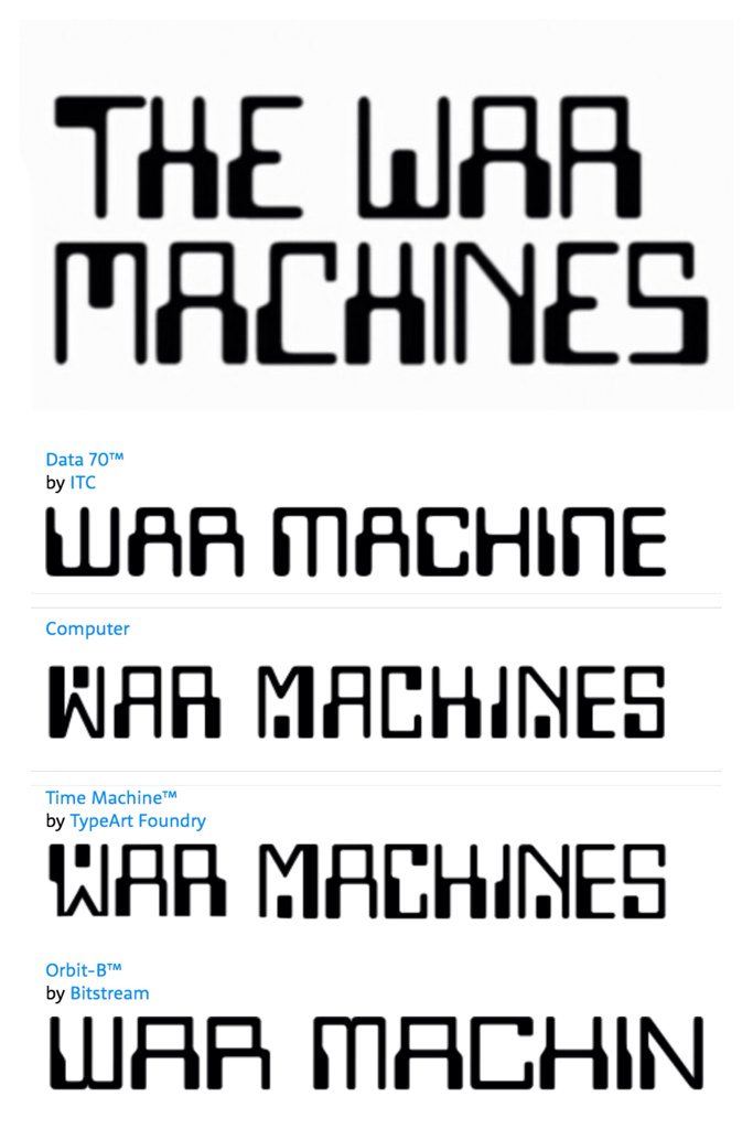
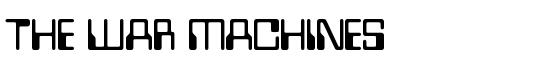
WOTAN - the Font of Doctor Who and the War Machines
As part of my silly floppy artwork, I wanted to find a retro computer font. Then I remembered that there's a 1960s Doctor Who serial with this beauty.
The War Machines is a cracking slice of 60s sci-fi. It's very groovy.

But what font is it?
It isn't Westminster.
 The W is completely wrong. And the letter
 T is mirrored.
Westminster has a surprising and interesting history.
It isn't Data 70.

Which, in any case, was released a few years after the episode. Time travel is complex though.
It isn't a modern font like Computer Font

As far as I can tell, it is an original font which is heavily inspired by Westminster. The T is a particular giveaway.
There are only a few title screens, so there are only a limited number of characters available.

With a bit of jiggery-pokery, we can grab a few more character. A flipped E easily becomes a 3, for example.
I am indebted to my producer Clayton Hickman for his original investigative work.


Just noticed the War Machines title font isn't one of the regular typefaces I assumed it was. Was it specially made?
pic.x.com/jiyfllgl8d

| Reply to original comment on twitter.com
Westminster is a derivative
Caroline Jarrett says:
| Reply to original comment on twitter.com
(This doesn’t explain the ‘W’ however)
They use data seventy (the K-9) font for the tile and "machines" range, not the custom made one they used in the story
BUT the WOTAN W on the machine is the original font
shkspr.mobi/blog/2020/09/w…
| Reply to original comment on twitter.com