My mate, the accessibility specialist Léonie Watson, has this to say about how we improve the world, piece-by-piece:
Accessibility doesn't have to be perfect, it just has to be a little bit better than yesterday.
Damn straight! One of the best ways we can make tomorrow slightly better than today is by making small changes which make it easier for people to do the right thing.
With that in mind, I've proposed a small change to the default behaviour in WordPress's media UI.
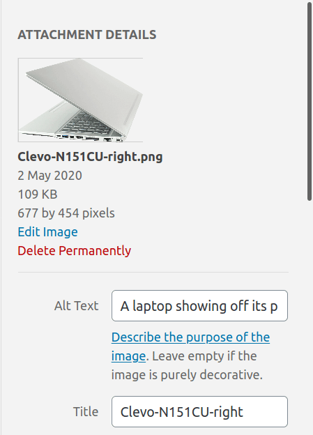
At the moment, when you add an image to your blog, you get a tiny little text input field - with only enough space for a few characters.

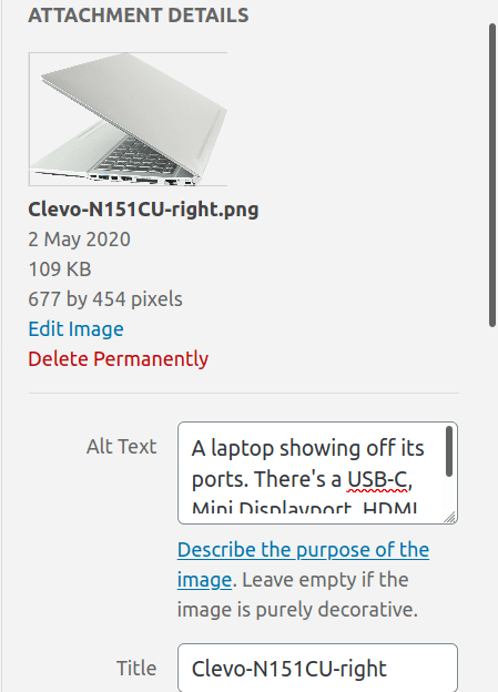
That doesn't encourage people to write meaningful text. So my suggestion is to turn that into a <textarea> element.
It looks like this:

More space for writing, and people can drag the corner of the area if they need more. It also matches the other text areas in the interface.
Hopefully, that will go a small way to improving accessibility on the web.
(I raised the same issue in the new Gutenberg Editor a couple of years ago - and it was accepted and merged.)
You can read the patch and the bug report - please leave a comment on them if you think this is a useful change.
6 thoughts on “A small accessibility improvement to WordPress”
Guilty of that @Edent. Usually I upload images while writing (or use Indigenous for Android) where the alt text fields don’t show up at all or doesn’t make it to my media endpoint (bug?). So I’m going to add this later™ – and that never happens. Thanks for reminding me on accessibility!Shame on me 🙁
| Reply to original comment on beko.famkos.net
Isabel Holdsworth
No biggie if it’s a decorative image, but if it’s a graphical link with no text content it needs alternative text describing the destination page (“Isabel’s blog”). And if it’s a button, the action should be described (“Search”).
I switched to writing [external] links within articles the way they are some time ago. Including protocol. This makes it also clear for anyone reading that this is a link to somewhere else. It also helps with syndication where HTML or images may be lost. A Webmention comment for example is usually plain text only and images are dropped.
| Reply to original comment on beko.famkos.net
Guilty of that @Edent. Usually I upload images while writing (or use Indigenous for Android) where the alt text fields don’t show up at all or doesn’t make it to my media endpoint (bug?). So I’m going to add this later™ – and that never happens. Thanks for reminding me on accessibility!Shame on me 🙁
| Reply to original comment on beko.famkos.net
Isabel Holdsworth
I love ideas like this, because being a screen reader user they tend to make my life easier 🙂 But by way of encouraging people not to waffle too much when providing alternative text, would it be worth, say, starting off with a reasonably small textarea, so waffling takes a little effort as you have to resize the textarea first?
Thanks @edent Makes sense to me. Aside: there's another #WordPress trac ticket exploring broader #a11y improvements to the alt text user interface. You're very welcome to join the discussion there! core.trac.wordpress.org/ticket/47456
| Reply to original comment on twitter.com
What links here from around this blog?