The Great(er) Bear - using Wikidata to generate better artwork
By @edent![]() · art data NaBloPoMo python tfl wikipedia · 15 comments · 2,350 words · read ~7,287 times.
· art data NaBloPoMo python tfl wikipedia · 15 comments · 2,350 words · read ~7,287 times.
One of my favourite works of art is The Great Bear by Simon Patterson.

At first glance, it appears to be a normal London Tube map. But look closer...

Cool! But there is something about it which has always bothered me. Each Tube line represents a theme - therefore, a station at the intersection of multiple lines should be represented by someone who matches all of those themes.
For example, here's Baron's Court - the intersection of the Explorer line and the Saint line - represented by Saint Ursula.
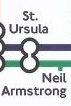
She is just an saint - she has nothing to do with exploring. This artwork is wrong!
So, can we write something to query Wikidata to generate a more accurate artwork?
Because accuracy is my aesthetic.
Jump straight to the finished product and skip all the geeky details!
A brief guide to SPARQL
Wikipedia holds structured data about people and things. It uses SPARQL to query that data. It is a bit complex to use, but a valuable skill.
For example, this query finds people who are explorers and also saints.
SELECT DISTINCT ?person ?personLabel WHERE {
  ?person wdt:P106 wd:Q11900058 . # People whose occupation (P106) is explorer (Q11...)
  ?person wdt:P411 wd:Q43115      # People whose canonization status (P411) is sainthood (Q43...)

  SERVICE wikibase:label {
    bd:serviceParam wikibase:language "[AUTO_LANGUAGE],en" .
  }
}
The result is just four people. And that's where the problem starts. Simon Patterson chose categories for the lines which often don't have any intersections. There is no one who is an Italian Artist who is also a Saint and also a Footballer.
So, to create a more accurate artwork, we'll need different categories.
Nodes
One of the first things we need to do is understand the Tube map as a graph - with stations as nodes and lines as edges.
We want to know:
- Which stations are on which lines
- Which stations are on multiple lines
- Which station has the most lines
- How many stations are on each line
Thankfully Mark Dunne has done lots the hard work for us, and provided a great tutorial. Sadly, the data are about 5 years out of date.
Alternatively, the TfL API has lots of the information we need. Here's the call for all the stations on the Bakerloo line - https://api.tfl.gov.uk/line/bakerloo/stoppoints
Let's throw some Python down to grab the data we need. First, how many stations are there on the Bakerloo line?
import requests
r = requests.get("https://api.tfl.gov.uk/line/bakerloo/stoppoints")
stations = r.json()
count = len(stations)
print("There are " + str(count) + " stations on the Bakerloo Line")
Next, let's get the lines for each station:
import requests
r = requests.get("https://api.tfl.gov.uk/line/bakerloo/stoppoints")
stations = r.json()

for station in stations:
    stationName = station["commonName"]
    lineGroups   = station["lineModeGroups"]
    for lineGroup in lineGroups:
        modeName = lineGroup["modeName"]
        if (modeName=="tube"):
            lineCount = len(lineGroup["lineIdentifier"])

    print(stationName + "," + str(lineCount))
The line names can be found at https://api.tfl.gov.uk/Line/Mode/tube
Brief survey of the problem...
270 Tube Stations(!) across 11 lines. King's Cross St Pancras has the most lines - 6.
There a few anomalies in the data. It lists Edgware Road as two separate stations - even though it's really one station.

The same problem is present on Hammersmith and Paddington. Cleaning data is "fun"...
The categories are also challenging. This is how many times the Bakerloo line intersects with the other lines
    'bakerloo': {
        'circle': 3,
        'hammersmith-city': 1,
        'jubilee': 2,
        'metropolitan': 1,
        'northern': 4,
        'district': 2,
        'central': 1,
        'victoria': 1,
        'piccadilly': 1,
        'waterloo-city': 1
    },
That is - the Bakerloo line touches every other line at least once. As do the Northern, Central, and Jubilee lines. Those lines will need to contain some very broad categories.
Back to Wikidata
So, we want to replace each station's name with a human's name. We need attributes which are wide-spread enough to get good coverage in the data - and quirky enough to be interesting. I'd also like to keep some of the original categories:

I suspect there's a way to interrogate SPARQL to find a list of categories based on a graph - but I'm not clever enough to do that. I started off with an entirely arbitrary set of attributes:
- Academy Award Winners
- Left-handed people
- Nobel Prize Winners
- People born in London
- Educated at UEA (the university where my wife and I first met)
- Female Computer Scientists
- Saints
- Explorers
- Journalists
- Sinologues
- Comedians
Here's the query for Comedians who were educated at UEA and were born in London:
SELECT DISTINCT ?person ?personLabel WHERE {
  ?person wdt:P69 wd:Q1045828 .
  ?person wdt:P106 wd:Q245068 .
  ?person wdt:P19 wd:Q84
  SERVICE wikibase:label {
    bd:serviceParam wikibase:language "[AUTO_LANGUAGE],en" .
  }
}
One result - Doc Brown. There are no saints who have won an Oscar, and data about left-handed people is suspiciously absent. The categories will have to be completely rejigged.
Keep It Simple, Stupid
I figured the easiest thing to do would be to start from a well data'd individual and work backwards from there.
SELECT DISTINCT ?person ?personLabel WHERE {
  ?person wdt:P108 wd:Q35794  . #Employed by Cambridge University #Bakerloo
  ?person wdt:P19  wd:Q84     . #Born in London                   #Circle
  ?person wdt:P463 wd:Q123885 . #Member of the Royal Society      #Hammersmith&City
  ?person wdt:P106 wd:Q121594 . #Professor                        #Waterloo&City
  ?person wdt:P106 wd:Q205375 . #Inventor                         #Metropolitan
  ?person wdt:P106 wd:Q81096  . #Engineer                         #District
  ?person wdt:P106 wd:Q4964182. #Philosopher                      #Piccadilly
  ?person wdt:P106 wd:Q11063  . #Astronomer                       #Victoria
  ?person wdt:P106 wd:Q170790 . #Mathematician                    #Jubilee
  ?person wdt:P106 wd:Q82594  . #Computer Science                 #Northern
  ?person wdt:P106 wd:Q188094 . #Economist                        #Central

  SERVICE wikibase:label {
    bd:serviceParam wikibase:language "[AUTO_LANGUAGE],en" .
  }
}
The result of that query is the inventor of steampunk, Charles Babbage!
We can do a reverse query. Given these people, which common properties do they have?
SELECT ?property ?propnameLabel ?value_Label
where
{
  wd:Q46633 ?property ?value . #Babbage
  wd:Q7259  ?property ?value . #Lovelace
  ?propname wikibase:directClaim ?property . # constrain to directClaims
  SERVICE wikibase:label { bd:serviceParam wikibase:language "[AUTO_LANGUAGE],en".
                         ?value rdfs:label ?value_Label .
                         ?propname rdfs:label ?propnameLabel .}
} order by ?property
(Thanks to TagishSimon for the help)
This is where things got trickier! Most of the major intersections didn't have any candidates other than Babbage - truly a Renaissance Man! - so I expanded "born in London" to "born in the UK".
We can't use ?person wdt:P27 wd:Q145 becuase that only covers the current United Kingdom - not The Kingdom of Great Britain (1707–1801) nor The United Kingdom of Great Britain and Ireland (1801 to 1927)
The correct query seems to be ensuring the place of birth is within the current administrative territory of UK:
?person wdt:P19 ?pob . ?pob wdt:P131* wd:Q145 .
But you can also use a UNION
{?person wdt:P27 wd:Q145} UNION {?person wdt:P27 wd:Q174193} UNION {?person wdt:P27 wd:Q161885} .
That got closer - but still not enough.
Unions
Wikidata is fickle. Someone may have an occupation as a "computer scientist" or they may work in the field of "computer science". SPARQL eschews the or operator, and uses UNION:
{?person wdt:P101 wd:Q21198} #Field of Work CS
UNION
{?person wdt:P106 wd:Q82594} #Occupation CS
I'm beginning to see why the original artist was more liberal in his accuracy!
Sorting
I want the map to contain notable people. There are a couple of ways to assess the "notability" of a Wikidata subject. I've chosen to use "sitelinks" - that shows how many languages their article is available in. It's a crude, but quick method.
Here's it in action:
SELECT DISTINCT ?person ?personLabel ?sitelinks WHERE {
  ?person wdt:P106 wd:Q205375 . #Inventor
  ?person wikibase:sitelinks ?sitelinks .

  SERVICE wikibase:label {
    bd:serviceParam wikibase:language "[AUTO_LANGUAGE],en" .
  }
} ORDER BY DESC (?sitelinks)
Correcting for Bias
Wikipedia has an acknowledged male bias. So I used SPARQL's FILTER property to great effect:
FILTER ( !EXISTS{ ?person wdt:P21 wd:Q6581097 })
It says to return anyone without the sex/gender of "Male". (Yes, I know things are a bit more complicated than that - but this is a good way to return women, intersex people, agender, transgender folk etc).
If no non-men were returned, I repeated the search but omitted the filter.
Because I used "Born in the UK" as a filter, there is probably a bias towards white people. And people who become Professors or members of the Royal Society may also be the product of a biased society. There are many other filters and categories I could have chosen - and I hope some of you will create maps for your own cultures and societies.
P-p-p-pickup Some Python
There are several Python libraries for SPARQL, I used sparqlwrapper.
Here's a sample query
from SPARQLWrapper import SPARQLWrapper, JSON

sparql = SPARQLWrapper("https://query.wikidata.org/sparql")
sparql.setQuery("""
    SELECT DISTINCT ?person ?personLabel ?sitelinks WHERE {
        ?person wdt:P106 wd:Q81096 . #Engineer
        ?person wdt:P20  wd:Q84    . #Died in London
        ?person wikibase:sitelinks ?sitelinks .
        SERVICE wikibase:label {
            bd:serviceParam wikibase:language "[AUTO_LANGUAGE],en" .
        }
    } ORDER BY DESC (?sitelinks)
""")
sparql.setReturnFormat(JSON)
results = sparql.query().convert()

for result in results["results"]["bindings"]:
    print('%s %s %s' % (result["person"]["value"], result["personLabel"]["value"], result["sitelinks"]["value"]))
Plotting onto an image
Let's leave who and what we select for now, and work out how we draw the eventual results.
We could do all sorts of clever things plotting out locations - but I decided to cheat!
There is a fully semantic SVG of the tube lines (Thanks to Oliver O’Brien for finding it).
I removed all the lines I didn't want, then I was able to search & replace station names with my preferred text.
Search And Replace
Well... sort of! Charing Cross Station has an ID of 940GZZLUCHX.
On the map it is:
<g id="s-940gzzluchx_label">
    <g id="s-940gzzluchx_label_1_">
        <text transform="matrix(1 0 0 1 515.8999 487.6963)">
            <tspan x="0" y="0">Charing</tspan>
            <tspan x="4.3" y="4.5">Cross</tspan>
        </text>
    </g>
    <polygon id="s-940gzzluchx_nr" fill="#EE3124" points="514.3,487.7 512.6,486.9 515,486.9 515,486.4 512.5,486.4 513.8,485.8 515,485.8 515,485.3 513.8,485.3 512.2,484.6 511,484.6 512.7,485.3 510.2,485.3 510.2,485.8 512.7,485.8 511.4,486.4 510.2,486.4 510.2,486.9 511.5,486.9 513.1,487.7 "/>
</g>
Whereas the SVG element for North Wembley is just:
<text id="s-940gzzlunwy_label_2_" transform="matrix(1 0 0 1 282.1489 289.1079)">North Wembley</text>
Again, I'm not quite clever enough to work out a way to reliably find the inner text for an element which may be inside (or not) several other similarly named elements.
So a lot of repetitive search-and-replace it is. *sigh*
I also need to manually place some of the station names, because they're a different length to the originals. *double-sigh*
Putting it all together
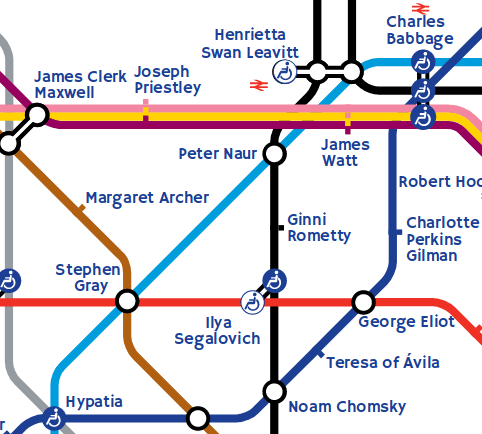
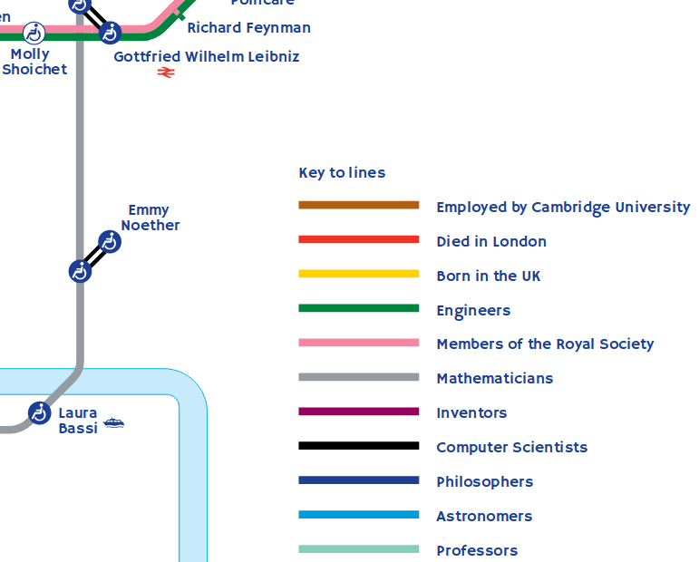
I have great pleasure in revealing to you "The Great(er) Bear"!
Copyright
OK gang, turns out that copyright law is even trickier than computer code! I've spoken to Simon Patterson and he is happy for me to host a not-for-profit version of this piece of art which is heavily indebted to his original.
TfL has been litigious in the past when it comes to derivative maps. I tried contacting them several times, but didn't receive any clear answers as to whether I could do this.
The data that I used to generate the art is "Powered by TfL Open Data" and provided under OGLv2. It may contain OS data © Crown copyright and database rights 2016.
The original font is tightly controlled. So I've used a freely available font called Hammersmith One which is broadly similar.
Lots of people create modified tube maps:
- The Literary Tube Map - putting authors on the map
- Tube Map of Beer Prices
- Decibel levels on the Tube
- House Price Tube Map
- And no doubt many more.
If you want to build your own version of my modified map, all the data are on my GitLab!
Details
Here are a few interesting close-ups of the map - they may be different from the final version.


Errata
- The data in Wikidata may be incorrect or incomplete.
- I originally didn't restrict it to just humans! So a few weird entries snuck in. Using
?person wdt:P31 wd:Q5 .corrected that. But I'm wondering if anyone on the map is fictional...! - Due to timeouts and my crappy coding, I ran the code over several passes on different days. If you run the code, you might get different results.
- I didn't use people's names in their original language, I had to back-fill them. I probably missed some. I should have used
P1559. - Even after lots of jiggling of categories, one or two stations kept coming up blank. So I manually added in a few people. Can you spot who they are?
- Some people's names were too long for the allotted space, so I have swapped a few people around. Better code would try to keep name length as close to the original as possible.
- There's no (intentional) ordering. It might be nice to put people on the line in order of, say, year of birth.
- Similarly, there's almost no relation between the people and the places. Although I've contrived to put the author of Mary Poppins somewhere special!
- The Hammersmith One font only has a basic set of characters - so non-European languages (and some accents) are in the default font.
- The Elizabeth Line / CrossRail hasn't opened yet. I suspect it will be much harder to produce a new map once it goes live. Similarly the DLR and Overground lines are excluded.
- The SVG renders well in Firefox, and seems to work OK in Chrome. Please let me know of any glitches.
- I've also added a couple of Easter Eggs. Enjoy finding them!
Thanks
Mainly to my wife, Liz, for being very patient with me while I swore at my code.
I am indebted to Simon Patterson for his incredible and inspirational artwork. When it was created in 1992, Wikipedia did not exist. Linked Data stores were in their infancy. It would have been close to impossible to create a semantically correct map. Nothing in my version is intended to take away from Patterson's work and creativity.


 You can print posters of your own artwork and no one can stop you!
%20Bear.svg)
I was going to suggest that Elizabeth Holmes shouldn’t be categorised as an inventor, but she certainly invented a way to separate rich people from their money.
Why were the names chosen in the first place? We're they linked to the areas around the stations? It seems quite arbitrary.
Yes, most tube stations are named after the local area.
Sorry to be pedantic but the two Edgware Road and Hammersmith stations aren't really just one station.
Yes they have the same names but they are separate entities. They are all in separate buildings and you have to cross at least one road to get between them.
Sorry if this puts a spanner in your works.
Sure, but they have the same name. In order to keep consistency with the original map, they needed to have the same name in my version.
Paul Kerensa did a manually-researched version for comedians a few years ago that was line-accurate (station on multiple lines had to describe all facets of the comedian or act). It's still online at https://www.paulkerensa.com/gfx/tube_map3.gif
That's lovely! Thanks.
I appreciate the effort you've put in, but I have a major bugbear (similar to the one you had originally) as you have lots of people there who were born in the UK (eg - Angela Carter, Mary Wollstonecraft), but aren't on the born in the UK line - which invalidates the whole point of that line. They should be on points that intersect.
Sorry...
Hi Norval,
I think you've misunderstood. The lines are not exclusive. UK line only contains people born in the UK. That does not imply that people on other lines are not born in the UK.
However, if you feel that isn't precise enough for you, do feel free to create a more accurate version.
Great work, and thanks for bringing us along for the explanation! no small challenge you gave yourself!
I remember a similar reaction to the great bear map when i first noticed the intersections.
I may be mistaken but doesn’t the map indicate that carol vorderman died in london?
many thanks ,
kito
There's a station interchange between James Duff-Brown and Carol Vordaman. She is, I hope, very much alive.
How Wikidata was used to improve an artwork.
shkspr.mobi/blog/2019/11/t…
Really interesting approach. Thanks for sharing how you got there Terence.
I have a print of The Great Bear on my wall and finally gave in to my long held desire to do this exact exercise myself over the past few months in my spare time…
We went about it slightly differently it seems - my categories aren’t all people but also places and things which helps get to more commonly known intersections (eg “Washington” and “Jordan”). I also just did the initial working out of where to start (Kings Cross and other multi-line stations first) and then created an Excel grid and started work on things I could fit based on Google and a LOT of Wikipedia disambiguation pages. It’s also futureproofed for the Elizabeth line, but not Crossrail 2 (yet!)
Thanks for the visualisation tips too, that’s what I now need to sort. I initially have one made up in Photoshop, but I’m working through your SVG links and instructions which are very helpful as the resolution currently isn’t the best.
TfL were in the news this week doing more of these kinds of things… Black History Month has been celebrated with a map now.
https://www.standard.co.uk/video/news/black-history-tube-map-launched-in-collaboration-with-black-cultural-archives-v033825b0
I’m interested to see how something like this could be used as not just art but also education. I think it’s cool to get people thinking laterally about connections, names and history. Maybe TfL would be open to allowing more collaborations and uses of the map in different ways going forward? I’d have no idea where to start with that and it sounds like you’ve come up against a brick wall too.
As you have found there will often be bias - I know mine is still quite Westernised but I’ve tried to find and place inspiring people on there on the global stage. I also have clusters of similar people/places/things or have found something which has a connection to the actual station itself (or if that wasn’t possible then nearby, I have both “Holmes” and “Watson” near to Baker Street for example but neither fitted my categories for the station itself unfortunately).
It’s been a fun challenge and it’s great to see others have tried the same thing and are inspired by the work Simon Patterson gave us.
I'm glad it was useful. Would love to see what you have created.
It took a while to get the time to do the finishing touches, but have a look and see what you think!
https://www.dropbox.com/s/0a1m7gx2k36ggim/Mind%20the%20Connections.png?dl=0
I'm a tiny bit tempted to wait until Elizabeth line is completed and re-do it then.
The whole map appears to be under licence, not just the logo and the font (https://tfl.gov.uk/info-for/suppliers-and-contractors/map-licensing?intcmp=4727) I have kept your copyright caveats but I'm not planning on distributing it further than this for the moment.