One of Android's mottos is "Be Together; Not The Same". What does that mean to you? To me, it means that you don't need to conform to a single way of doing things. Sadly, Google seems to be moving far away from that ideal. The latest change - adaptive icons.
All "adaptive icons" means is that every unique icon has to be constrained in a circle. It makes every icon look monotonous and, in some cases, shrinks the icon so that they're hard to see even on large screens.
There's a cognitive element here. When I look at my screen for an icon, I tend to use colour and shape to find what I'm looking for. With every icon now a circle, and half of them trapped in a white background, it makes looking for the right icon harder.
Boring!
Better!
Æsthetics
This is the way I personally prefer my icons. I don't care that they're not a uniform shape. I don't care that some of them have a lower centre of gravity than others. I don't care that the corner radius is different on each one. I don't care that they don't all line up perfectly like ticky-tacky little boxes.
I want them not to be the same.
Getting the icons
Here's how to fix it.
This is the Gmail adaptive icon - tiny and indistinct.
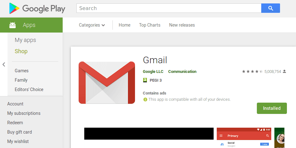
The Gmail app lives at:
https://play.google.com/store/apps/details?id=com.google.android.gm

Inspecting the source code shows the nice large icon lives at:
https://lh3.ggpht.com/8-N_qLXgV-eNDQINqTR-Pzu5Y8DuH0Xjz53zoWq_IcBNpcxDL_gK4uS_MvXH00yN6nd4=s180
Removing the =s180 from the end of the URl gives us the full 512x512 image. That's suitable for use as an alternative icon.
OK, but how do we get the icon from the Play Store URl? Google intentionally make this difficult. You'd think that it would be <div id="icon"><img id="icon-small" ...> or something. Nope!
Here's what the source looks like:
 What the flippity-flack is going on there? Purposefully uglified code designed to obfuscate and frustrate?
At the moment, it looks like all icon images have class="T75of ujDFqe" - but I wouldn't want to bet on that being stable.
There's no official API for Google Play - but there are unofficial paid-for APIs and some open source scrapers of varying usefulness.
I ended up using Daniel Liu's Python Play Store Scraper.
This quick scrap of code take's an app's package name, downloads the large size icon, compresses it using WebP, and saves it.
Python 3
import play_scraper import requests from PIL import Image import webp packageName = "com.android.chrome" icon = Image.open(requests.get(play_scraper.details(packageName)["icon"], stream = True).raw) # Save as png icon.save(packageName + ".png", optimize=True) #Save as WebP webp.save_image(icon, packageName + '.webp', lossless=True)
Setting the icon
Most modern Android homescreens allow you to manually set the icons of each app. Long press on an app, then choose edit, then select the icon you want. Easy! (ish)
If I Was Clever
If I had the skill, I'd create an Android app which looked at the app name, downloaded the icon from the play store, and used that as the launcher icon.
Or, I'd fork an existing icon pack and manually add the top 500 apps.
But I'm not that good at Android apps. If anyone else wants to make it, please do so!
4 thoughts on “Annoyed by Android's circular icons? Here's how to fix them”
huh
or you could just... use an icon pack?
@edent
Great - please can you tell me which pack has official icons for all the apps I use?
John doe
Downloading a second copy of each icon seems stupid when the real one is in each installed APK . I came here looking for a way to turn off the adding of the circle transformation done by the Amdroid shell ("launcher") .
@edent
Do feel free to tell us all how to extract the icons from the APK then, oh wise one!
What links here from around this blog?